Big Mail Review
TL;DR: While I commend Big Mail for going big (heh) on rethinking email, a few missing basic features, bugs, and a realization that I’m more of an email traditionalist keeps me from sticking with it.
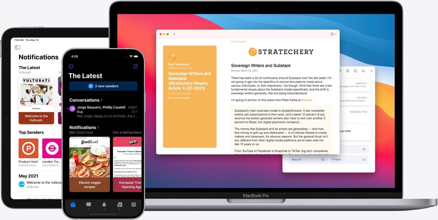
Email is my love language
I’ve long said that email is my love language. I take pride in crafting valuable messages to people, in and out of the workplace. If you send me an email, you can rest assured that you’ll get a thoughtful response. So as an email aficionado, it should come as no surprise that I’ve tried all the high-profile email clients throughout the years:
- Apple Mail (the steadfast workhorse)
- Mailbox (the OG who started it all, the golden child, and the one we’ll never forget)
- Inbox by Gmail (Google’s comeback to the simplicity of Mailbox)
- Spark (not the prettiest, but the fastest and most useful)
- HEY (the rethought and controversial market invigorator)
- and now Big Mail (we’ll find out!)
The hype for Big Mail, by The Not So Big Company, has been real. Flashy promo videos, a well-designed website, and pre-orders helped to raise its visibility well before launch. I, like many others, was hopeful for the promise of Big Mail: a rethink of email management — brought to the masses by HEY — but in a more familiar package.
Here are a few of the headline features.
Bouncer - Approve or deny senders the first time they email you. Approved senders get categorized automatically, ignored get hidden forever.
Automatic Categorization Using Scenes - Nearly every email can be categorized into Conversation, Notifications, Newsletters, or Purchases. Big Mail would sort them for you.
The Latest - Where new email surfaces, rather than an inbox. Once read, the email disappears from The Latest but sticks around in its Scene.
Privacy - Blocking those tracking pixels that have come under fire lately.
Setting up Big Mail
I’ve been using Big Mail as my primary email client for the past week, and I have some thoughts about what it’s like to make the switch. I removed Spark from all my Home Screens and docks and replaced them with Big Mail. I was only comfortable with this trial because Big Mail doesn’t do anything funny with your messages. Everything stays between your email provider’s server and your device. Big Mail just uses pseudo messages within a Big Mail folder to sync data and work its magic. If I didn’t want to keep using Big Mail after the two-week trial, I could easily switch back to another client. Having just recently made a transition away from HEY, I was glad for the non-destructive nature of Big Mail.
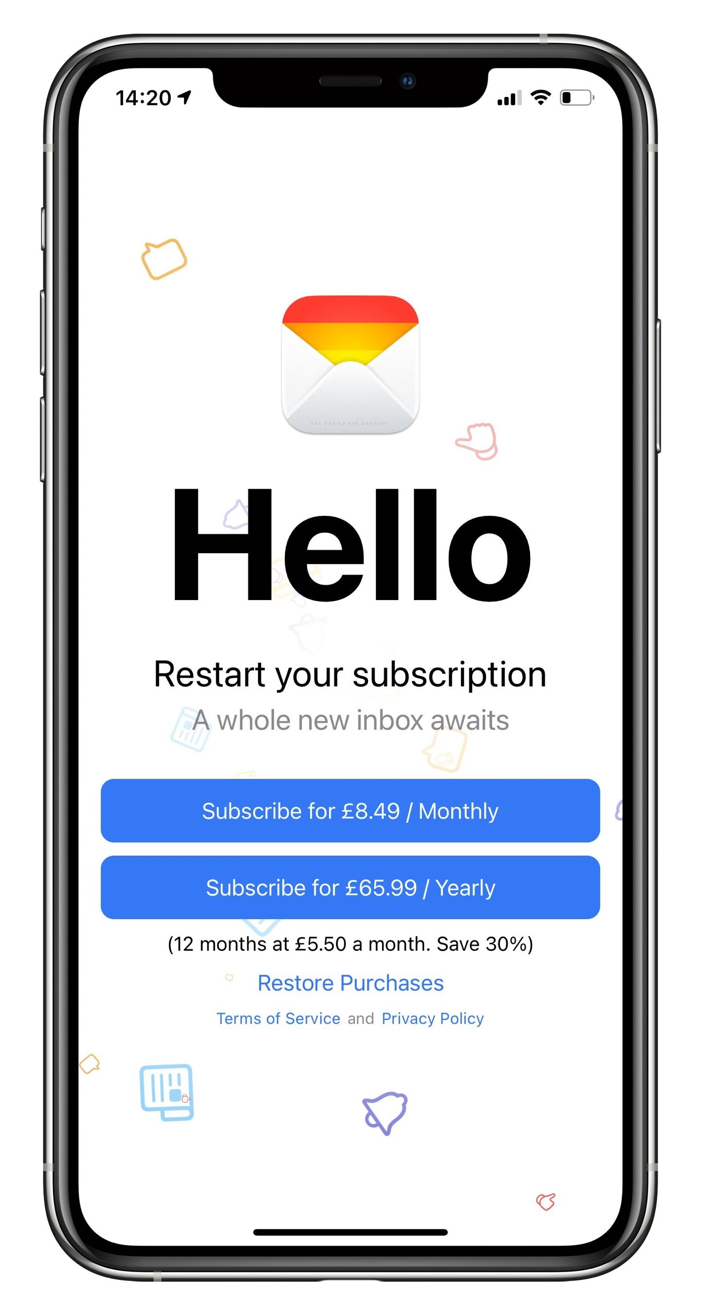
The sign-up process, I’ll admit, was a little confusing. I’d pre-ordered the free app, but I was greeted with a subscription screen upon opening it for the first time. I’d known this was a paid email service that came with a two-week free trial. Though I’m very familiar with subscription sign-ups, the welcome screen gave me pause. I wasn’t sure if I would be charged right away or if the free trial would kick in. Apple apparently also took issue with the subscription screen, which led to the app’s delayed launch, and I think I see why.
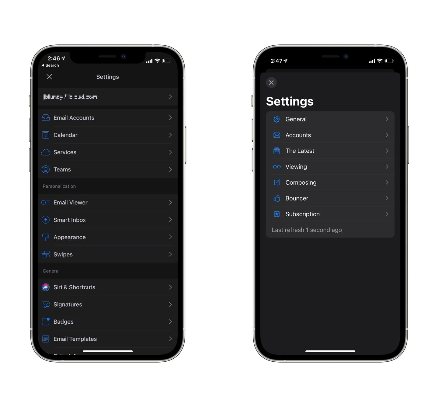
After a reasonably quick initial sync, I was up and running. I had a few emails that needed to be approved in the Bouncer. First, I took a look in the settings area — a little bare, which was especially surprising coming from Spark’s stuffed full settings screens.
Big Mail delivered on its guarantee to feel native to the operating system. With its large headings, SF Symbols, standard context menus, and following the layout guidelines for each platform, Big Mail looks at home on iOS, iPadOS, and macOS.
Sorting my existing emails into Big Mail’s scenes was simple. I could move an individual message or always sort a sender into a specific category, which I’d recommend. While not difficult to change afterward, I wish that I was given an option of where to sort that sender on approval in the Bouncer. I guess the developer wants the app to have the opportunity to do auto-sorting, but that was inaccurate enough that a choice upon approval would be helpful.
Since Big Mail works like most any other client, there was very little else to set up. So I made sure Glancing (marking messages as read upon a slow scroll by them) was turned on and adjusted the order in which items appeared in The Latest. After that, I waited for more messages to come in.
Using Big Mail day-to-day
Having gone through an email makeover last year when I tried out HEY, I thought I knew what I was in for with Big Mail. But while HEY was weird and quirky in ways that made sense, I’ve found Big Mail to be a mixed bag of delightful touches and frustrating omissions.
One thing I appreciated about HEY and now enjoy in Big Mail is partitioning off newsletter-type messages. Big Mail promised a little extra design polish for these messages to make them look more like articles in a read-later app, and I think it works. Newsletters (along with Notifications and Purchases) get a nice sidebar that takes on identity from the email content. I like it. Some messages don’t get the formatting exactly right, but I didn’t find the occasional pinch and zoom needed to be annoying.
Another feature somewhat lifted from HEY’s playbook is eschewing the act of archiving messages. In Big Mail, once a message is read, it leaves The Latest and lives forever within its Scene. No need to archive because it’s (kind of) done for you. Except that Big Mail doesn’t archive the messages. Since it reads messages from specific folders, it leaves every message in the canonical inbox. When I opened Spark to see what was happening to the messages, there they were — marked as read but living in the inbox.1
I’ll acknowledge that the Conversation scene is quite nice. I had a few important messages that I was waiting for, and having all emails that involve a back-and-forth between recipients always be in the Conversations tab made it simple to keep up with them. But, weirdly, all the previous messages sorted into Conversations display my name rather than the person I was conversing with, which made them difficult to differentiate from each other. This brings me to the bugs I’ve experienced.
A buggy 1.0
I’ve experienced other strange bugs that taken alone would not be a big deal. I’m willing to overlook a few bugs knowing that writing an email app is a significant undertaking. But some of these bugs I have never experienced in any other app and make Big Mail feel as though it is built on a house of cards ready to tumble.
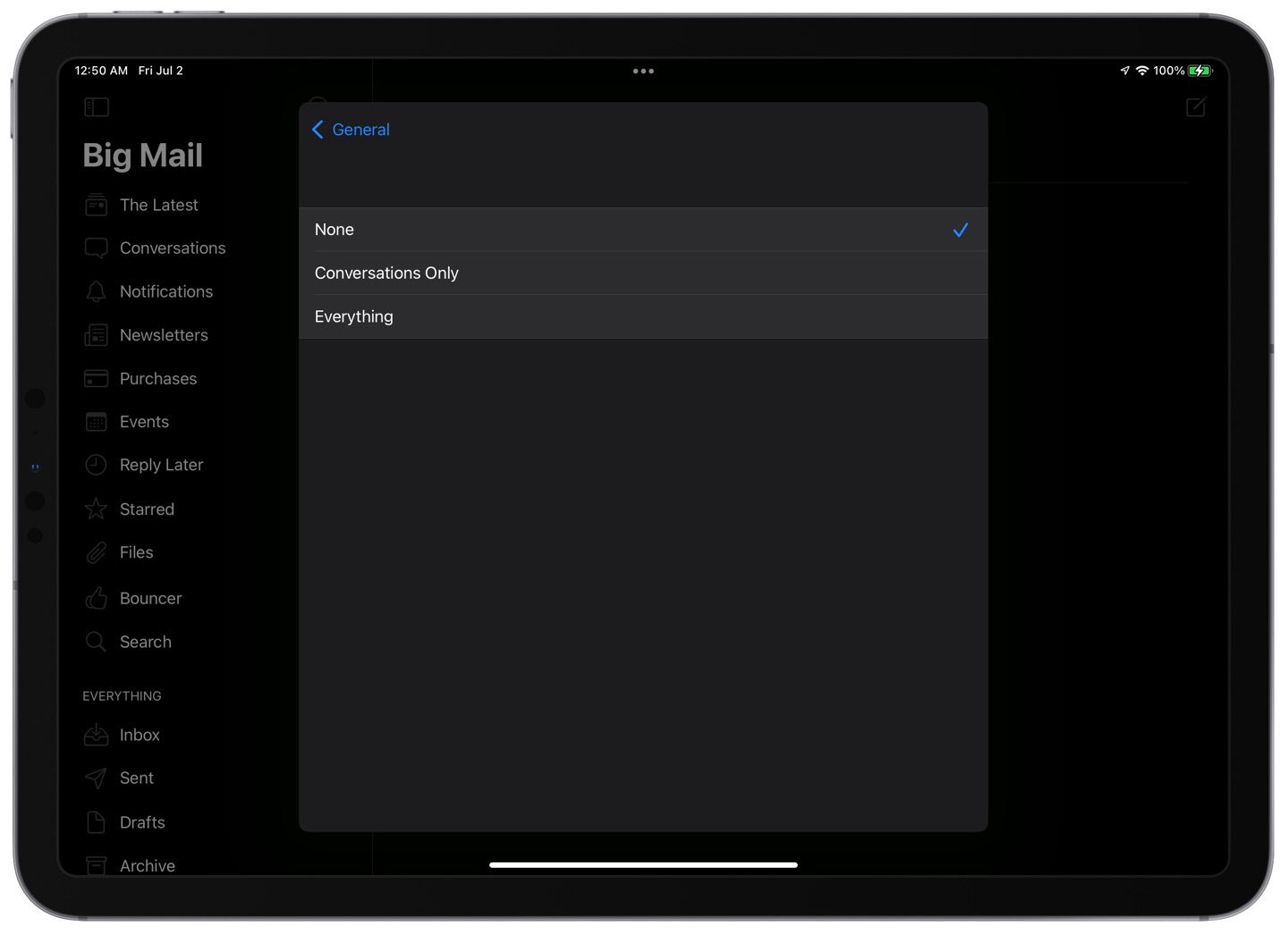
A notifications bug has become a sticking point for me. I typically leave email notifications off but like to have a badge display the number of new messages in my inbox. Unfortunately, that differentiation isn’t currently available, so I left notifications turned off, and yet a few days into the trial, I started getting message notifications on my lock screen. Though I don’t recall doing so, I had permitted Big Mail to send notifications in the Settings apps, but I still had notifications set to “None” within Big Mail itself.
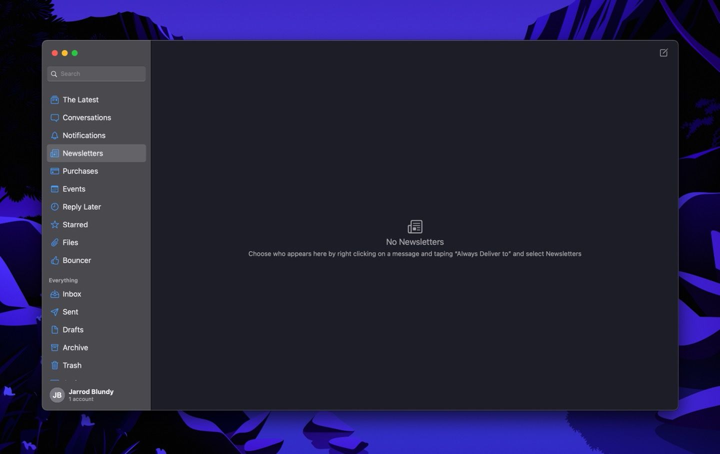
I also regularly see empty alerts upon opening the app. Not being able to read them, I have no idea of what I’m supposed to be aware. I assume it’s trying to let me know of a syncing issue because I’ve seen plenty of those. Sadly, the Mac app or usually doesn’t get the memo about messages I’ve already passed through the Bouncer on my iPhone.
When composing a reply, I have had the large heading-style subject follow my scroll down the page, obscuring the previous messages I’m trying to read.
And, perhaps most concerning, is the speed at which messages are delivered. It’s not uncommon for messages to take dozens of minutes to appear in The Latest or Bouncer even though they’ve been received without issue in Spark or Apple Mail. Since Big Mail is purportedly using only on-device processing and no third-party servers, I’m not sure what’s delaying those messages.
It’s good to keep in mind that the app has only been released to the public for about a week now, and I’m sure that the developer will iron out many of these bugs over time. But in the meantime, it gives me a nagging feeling that I can’t trust my email client — and email is supposed to be the most reliable form of online messaging around.
Some additional pros and cons
Pros
- Native design.
- Quick navigation.
- Scenes, while there are many, make sense to how I mentally categorize messages.
- I like “The Latest” both as a separate tab and a section within each Scene. But, to take advantage of the “Glancing” feature (mark as read while scrolling), you need to go down to the more traditional list of messages which isn’t apparent.
- Attachments tab for each message thread to aggregate any attachments sent within that conversation. There’s also a global Attachments tab.
Cons
- Some sidebar selections automatically close the sidebar, while others keep it open. That inconsistency is jarring.
- I’d prefer that everything that gets marked as read also gets moved to the archive. This is important because, otherwise, everything gets left in the inbox. If I need to check from a web interface or just want to use a feature of another email app, that will be overwhelming.
- Likewise, Big Mail would be much more useful if it organized my archived email using Scenes in addition to what’s in the inbox.
- No Quick Actions from the Home Screen.
- No Shortcuts support.
- No Widgets.
- Not available to set as a default mail app on iPhone and iPad. Apple introduced this integration in last year’s operating systems, and I’m flabbergasted that this wasn’t included in the 1.0 release of Big Mail. The result is that if I tap on an email address outside of Big Mail, I’m brought to Spark’s composing interface instead.
- It seems like the app is always trying to catch up on syncing. Perhaps with time, more frequent background updates will kick in, but right now, it needs to sync every time I open the app.
My takeaway
It will probably come as no surprise that I don’t plan to stick with Big Mail after the trial period. But that’s not to say that trying it out has been a waste. On the contrary, I’ve learned a lot about how I prefer to manage email while I’ve bumped against Big Mail’s features and limitations.
For years now, I’ve been an email completionist. That is to say that I try to get to “inbox zero” as quickly as possible. While not easy, it makes me feel good not to keep people waiting on a response or keep irrelevant messages taking up space in my inbox and mind. Spark has been my trusty tool for getting to inbox zero for several years. With its swipe gestures, customizable keyboard shortcuts, and integrations with other apps (like my task manager), I can triage messages with surprising speed in Readle’s app. However, Big Mail is quick in a different way. Once the message is read, it assumes that it is no longer relevant. Every message is still accessible, but I can’t use the client as a productively layer in the way that I can with Spark.2 And I don’t get the same satisfaction from “completing” an email in Big Mail.
I’ve also realized that I get too many messages in general. While the newsletter formatting is pleasant in Big Mail, it can feel like organizing a junk drawer. And you should never organize anything that you should discard. I’d sooner unsubscribe or mark as spam with aplomb than need to glance through dozens of marketing messages, no matter how nicely they’re formatted, or easily they get marked as read.
So, I’m headed back to my trusty Spark and prolific use of archiving, snoozing, flagging, reminders, and sending as a task to Things. And I won’t need to pay a monthly subscription for my email client, which in the case of Big Mail is up to $10/month.3 But I wish Big Mail the best of luck, and I’ll be keeping an eye on how the developer responds to feedback. I have high hopes, even if it’s not for me.
-
It’s worth noting that in the 1.1 release, the developer did add archiving support, as well as reading messages from the archive folder, but by default, every message continues to live in the inbox. If you archive an email in Big Mail, it’s no longer sorted into its Scene. ↩︎
-
I recently came across an interesting article about using email as a to-do list and productively layer. While this example features the Superhuman app, I find that I can do everything I need with Spark’s integrations and keyboard shortcuts. ↩︎
-
If some of the features of Big Mail, and HEY before it, appeal to you my experience has you second-guessing, I recommend reading this article on Just Use Email. It tells how to set up similar benefits using the most vanilla of email clients: Apple Mail. ↩︎