Loving ‘More Space’ Mode on iPad
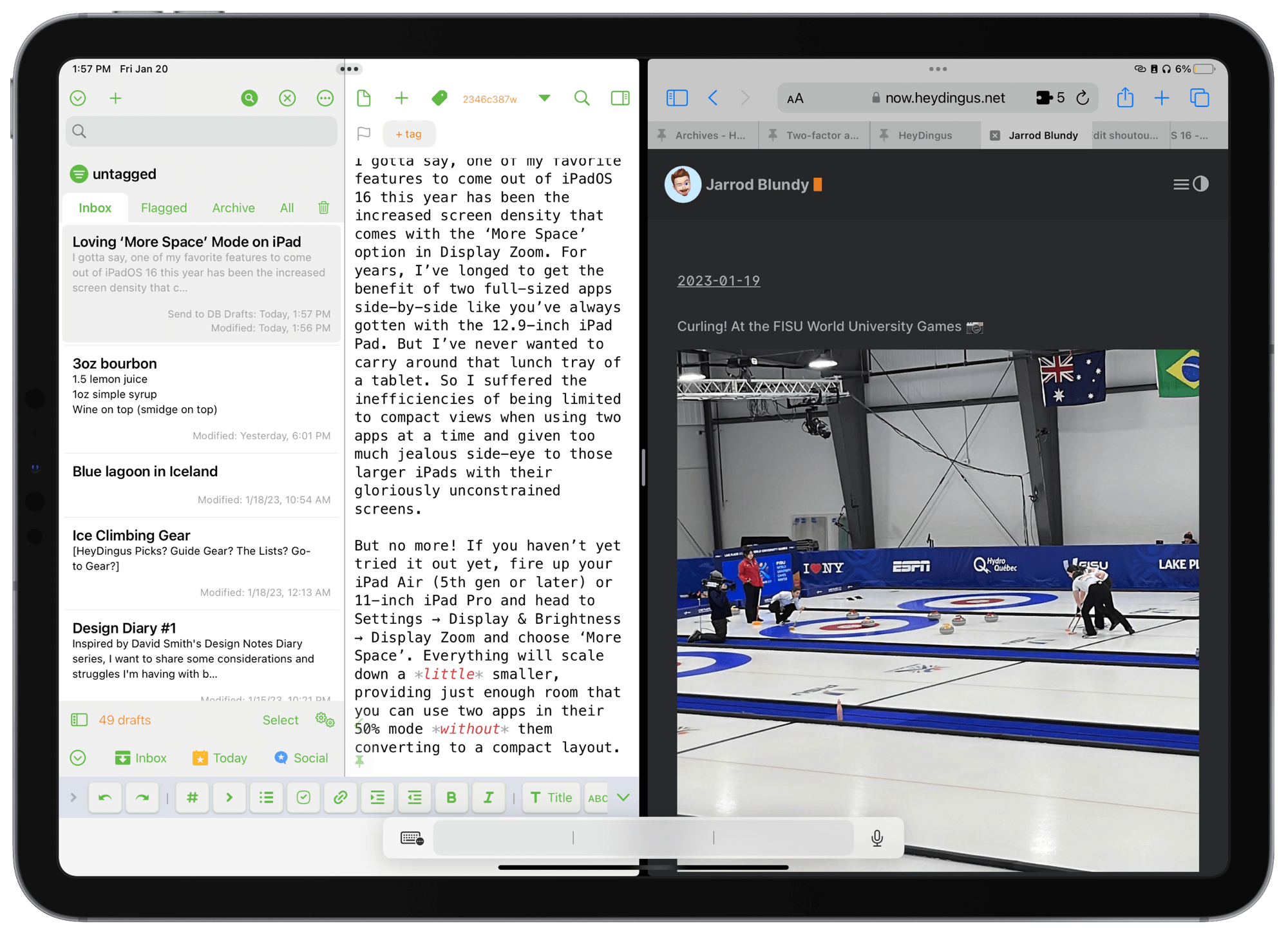
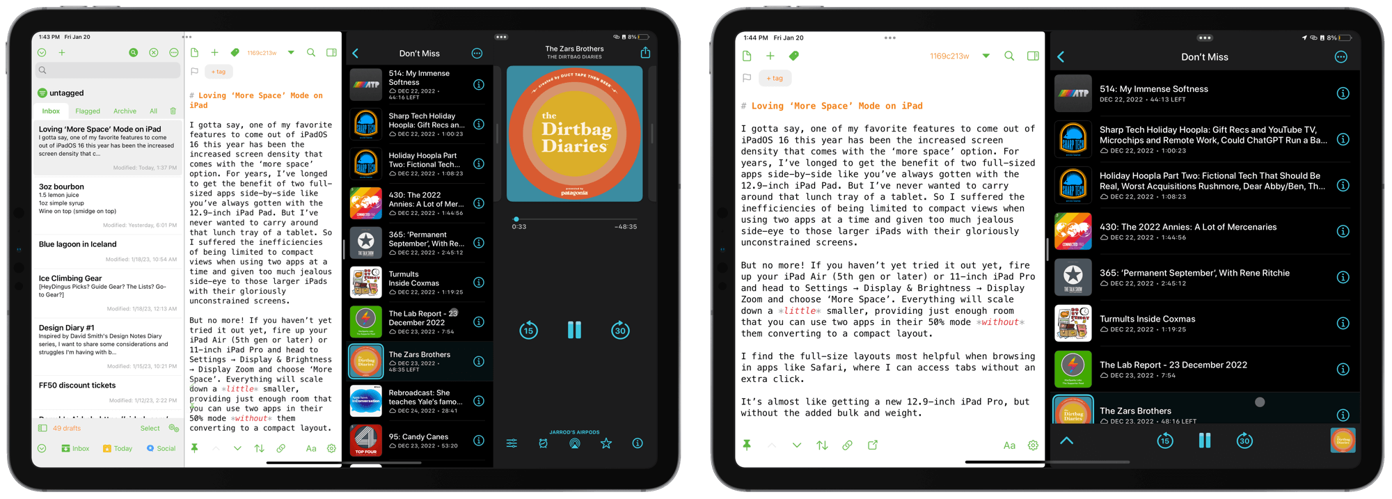
I gotta say, one of my favorite features to come out of iPadOS 16 this year has been the increased screen density that comes with the ‘More Space’ option in Display Zoom. For years, I’ve longed to get the benefit of two full-sized apps side-by-side like you’ve always gotten with the 12.9-inch iPad. But I’ve never wanted to carry around that lunch tray of a tablet. So I suffered the inefficiencies of being limited to compact views when using two apps at a time and given too much jealous side-eye to those larger iPads with their gloriously unconstrained screens.
But no more! If you haven’t yet tried it out yet, fire up your iPad Air (5th gen or later) or 11-inch iPad Pro and head to Settings → Display & Brightness → Display Zoom and choose ‘More Space’. Everything will scale down a little smaller, providing just enough room that you can use two apps in their 50% mode without them converting to a compact layout.

While text and UI elements are a bit smaller, I still find them completely usable. Certainly no smaller than on the iPad mini. Your mileage may vary based on your eyesight, but I think it’s the best way to use the roughly 11-inch iPads.
In fact, it’s almost like getting a new 12.9-inch iPad Pro, but without the added bulk and weight. So, thanks, I guess, goes to Stage Manager, which brought about the necessity of this feature. The apps themselves needed to be able to scale down to show the rest of the Stage’s UI. So even though I’m not rocking Stage Manager day-to-day, I’m pleased it’s given me this treat.
