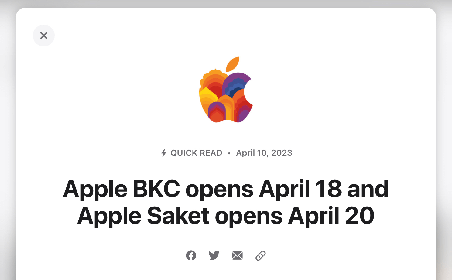
Apple’s Newsroom Blog Debuts New ‘Quick Read’ Post
Tonight, I noticed something curious about Apple’s latest post to their official Newsroom, a blog of sorts where the company makes public statements and press releases. The post regarding the opening dates for their two newest retail stores is categorized as a ‘Quick Read’, complete with a lightening bolt icon and pop-up interaction from the main Newsroom feed. Items there have traditionally been categorized as ‘Press Pelease’, Update’, ‘Photos’, or ’Feature’1 - the differences between which have always been hazy to me. As of tonight, they’ve added ‘Quick Read’ into the mix, which further muddies the meanings.

Now, I’m not one to typically throw shade at ambiguous categorization; I’ve certainly gone back and forth in my brief time as an internet publisher on the merits of tags vs. categories, and which buckets even make sense to have ongoing. But I’ll just leave these word count comparisons here as anecdata:
- The other most recent post about an Apple Store’s opening day, ‘Apple Gangnam will welcome first customers this Friday, March 31 in South Korea’, was categorized as a Press Release and contains 699 words.
- ‘Apple’s Worldwide Developers Conference returns June 5, 2023’, another Press Release, weighs in at 384 words.
- ‘“Friday Night Baseball” resumes on Apple TV+ on April 7’, an Update which I assumed would be relatively short, clocks in at a full-sized 663 words. And there are many that are longer.
- Tonight’s ‘Apple BKC opens April 18 and Apple Saket opens April 20’ is a respectably short 286 words, justifying its Quick Read category.
- But the recent ‘Apple reports first quarter results’, a full-blown Press Release, is just 264 words long.
Huh.
Still, it’s nice to see Apple join in on the return of personal blogging with something new, however minor it may be, on their blog.
And occasional letters from the CEO, like Tim Cook’s apology for the unstable iOS 6 Maps debut. That article, I learned during the writing of this article, was taken down from Apple’s site after less than three years. Here’s the Internet Archive’s final snapshot of that page on March 31, 2015. Shame on Apple for contributing to link rot with such a highly linked post.↩︎