The Two-Tone iPhone and Apple’s Services Recap
I was struck today by the hero image of Apple’s press release about the success of their services in 2020:
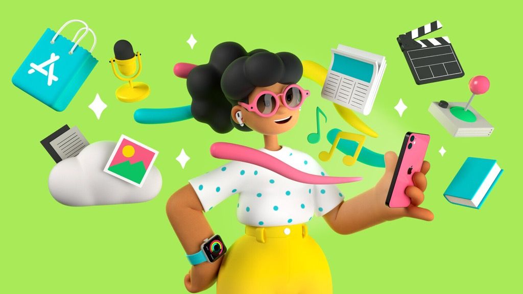
Is it just me, or does that two-tone iPhone with matte black rails and shock of color on the back look awesome? It’s almost certainly not a tease of phone designs to come, but I do like it. A black and orange, or black and forest green iPhone, please!
Well done, Apple, for the design of image in general. It’s fun, colorful, and the services are instantly recognizable.
As pointed out by John Vorheeres of MacStories, it’s also interesting to note the order in which Apple presents their services year-to-year. This year it was as follows:
- App Store
- Apple Music
- Apple TV App
- TV+
- Apple News
- Fitness+
- Apple Pay
- Apple Arcade
- Apple Books
- Apple Podcasts
- iCloud
We used to think that Apple couldn’t “do services” back in the early days when iCloud and Siri were unreliable. They have come a long way since then, and I now rely on many of Apple’s services every week.