Thoughts on the Windows 11 Event
Microsoft introduced the next version of Windows this week, as I’m sure the whole internet has heard by now. After reportedly saying that Windows 10 would be the “last version of Windows,” they’ve turned it up to 11.1
As someone who lives firmly in Apple’s ecosystem and has only interacted with the Windows operating system sporadically and reluctantly for the past nine years, I felt oddly drawn to this introduction. So here are a few thoughts I had on the new operating system and the event in general. (If you don’t have 45 minutes, here’s a slimmed-down version of the video provided by The Verge.)
Am I just taken in by visually impressive introduction videos, or is Microsoft finally doing some good stuff with design? It looks modern, more inviting, and yet still distinctly Microsoft in a way that Windows 10 didn’t.
Panos Panay is an engaging presenter, but he always seems just a little off — like he’s not sure what he’s going to say. Not nearly as distracting as Elon Musk, though.
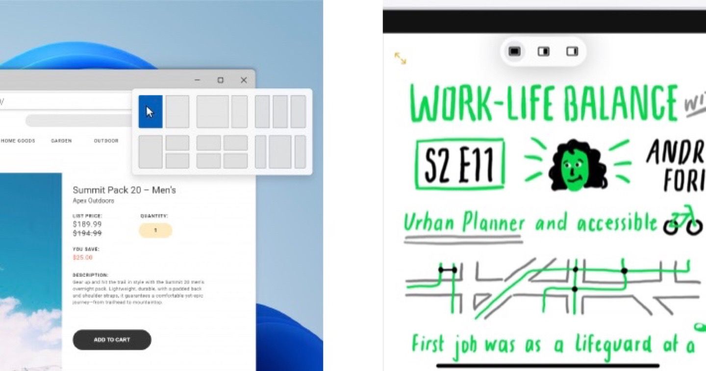
Snapping is a real winner with preset arrangements that I’d actually use. It looks like the maximize button retains that behavior by default and snapping appears on hover. Clever. It reminds me of what Apple just did with the multitasking control in iPadOS 15, but Microsoft has the edge here with additional convenient options.

This event is well-produced, but Apple’s quality of presenters, videography, and transitions remain unmatched. They nailed remote presentations on their first try with WWDC20 and have only gotten better.
Microsoft has an intriguing relationship with Android. They’ve now introduced Android apps on Windows, which adds to the partnership they’ve had still making Android phones. It’s a little odd that they’re using the Amazon App Store as a mediator. Does this new feature make Windows tablets the best Android tablets available?
The taskbar sure does look like the macOS dock these days. The frosted glass aesthetic, too. I know Vista started this trend, but Apple took ownership in iOS 7. Meanwhile, Windows moved away from that style in Windows 8 and 10. It makes Microsoft feel like the follower here.

Microsoft is finally all its core software (e.g., Teams) and services (e.g., Game Pass) closer together in their flagship product. Maybe they’ve been integrated before, but it sounds like they’re doing more here. I bet this will get a fair number of people to try them out who usually wouldn’t have gone searching.
Microsoft brings the heat with its app store announcements: bring-your-own commerce engine, support for many types of app frameworks, alternative app stores, and a lower cut of revenue share, to name a few. These are surely going to put pressure on Apple, which is excellent! Should Apple replicate everything they introduced? Probably not, but alternative payment options alone are a big deal. Competition, what a concept!
Satya Nadella is very well-spoken. He seems legitimately excited and keen on the future of Windows. I may not use many Microsoft products, but I’ve always had respect for Satya, and I think he’s the right person to be leading the company.
For the first time in living memory, I could see myself not hating Windows if I had to use it. But I’m thankful that I don’t. Nevertheless, I’m happy to see the operating system take a few steps forward. It brings some competitive features, which I hope will compel Apple to make a satisfactory response. I also glad to see the version number bump, as it looks to be a good release for Windows users, and going to version 11 adds hype.
Likes
- Rounded corners
- Lots of snapping options
- Tipping creators (but I have questions about how this will work in practice)
- Alternative payment engines in the Microsoft Store
- Updated icons
- Widget view. I’d prefer to pin widgets on the desktop, but I like that it looks like it can expand out to the full screen in the style of Dashboard.
- Disconnect external display and app windows get minimized. And then they remember where they go when the display is reconnected. Yes, please!
- Android apps via the Amazon App Store. I thought they already had this, to be honest. It sounds like iOS/iPadOS apps on the Mac. Hopefully, fewer developers will limit them than they have on macOS.
Dislikes
- There’s too much going on in each window, which, I know, is just the Windows style. I’m still not too fond of the ribbon. Maybe those controls should live in a sidebar as they’ve done with browser tabs.
- There are still bits of very old classic Windows hidden in there. While most people won’t find them, some will, and it won’t be clear why. If not now, when?
- AI-powered widget feed. I will hold out for more feedback, but if it’s anything like other machine-learning news feeds, it gives me way too much distracting crap.
- Subsequent reporting has revealed that the system requirements are pretty restrictive. I know Microsoft has a vast swath of devices to support, but for an update that seems like it was built on the bones of Windows 10X, this decision will severely limit who can take advantage of the new OS — which is a shame because there’s a lot to like.
-
I’m sorry. I couldn’t resist. ↩︎