Marcos Tanaka’s Play 2.0
If you’re the kind of person who likes to save articles to read later, you’re going to wonder how you lived without Play in your life. It’s a read-it-later app, but for YouTube videos! I’ve mentioned it before, and Play continues to be one of my very favorite apps across my iPhone, iPad, Mac and Apple TV.
Today, Play’s developer Marcos Tanaka, introduced a major new release of Play, version 2.0, with some incredible features that will save you from having to delve into the YouTube app, maybe ever again. You should definitely check out the app’s website, the MacStories review of v2.0, and Devon Dundee’s blog post for a good rundown of the new features and its (pretty reasonable, I think) new subscription.
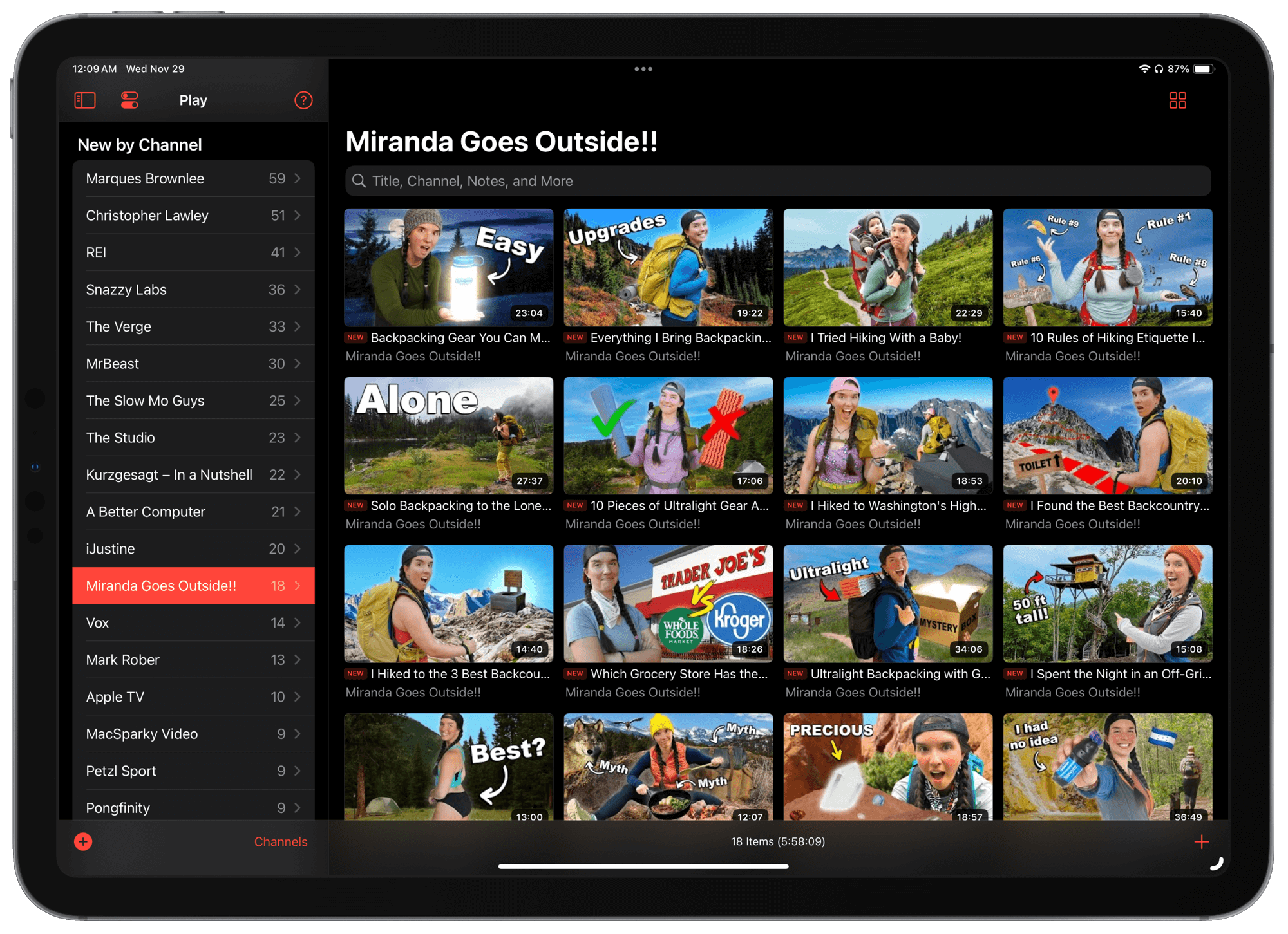
I don’t know if the headlining new Follow Channels feature — where you can now use Play as an inbox for new videos from your favorite channels and save the ones you want to watch — will be for me. I’ve used RSS for years to keep on top of new videos from channels I follow and I don’t think I’ll end up wanting a separate place to check for new stuff, but I can totally see how it would be great for anyone not as “all in” on RSS as I am. That said, I’m using the one week free trial to see if it’ll change my mind about that.
[Update: I made this shortcut to help with following all your existing YouTube channel subscriptions in Play all at once.]
But what I am super excited about when it comes to channels, and that actually came in a release earlier this year, is the auto-populating folders for each YouTube channel that you have at least one video saved from. So when I save videos from a shortcut or the share sheet, they show up in that channel’s list in the sidebar. I tend to binge stuff from a single creator, so it’s perfect for the way I like to watch videos.

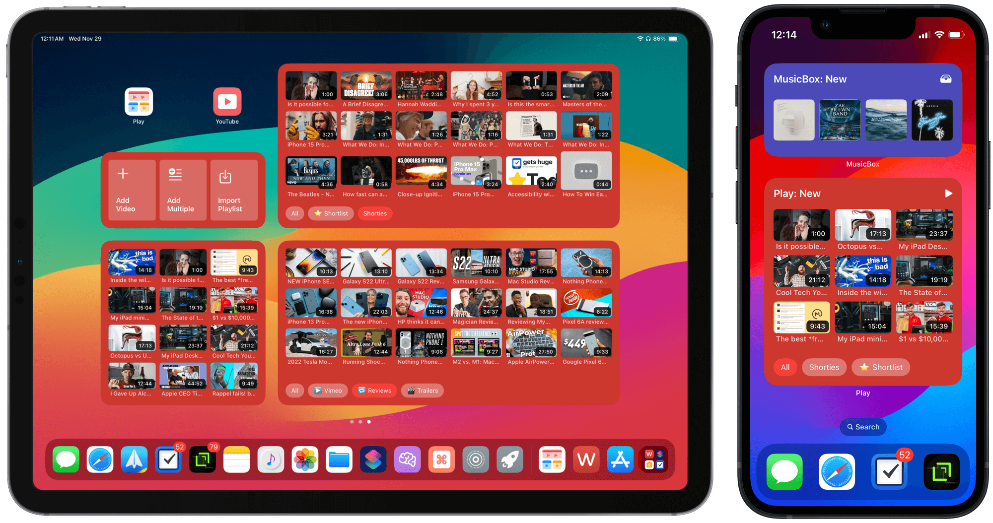
The last thing I’ll leave you with is a couple of screenshots that show how I’ve set up Play-specific home screens. I love how I can jump right into a video without having to browse the app first. As of iOS 17, they’re even interactive so I can filter by tag or Smart Search lists.

The one shortcut icon you see next to Play is this one, my YouTube Launcher that presents a menu to jump directly into specific parts of the YouTube app, which prevents me from getting having to navigate throughout the app and risk distraction from my goal.
Congratulations to Marcos on a solid new release, and for earning not just a spot on my home screen, but multiple full home screens with this vital creation.
P.S. Once you’ve downloaded Play, go ahead and try two of Marcos’ other apps, MusicBox (it’s like Play, but for songs, albums, and playlists you want to listen to later), and MusicHarbor (for keeping up with every new release from artists in your music library).