Shortcuts Tips: Using ‘Show Alert’ for More Flexibility
On the same day I learned that the ‘Show Result’ action has gotten way more useful than ‘Show Alert’ for shortcut construction and debugging, I also thought of a new way to use ‘Show Alert’ to get better control over the flow of a shortcut. What is dead may never die! Or something like that. Anyway, let’s dig in.
I’ve never quite been satisfied with the options for putting up a menu in Shortcuts. ‘Choose from Menu’ is great and all, but it necessitates duplicating a lot of actions unless you really know your way around variables and set them up before the menu. Pairing ‘List’, ‘Choose from List’, and ‘If’ actions offer another avenue if you want to reuse the list of choices, or just pass something from the list on later. ‘Dictionary’ actions are another more complicated option. But sometimes all you want is something simple, just this or that.
That was the case for one of my most-used shortcuts which helps me set up a linked post for my blog. It takes a link shared from the share sheet and a quote that I’ve copied to the clipboard, asks me to write an original comment about the article, and then formats the foundation for the post including the post’s title, author, a link back to the original article, and the block quote all in Markdown. It’s great! But sometimes my quips are short, they get saved and are done. But other times my thoughts about the article run long, and I’d rather move into my writing environment in Drafts. What’s the best way to offer that flexibility? That’s where today’s tip comes in.
Until now, I’ve always just ended the shortcut which saves my draft to Drafts. If I want to continue writing, I open the app, navigate to that item, and then pick up where I left off. Not a huge hassle, but we all know that navigating through different interfaces introduces room for error and distraction — it’s better to keep it all contextual.
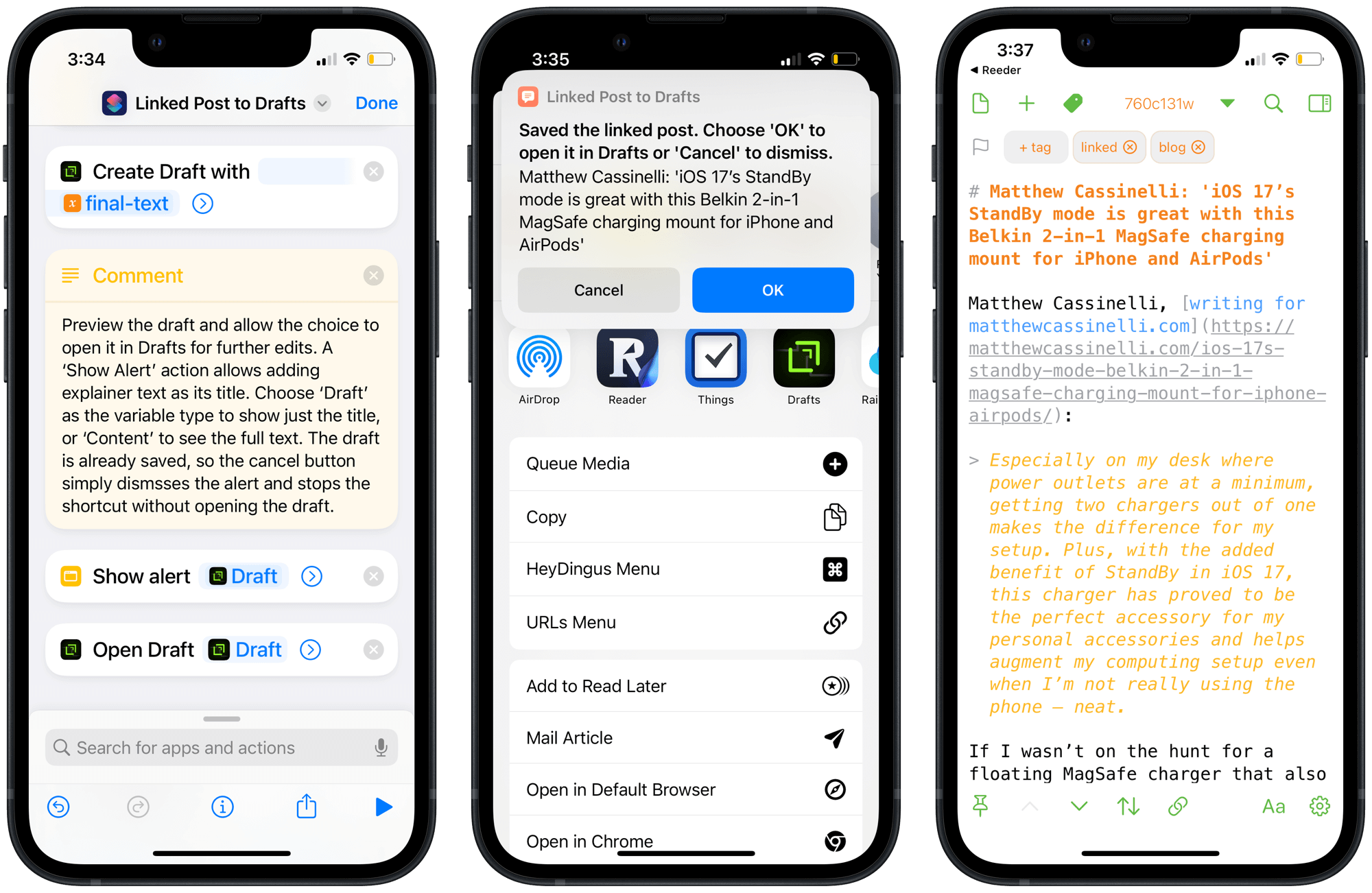
The simplest path, up until today, would have been to add a ‘Choose from Menu’ action with options to be done or to continue in Drafts. But if I was going to go through the trouble of making a change to my tried-and-true shortcut, I wanted more. I’m a big fan of checking my work and I wanted a preview of what I’d written so far. Enter ‘Show Alert’.
As I recently explained in another blog post, the ‘Show Alert’ action excels at popping up text with ‘Cancel’ and ‘OK’ buttons. ‘Cancel’ stops the shortcut in its tracks, while ‘OK’ moves on to the next action. That sounds pretty close to ‘Done’ and ‘Continue’, doesn’t it? The other advantage of the ‘Show Alert’ action is that you can customize the title of the alert separately from the body text of it. In the case of my shortcut for linked posts, this meant I could specify some explainer text to help me remember what the two buttons would do.
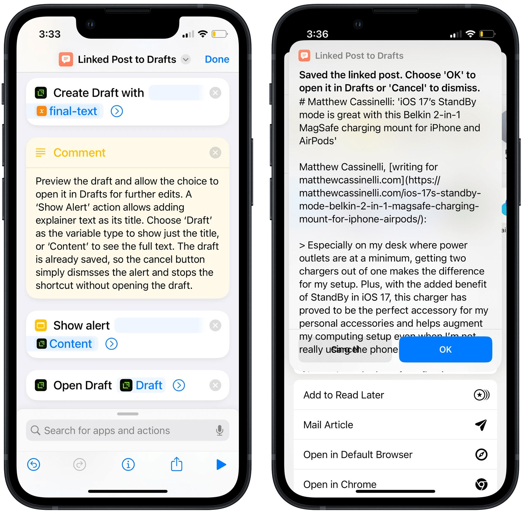
And what do those buttons do? You can probably guess. By adding an ‘Open Draft’ action after the ‘Show Alert’, if the shortcut continues (the ‘OK’ button) it will automatically open the draft I’m working on. Alternatively, if I tap ‘Cancel’, the shortcut just ends as usual. The draft was already saved before showing an alert, so there’s absolutely no harm in stopping it cold. The best part, since ‘Show Alert’ is made for showing text, I can pass in the content of the draft so far to double-check that it’s saved correctly either way!

With a little imagination, you can see how this technique will be useful elsewhere. You could use it to manage how a variable gets shared. Copy it to the clipboard before ‘Show Alert’ so that if you hit ‘Cancel’ that’s all you get. But after the alert, it could get more complicated, like opening a specific app. Or transforming text to another format. Or uploading the variable somewhere. These absolutely could be achieved with a ‘Choose from Menu’ action, but there’s something to be said for KISS (Keep It Simple, Silly). And, again, I’ll say that I really like that I can include a preview of the passed variable using this method.
If I had one suggestion for the Shortcuts team to improve this workflow, it would be to relabel the buttons to ‘Stop’ and ‘Continue’. Although less elegant, I think that would better explain what those buttons actually achieve and help my brain decide which one I should hit.
Actually, I do have a second suggestion. The ‘Show Alert’ action doesn’t allow scrolling text passed into the body of the alert like ‘Show Result’ does. This means that the buttons are obscured (but still work!) by longer amounts of text. My suggestion: Fix that.1 😉

Yes, I will be filing a Feedback for it shortly, now that I’m on the iOS 17 beta and…double checks…it also doesn’t work right there.↩︎