It’s like Christmas morning for all the Apple junkies out there! I hope you’ve hit the bathroom and that you’re prepared with snacks and drinks because I think it’s going to be a long, fast-paced ride.
Let’s go!
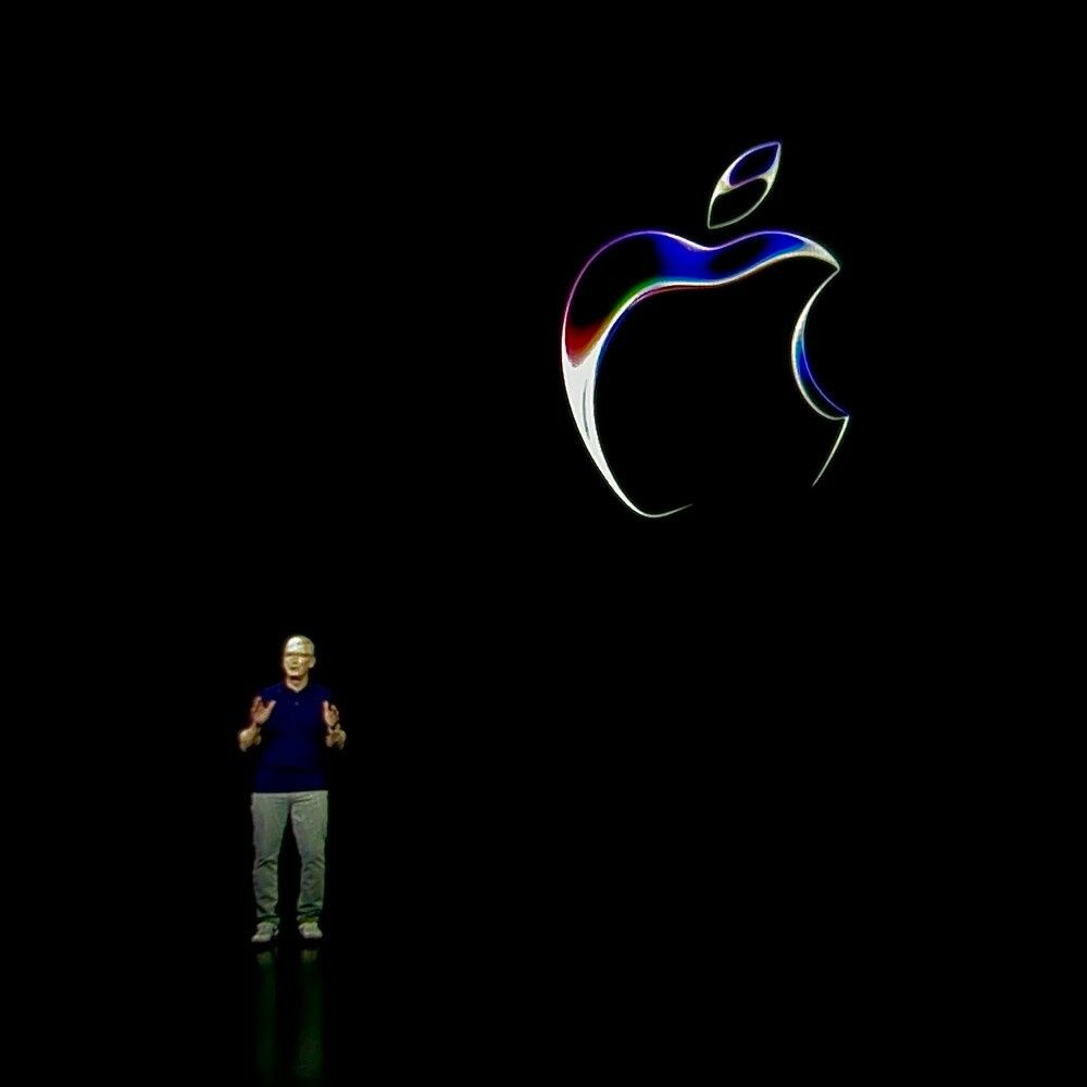
00:00:01 - Back to an opening video! Hooray!
00:01:21 - “Dream it. Chase it. Code it.” Very nice.
00:01:59 - 15 years, huh?
00:02:50 - “Biggest WWDC ever”
00:03:03 - Straight into the Mac with John Ternus! Must be a hardware day!
00:04:01 - Oh yeah, gotta be the 15-inch Air!
00:05:45 - Oh man, they’re gonna sell so many of these Airs. People have been wanting it for years and years.
00:08:14 - Whoa! They already dropped the 13-inch M2 Air. Didn’t see that coming and shows they still are aiming to hit that magical $999.
00:09:08 - I didn’t have a Mac Studio update on my Bingo board. I figured it’d be an every-other-year product.
00:11:15 - 192 GB of memory. Very nice. Let’s see how much memory the Mac Pro gets…
00:12:47 - Pushes 100 million pixels. 😲
00:13:06 - Wait, are they gonna let us put cards in the Mac Studio? Wouldn’t need the Mac Pro then.
00:13:24 - Nope! MAC PRO DAY!!!
00:13:53 - I love that they kept the same case design. It’s already iconic and leaves so much headroom. Good return on that design.
00:14:33 - 😳 The equivalent of 7 Afterburner cards? That’s wild.
00:15:33 - Looks like no graphics card expansion at this point and much less RAM capabilities. Looks like that higher-level chip was axed after all.
00:17:29 - iOS, let’s go.
00:18:16 - Oh, that’s cool! But I wonder if it’ll be abused to be able to put graphics on someone else’s phone.
00:19:25 - Yes! Pixel did live voicemail first and I’ve wanted it ever since.
00:20:05 - “Power of the neural engine…” Not “AI”.
00:20:32 - Yay! Video messages!
00:21:15 - Every timeline app needs a catch-up feature. So smart.
00:21:49 - Damn. They really did take this year to focus on little life improvement features. I love it! Check in is going to be so helpful for me when I’m out and about while out of service hiking.
00:22:46 - Hell yes, so ready for that plus button.
00:23:39 - Haha, are emoji stickers the response to the call for emoji reactions?
00:24:27 - I think Live Stickers were created so that Apple didn’t have to take a stance on the pronunciation of GIF.
00:25:32 - Hold on, gonna NameDrop you.
00:28:51 - It’s the reincarnation of Bump!
00:29:39 - All I want here is a fixed autocorrect.
00:27:17 - Oh, would you look at that! It better be drastically, notably better or they’re gonna get (rightfully) dragged.
00:28:02 - 😲 Craig went there. 🦆ing word. Hahaha!
00:28:51 - I love that all these ML-powered features like Dictation are just going to keep getting better year after year as the underlying models improve.
00:29:39 - Aw, what a cute icon for Journal.
00:32:33 - Will Journal mark the end of me being a Day One subscriber? I don’t use it much, but the integrations with IFTTT are pretty handy for archiving stuff.
00:32:00 - Bring Standby to iPad, you cowards!
00:32:33 - While everyone wondered if iPad and Mac were merging, Apple was quietly morphing watchOS and iOS. Seriously, Standby looks like a bigger watch, but so nice.
00:33:45 - Dropping “Hey” from Siri and continued conversations with it would have been a big segment in other years, with demos. So much to cover!
00:34:04 - Can’t wait to dive into all of this stuff even more!
00:35:07 - 36 minutes in and we’re already off of iOS, the flagship software.
00:35:31 - Starting with bringing iOS 16 to iPadOS17.
00:35:54 - Alert! Interactive widgets! It’s about time these came back. This makes them so much more useful.
00:37:53 - Don’t tease me with that left-sided Widget view on the Lock Screen. I miss being able to relegate them to the left on the Home Screen.
00:39:33 - I’m glad the Health app is coming to iPad, but I can’t imagine that I’m going to use it much there.
00:40:23 - Was anyone expecting PDF improvements making the cut for the Keynote?
00:42:37 - If those collaboration features are as real-time as that demo, I’ll be impressed.
00:42:47 - Better Stage Manager, on the other hand, got just a mention. Wonder how much they’re improved with better resizing.
00:43:34 - I hope Craig got to take a week off after recording all of this. He’s killing it.
00:44:56 - Woohoo! Widgets are breaking out of their jail cell. They’re on the desktop right where they belong.
00:46:13 - Fading out the color is a clever way to make widgets accessible while less distracting.
00:46:55 - Making widgets interactive was probably necessary for them coming to the headset.
00:47:53 - Apple’s been putting a lot of wood behind the gaming arrow. I never thought we’d see something like Game Mode. Let’s see if it pays off.
00:48:58 - I think that toolkit is going to come in handy for the headset, too.
00:51:46 - Content overlay screams a being feature that Apple has wanted for their own remote collaboration. It’s like how Keynote has always been great because they use it so much internally.
00:54:11 - Yaaaaas! Password sharing! Buh-bye 1Password.
00:54:47 - I don’t need Profiles for Safari right now, but I certainly would have liked it back in my corporate job.
00:55:28 - Apple just killed Unite for me. I guess their embracing of web apps closes the door to Xbox Game Pass coming to the App Store.
00:56:35 - OMG, this year’s Craig gag. Look at that guitar and those rings!! 🤣
00:57:30 - I kind of love that the AirPods system is getting elevated to the OS level of attention.
00:58:17 - Adaptive Audio and personalized volume are fascinating.
00:58:48 - Holy shit, you can just start talking to turn on transparency. I love all of this!
00:59:46 - Wait, did they just mention better Handoff for music? Is it finally coming?
01:00:35 - Siri will be able to grab audio from apps on other devices through AirPlay? That’s pretty wild.
01:01:22 - Come on collaborative playlists… Come on…
01:01:43 - Damn, SharePlay in the car is going to be one of those game-changing features that we won’t remember how we lived without.
01:02:27 - Wait, how are they doing Find My with the remote? Is that built-in to the USB-C version?
01:03:00 - FaceTime on Apple TV: AKA the Parent Feature.
01:03:45 - Okay, this is awesome. SharePlay + FaceTime. Well done, Apple TV team. 👏 (I’m gonna have to get one of those mounts, aren’t I?)
01:05:22 - I’m so ready for a refreshed watchOS. Let’s hope they don’t mess it up…
01:06:07 - Looks like the Siri watch face!
01:06:07 - Do I spy topographical mapping coming to watchOS? Yes, please!
01:06:51 - Hell yeah, such a better use of the Digital Crown on the watch face than Time Travel or zooming into the app view. I’ve always liked the Siri watch face, but it wasn’t pretty. Now we can use the best of it with any face!
01:08:31 - Looks like they’re doubling down on the Digital Crown for input. I’m not mad about it.
01:09:42 - watchOS is much more colorful these days! 😁
01:10:01 - I’ve been a runner for a while and Apple Watch has been great. Now that I’m a cyclist too, this is intriguing.
01:10:41 - 😮 I just got Cadence and Speed sensors and could only pair them effectively by using the Cyclometer app. This is going to be so much easier!
01:11:35 - I just bought a bike mount for my phone so that I could easily see all these metrics while cycling. I. Can’t. Wait!!
01:12:06 - Oh man, they’re speaking my language. I literally hike for a living! Noting the last cellphone point is so so smart.
01:12:56 - 🔔🔔🔔 Topographical maps. So great. I suspect this stuff came directly from Tim and all the hiking he does in the National Parks.
01:14:26 - I know I have recency bias, but this might be my favorite WWDC so far, even before we get to the headset. So much of this stuff will make using all my devices notably better every day.
01:15:59 - I’ll give this mental health stuff a shot. Hopefully, it sticks! The beautiful animations will help draw me in.
01:16:33 - I could see suggesting mental health help blowing up in Apple’s face with a single incorrect assumption. I hope, and suspect, they’ll be treading carefully with it. It has the potential to help a lot of folks.
01:18:13 - Wow, helping vision health related to holding devices too close shows just how seriously they take their responsibility as a tech company creating those devices.
01:19:00 - I would say that they nailed the evolution/refresh of watchOS. Good job Watch team!
01:19:31 - At least 40 minutes left. I wonder what more they could introduce… 😝
01:20:04 - I predict a Tim Cook “One more thing.”
01:20:54 - Nailed it.
01:21:25 - Let’s go!!!
01:21:37 - First look impression: Beautiful. Sleek. I want to wear that.
01:24:57 - Well shit! They went with “Vision”!
01:23:17 - Holy smokes, I want that giant movie screen.
01:23:49 - Hmm. “Spatial Computing” Yeah, I suppose it is.
01:24:57 - I mean, that UI looks incredible. Will it be that well integrated into the environment in practice?
01:26:00 - Exploring the world with Vision Pro is something that I was hoping they’d incorporate.
01:27:12 - Whoa, there’s the outward eye display that sounded so creepy. But…I don’t hate it. I suppose that people will be able to tell that you can see through the display.
01:28:16 - Yup, exactly. EyeSight. Very clever. Hopefully not creepy in person. Not to be confused with iSight.
01:30:48 - All of Apple’s work with AR over the years (those tabletop demos) is paying off.
01:31:22 - OH! Looking at that floating keyboard! Can’t wait to try that.
01:31:46 - But will the keyboard and trackpad come with quick-swap?
01:32:17 - Yeah, so I’m no longer saving up for a new display. These will do.
01:33:10 - That must be bone conduction audio. I bet pairing with AirPods will make it even better.
01:35:02 - The panoramic photos thing is so smart!
01:35:28 - Oh my gosh. All of that depth data we’ve been capturing with our phones for years. I wonder if they’ll be able to be explored like the spatial camera ones.
01:37:10 - Yup. I want to watch IMAX movies on a mountain. That sounds fantastic.
01:37:42 - Am I dreaming? They’re nailing everything I wanted in this device.
01:38:49 - Apple Arcade is going to pay off with all those titles on day one. I expected controller support, but I’m still glad to see it.
01:39:36 - Bob Iger totally took back the CEO job just to get to do this introduction with Apple.
01:40:18 - You know what would be awesome? Being able to experience future Apple Keynotes from a virtual Steve Jobs Theater with Vision Pro.
01:41:40 - Disney is a fantastic partner to have aboard on day one. This feels momentous. “What if you could bring DisneyWorld to your world?”
01:43:40 - Okay Richard, gimme the specs!
01:44:44 - I don’t think we’ve heard Richard Horvath’s voice before. I feel like he could take the mantle from the Jony Ive voiceovers. His speech is similarly calming and precise.
01:46:35 - Well done. They’re gonna have lenses right from the start.
01:47:20 - 3D Woven. Audio Pods. I’m gonna have to do a deep dive into all these lovely new terms.
01:47:38 - Congrats Mike Rockwell! One of your products gets to ship!
01:51:27 - New chip day x2! Welcome, R1, the Apple silicon family.
01:52:08 - Damn. They really thought through that external display. A 3D external screen. Incredibly wild stuff going on here.
01:52:48 - Wait, I only expected Memoji for now. This 3D rendering of the wearer is…so very cool.
01:54:24 - My head is spinning. I can’t imagine how developers feel. I can’t wait to see what they do with it. 😉
01:55:28 - I wonder if visionOS can give me a virtual guitar to (learn to) play?
01:56:51 - No one else can boast such an app platform for a brand-new device like Apple. They’ve been playing the long game, and been laser-focused on today’s announcements.
01:58:47 - LOL OpticID. Because they couldn’t do EyeID.
01:59:51 - Hearing Apple mention all the privacy features like no access to surroundings makes me wonder what the other AR headsets have access to.
02:00:44 - Okay, making the case for replacing other expensive devices… What’s it gonna cost?
02:01:44 - Fuck. Even higher than expected at $3499. Gotta start saving those pennies.
02:03:02 - So many OSes. “appleOS” would save some syllables.
02:04:41 - Haha perfect matching with that Everything Everywhere All at Once scene. 👏
02:05:11 - I’m thrilled with how seriously Apple took the wearer not being isolated from their surroundings with Vision Pro. Hopefully, people around you will feel the same way, that you are still actually present.
02:05:41 - And that’s it! Wow, what a show. So much to learn and unpack, starting in 3, 2, 1…
WWDC
Live Blog
