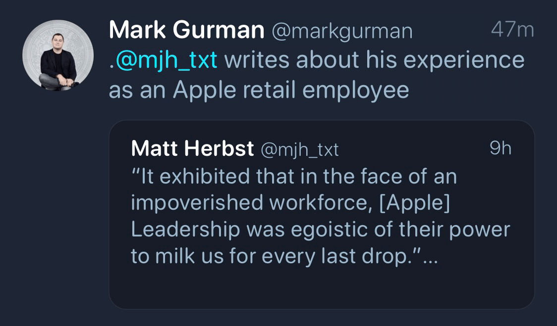
Here’s but one of the quotes that got my blood boiling:
I wholeheartedly believed this was my chance to prove that I could apply my skills outside of retail and potentially lay the groundwork for a corporate role. Alas, that fantasy vanished before my eyes. Upon further discussion, my managers blocked my nomination for the Career Experience because I was declared “too vital to daily store operations.” Conversely, my other two coworkers were not retracted. They decided that because staff was already strained and I was the most competent employee of the three designated, they couldn’t afford to spare me. My coworkers were regarded as expendable, whereas I was not. Somehow because I had more Genius Bar experience, it was now inhibiting me from expanding my horizons. My managers had typecast me, useful for one purpose only. To be clear, I held neither of my coworkers in contempt. In fact, I was content to watch them succeed (one of whom was just offered a permanent corporate job after their Career Experience manager recommended them), but it
was painfully arduous to come back to work after that. I resented the work I was doing because it didn’t seem like I was working towards something constructive anymore. Meanwhile, the overall store morale further decayed into an outright spiral.
At the end of the year, I finished a brief stint working as a Technical Specialist (part of the Genius Bar team) at the very Apple Store described in this article. In fact, Matt was the person who trained me in late summer. He was an excellent teacher and shared his years of experience with us newest hires.
Although I didn’t personally experience much of what Matt lays out in this well-written and documented memoir, I could definitely feel the tension he describes. It’s long, but well-worth your time to read in full.
I hope Apple will take the unrest in their retail arm seriously. If they don’t, the culture will continue to sour and they’ll keep losing incredible talents and evangelists like Matt. Retail serves as the literal face of the Apple brand, and it’s too bad that they’re getting black eyes from internal management issues.
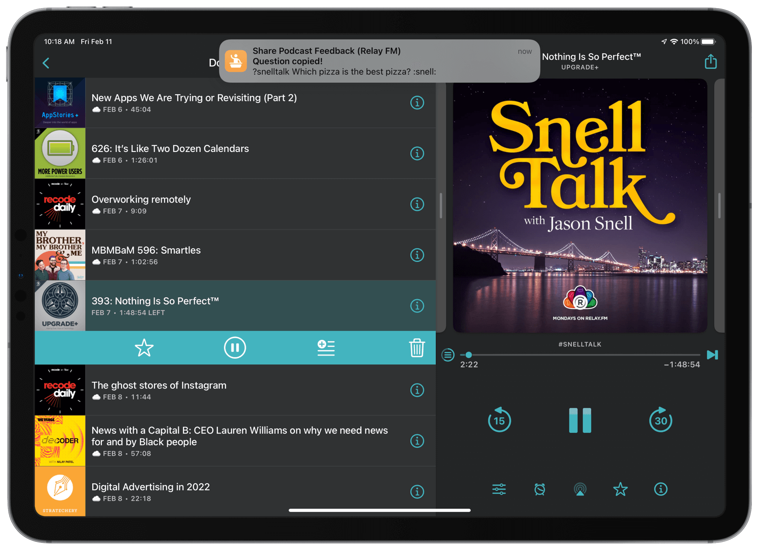
You’re listening to your favorite podcast when inspiration strikes: the perfect question. It’s concise, considered, and, without immediate action, going to climb right out of your mind. You need to get this feedback to the podcast hosts, stat. But, oh dear, you can’t recall the right hashtag to attach to make sure that it’s seen. What to do?
Of course! You whip out your newest favorite shortcut! With just a few taps, you’ve typed out your 1st place winner of a question and posted it to Twitter (or the preferred Discord channel), complete with the correct hashtag (or Discord command) to make sure it’s captured for the next episode.
This is that shortcut. Well, if you listen to the Relay FM (and adjacent) family of podcasts, that is.
I’ve had this shortcut lined up for a long time. I’d been waiting to share it here on HeyDingus until Discord supported proper Shortcuts actions, or at least a URL scheme that would let me post directly to the right channel. But alas, no such public functionality has been introduced that I can find. So instead of waiting for something that may never happen, I decided it was time for the shortcut to be available to anyone who wanted to use it, despite existing limitations. Some 68 people have downloaded this shortcut from its soft launch on RoutineHub, so I knew there had to be more Relay FM listeners who might like it, too.
I tend to launch ‘Podcast Feedback’ from a menu of podcast-related shortcuts in my Today View. Unfortunately, its use of ‘Dictionary’ actions seems to make it run inconsistently from Siri. On the plus side, it is compatible with the Mac.
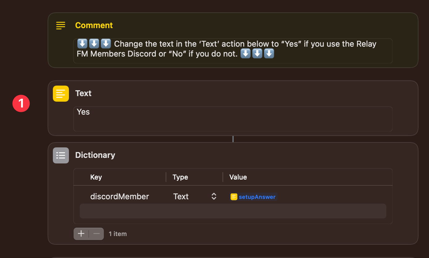
1️⃣ This shortcut uses setup steps, which ask the user if they tend to use the Relay FM Members Discord. This ‘Text’ action is where their answer is stored and can be changed later. The answer gets pulled into a dictionary action for use later in the shortcut. I figured a ‘Text’ action would be more accessible than having the user fiddle with a dictionary, which is why the ‘Text’ result is used solely for that variable.
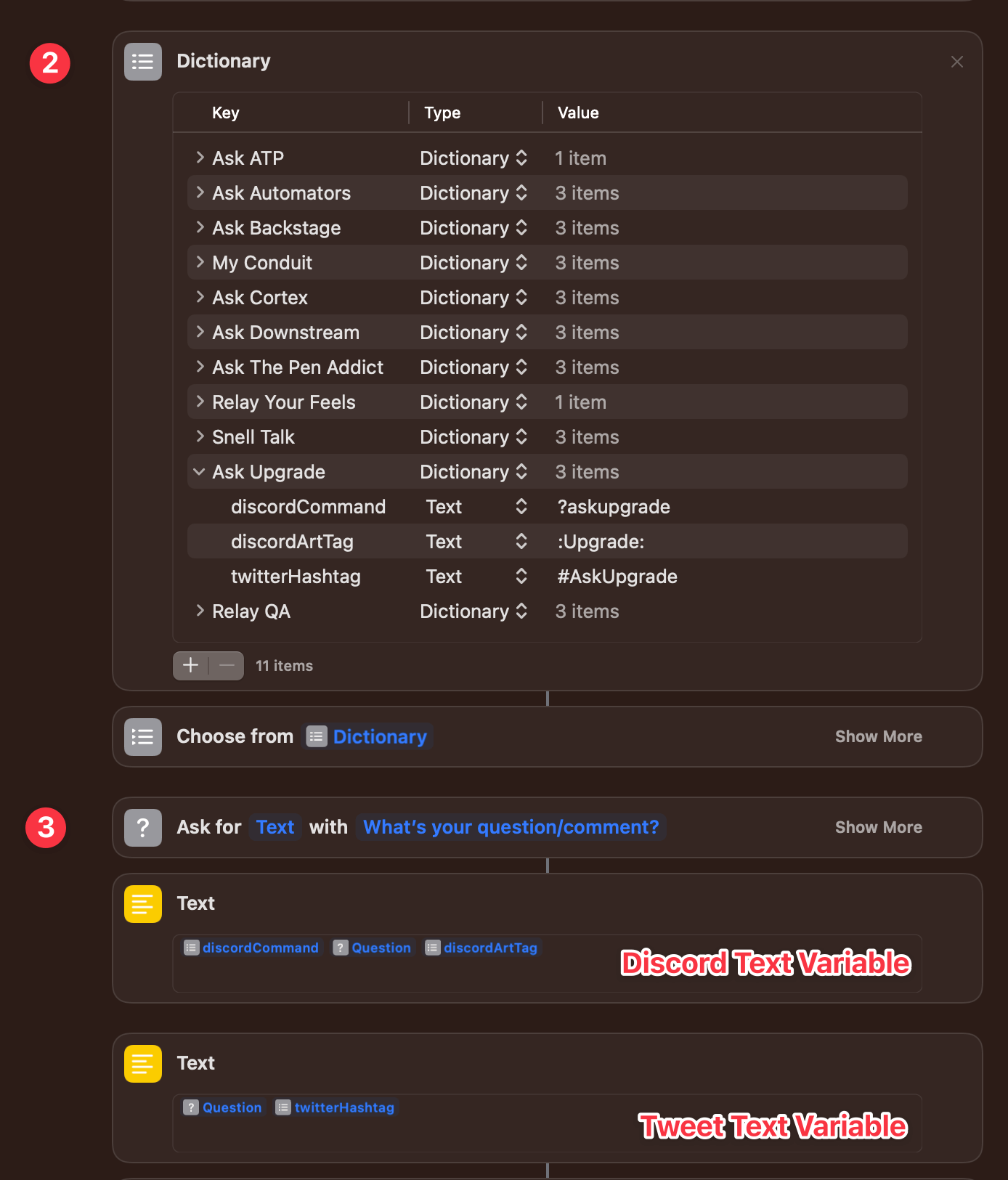
2️⃣ A second ‘Dictionary’ action is used to store all of the necessary syntaxes for each podcasts’ hashtag, Discord command, and show art tag. These key values were pulled directly from the #follow-up channel in Discord and will be updated as the active podcasts change over time.
I’ve been trying to incorporate ‘Dictionary’ and ‘Choose from List’ actions into more of my shortcuts as they can sometimes cut down on duplicate steps that a ‘Choose from Menu’ action would have you create. Of course, it doesn’t always work, but it’s ideal for this kind of shortcut where the chosen item needs multiple parameters.
3️⃣ Here’s the critical step, though it takes three actions. First, an ‘Ask for Input’ action has us type in the question or comment. Then, two ‘Text’ actions format it for Twitter (with a hashtag) or Discord (with the command and show art tag) by pulling in the proper syntax from the chosen dictionary key.
Although we didn’t specify it with a ‘Set Variable’ action, both ‘Text’ actions are used later on as named magic variables. I’ve annotated them in the screenshot to show which is for Twitter and Discord.
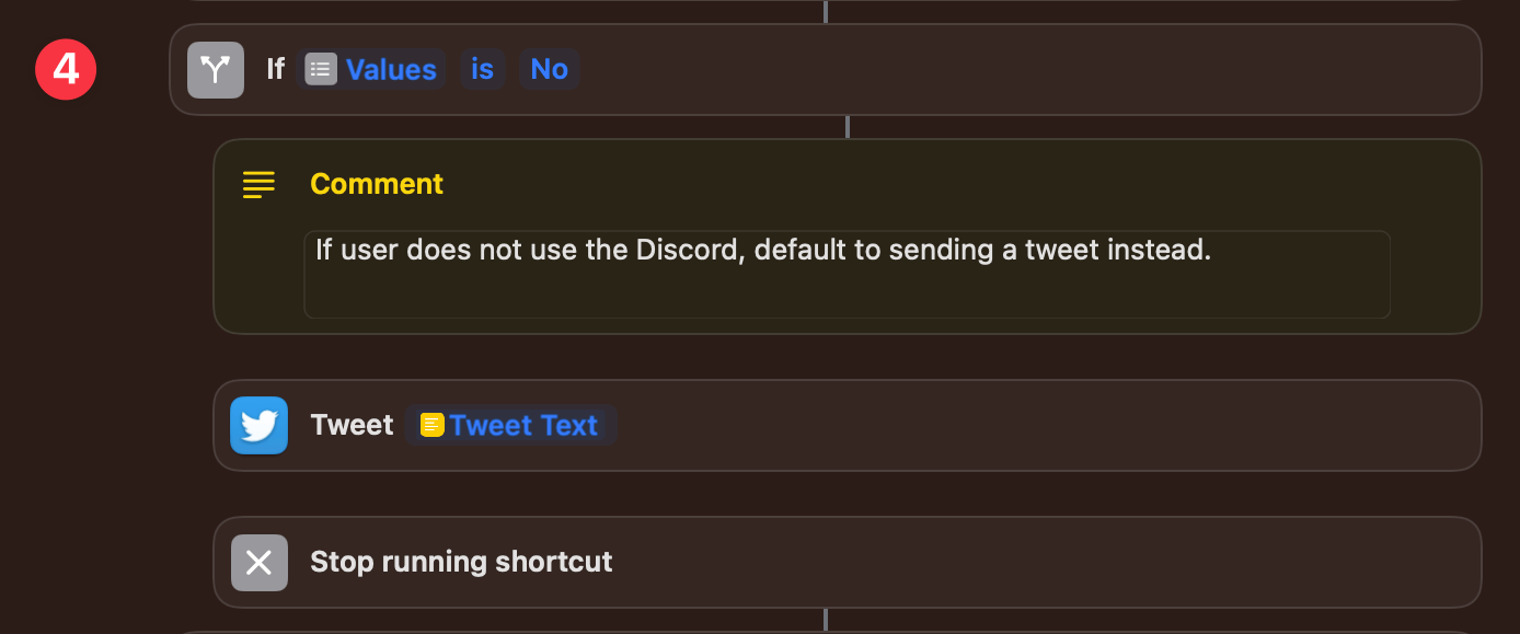
4️⃣ After formatting the text, we do a little logic evaluation using an ‘If’ action to determine how and where it should be shared. If the user is not a member of the Discord, it defaults to sending the question as a Tweet and doesn’t give any option to do otherwise. That logic is pulled directly from that first ‘Dictionary’ action, which was populated during setup. Since we don’t want any additional action to run after the tweet is sent, we stop running the shortcut following the ‘Tweet’ action.
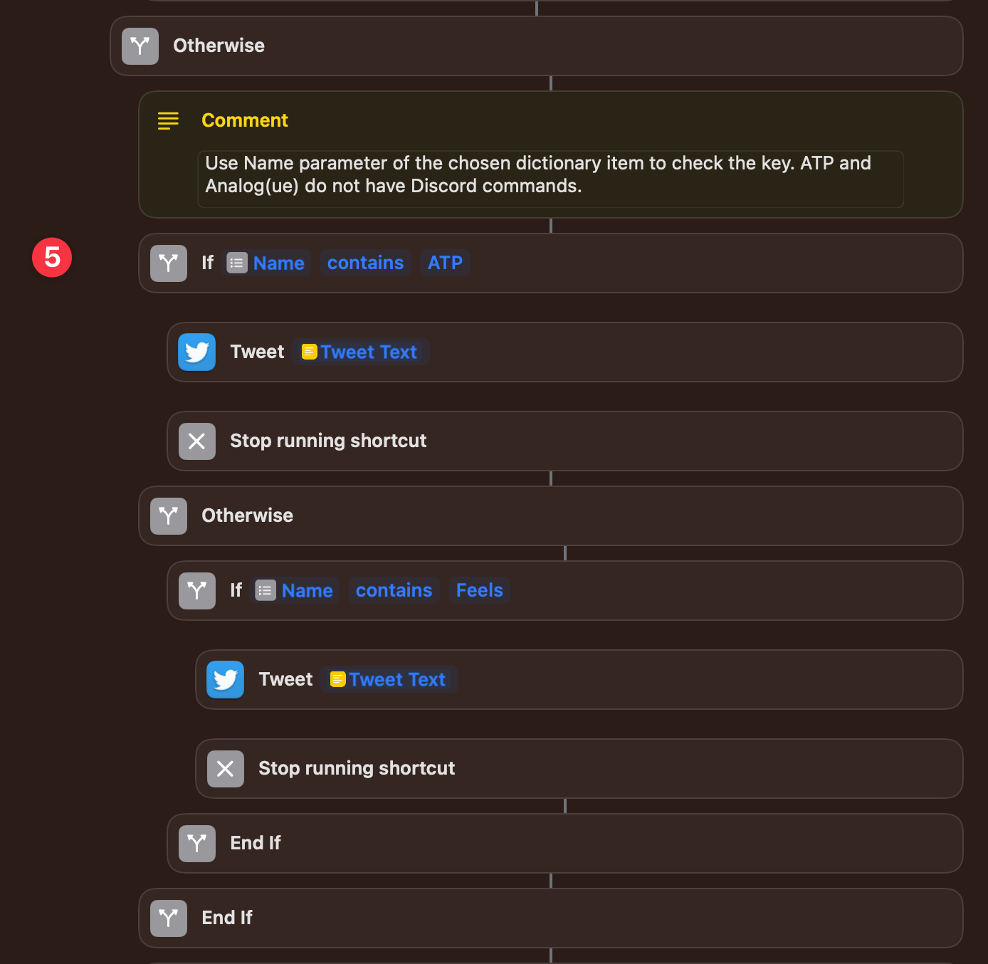
5️⃣ Using nested ‘If’ actions, we next check to see if the chosen podcast is either of the two shows which do not have Discord commands. ATP and Analog(ue) take public feedback using Twitter only, so we don’t need to present the option of using Discord, even if the user is a member. Again, we simply post a tweet using the ‘Tweet Text’ magic variable from earlier.
Note that you need to check the ‘Name’ parameter of the chosen dictionary item. I spent an embarrassing amount of time attempting to make the ‘Key’ parameter work before trying something else. Am I the only one who finds Key vs. Name unintuitive?
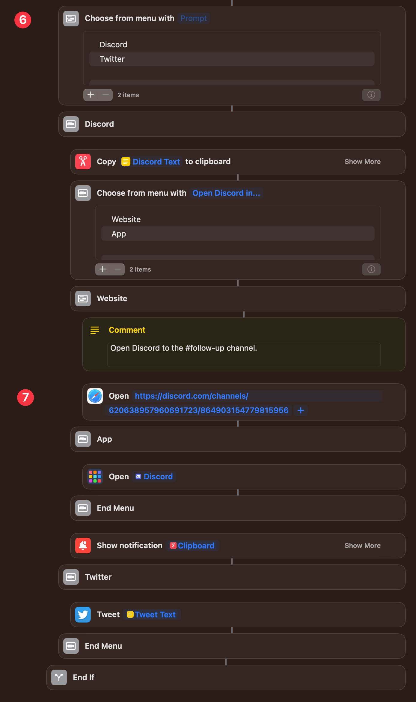
6️⃣ Now, if the user is a member of the Discord they may still decide to share their feedback more publicly on Twitter. The ‘Choose from Menu’ action gives them the option to post it either way. Since Discord works equally well in the native iOS/iPadOS app as on the web, we present a second choice of which avenue to use.
7️⃣ Unfortunately, due to nonexistent Shortcuts actions and no public URL scheme to be found, the best we can do is open the #follow-up channel in Safari. Or simply open the Discord app with the ‘Discord Text’ magic variable copied to the system clipboard and ready to paste.
If the user chooses to tweet the feedback instead, another ‘Tweet’ action does the trick.
I’m the kind of person who likes to make sure that when I’m asking something of another person — in this case, the podcast hosts — that it’s as convenient as possible for them. That means following the guidelines for submitting questions or feedback to a “T”. This shortcut has helped me format everything correctly without remembering all the syntax and without losing my train of thought. And, through building it, I learned a bit about how to use dictionaries and nested ‘If’ actions. So, I hope you find it as helpful as I have!
But too much friction exists today between creators and gamers; app store policies and practices on mobile devices restrict what and how creators can offer games and what and how gamers can play them. Our large investment to acquire Activision Blizzard further strengthens our resolve to remove this friction on behalf of creators and gamers alike. We want to enable world-class content to reach every gamer more easily across every platform. We want to encourage more innovation and investment in content creation and fewer constraints on distribution. Put simply, the world needs open app markets, and this requires open app stores. The principles we’re announcing today reflect our commitment to this goal.
And yet, not all of those principles, ostensibly designed to promote fair competition, will be applied fairly across all Microsoft’s platforms. Notably, their lucrative Xbox Store will not have to follow all of the rules:
Second, some may ask why today’s principles do not apply immediately and wholesale to the current Xbox console store. It’s important to recognize that emerging legislation is being written to address app stores on those platforms that matter most to creators and consumers: PCs, mobile phones and other general purpose computing devices.
Here’s what Microsoft has effectively said about developing for Xbox.
We retain the right to…
require developers in our app store to use our payment system to process in-app payments.
require developers in our app store to provide more favorable terms in our app store than in other app stores.
disadvantage developers if they choose to use a payment processing system other than ours or if they offer different terms and conditions in other app stores.
prevent developers from communicating directly with their customers through their apps for legitimate business purposes, such as pricing terms and product or service offerings.
In fairness (heh), Microsoft has said they’ll work toward bringing all the principles to Xbox over time, but with little detail about what that means in practice:
Nonetheless, we recognize that we will need to adapt our business model even for the store on the Xbox console. Beginning today, we will move forward to apply Principles 1 through 7 to the store on the Xbox console. We’re committed to closing the gap on the remaining principles over time. In doing so, we will incorporate the spirit of new laws even beyond their scope, while moving forward in a way that protects the needs of game developers, gamers, and competitive and healthy game-console ecosystems.
I believe Microsoft should be commended for their developer-friendly practices; I really do. From my perspective, they’ve got a lot to be proud of when it comes to developer relations, a stark contrast to where Apple stands (just read that section of the 2021 Six Colors report card!).
But, and this is a big but, this announcement rings pretty hollow to me when it explicitly excludes their most (only?) successful app platform.
You can read up on all the principles and the rest of Microsoft’s position in their blog post.
That said, wouldn’t it just be easier to send an audio message to whoever texted you rather than sending a riddled response that Siri is sure to get wrong? Something to consider!
and
As for my friends and voice messaging, well… those are entirely different relationships than with your siblings, aren’t they? While my friends and I text all the time, I can’t begin to tell you how fun it is to see when they’ve sent me a voice message, and to be clear, I send them constantly — they’re often of me laughing at something that happened or something they’ve said that made me laugh.
I often forget that I can even send audio messages, even though I really like them. As someone who instinctively texts with punctuation and grammar, I’m exactly the person who muddles through voice-to-text with Siri, trying to get everything just right in one go. Sending an audio message would be so much faster, easier, and better.
That’s not to say that Apple’s implementation in iMessage is perfect. Laura has suggestions where they can make improvements:
If my friend sends me an audio on iMessage, all I can do is pause it. What’s worse, if while I’m listening to their audio they then text me, the memo itself stops, and I have to start the whole thing over.
and
Lastly, if you want to hear the entirety of a voice memo within iMessage and it’s longer than whatever your screen display length is set to (mine is 30 seconds before my phone goes dark), you need to keep tapping your phone to keep it awake while listening, otherwise, your phone goes dark and then you again have to start over and replay from the beginning.
I’ll leave you with a quick tip. Since I do most of my voice-to-texting initiated from Siri, I wondered if I could send an audio message completely by voice without having to tap through the recording interface in the Messages app. It’s entirely possible! “Hey Siri, send an audio message to {Recipient},” worked like a charm. It does still transcribe the message to text as you record it to Siri, even though that text doesn’t get sent. I guess that’s cool since you know it’s working and hearing you well enough.
(Bonus Tip: Use “Captain” or another title as your nickname in your contact card for some fun when Siri addresses you in responses. 😆)
On the company’s February 3rd earnings call, Ek was clear that the rules were the rules and Spotify would not “change our policies based on one creator nor do we change it based on any media cycle or calls from anyone else.”
Then the next Joe Rogan media cycle arrived.
Musician India Arie pulled her music from the platform last week over Rogan’s repeated use of the n-word and shared a viral video montage of Rogan using the racial slur on his podcast — a montage that had originally been made in January of 2020. In stark contrast to how it handled Young and Joni Mitchell protesting COVID misinformation, Spotify quickly stepped in.
and
So: after a PR crisis, Spotify reached out to Rogan and got him to agree to remove episodes of his show from the platform. Ek’s memo also says the company will now dedicate $100 million to licensing and marketing content made by creators from historically marginalized communities — a move the company has not actually announced officially but clearly wants credit for.
Spotify’s response is indicative of what we know them to be in: a crisis mode. The Verge’s reporting has been quite damning, showing them wanting to have their cake and eat it too.
German Economy Minister Robert Habeck told reporters that he’s been without Facebook and Twitter for four years due to his account being hacked, and that “life has been fantastic” since then. French Finance Minister Bruno Le Maire added that he can “confirm life is very good with Facebook” and that “we would live very well without Facebook.”
On one side of the spectrum, you have art that was created entirely on the computer, and its final form is best experienced with the use of a computer. This type of art includes 3D art, pixel art, generative art, etc.
On the other side of this spectrum, you have works that are entirely produced with physical objects, in a physical environment, and the final output is best experienced in real life. Those art forms include painting, sculpture, dance, theater, etc.
Photography is in the middle.
Photography combines both physical aspects (both the tool and the construction of a photograph happen in the physical environment), but the capture and editing process happens in a digital environment.
Noah thinks about this kind of stuff day in and day out. It’s never occurred to me that digital photography straddles the fence, but I like it.
By the way, his newsletter is a must-read for me every single week. You should check it out then subscribe.
So in the spirit of game preservation (a topicI care deeply about) and out of skepticism regarding the future of Wordle as a NYT product, I teamed up with Finn Voorhees to create WordleForever, a shortcut that lets you back up the entire Wordle game offline — on your device — using Apple’s Shortcuts app so you can keep playing the game for the next few decades. With WordleForever, you can put the original Wordle on your iPhone or iPad Home Screen and play the original game (with the same words as everyone else) for years to come.
I can’t promise this is the lastIpost about Wordle, but I can feel the saga coming to a close with its acquisition by The New York Times. But a good closer is to see how Federico figured out how to preserve and play the original Wordle using Shortcuts. If NYT’s stewardship goes south, this is how I’ll keep playing.
Play is an excellent example of how purpose-built apps often outshine more general solutions. There are many ways to save a YouTube video for later, from a bare URL pasted in a text file to a bookmarking or read later app. YouTube has its own solution, too, with its Watch Later playlist. Each solution I’ve tried in the past works to a degree, but by focusing solely on the experience of saving YouTube links for watching later, Play outshines them all.
I’ve been beta testing Play from Marcos Tanaka (developer of other great media management apps like MusicHarbor and MusicSmart) for the past few months, and it’s my favorite new app in recent memory! It’s helped me keep track of the videos I want to watch and actually come back to watch them, so much better than anything else. I love that you can tap on a thumbnail straight from the widget, and it immediately starts playing in the YouTube app. Then it’s marked as watched, with no need to manually manage the queue, as you do with YouTube’s Watch Later playlist.
Play also inspired a shortcut that I’ve been using to streamline my save-for-later flow. Now, anything I share from around the web is evaluated by Shortcuts and then funneled off to the right app. YouTube links get sent to Play, articles to Reeder, and Amazon links to my task manager. I’m even starting to move my YouTube channel subscriptions back to RSS, now that it’s so easy to save things for later just from the video’s URL. That means I have one less app to keep up with. It’s been working great, and it’s all thanks to Play.
Give it a try for just $1.99 as a universal app on the App Store.
Once Tap to Pay on iPhone becomes available, merchants will be able to unlock contactless payment acceptance through a supporting iOS app on an iPhone XS or later device. At checkout, the merchant will simply prompt the customer to hold their iPhone or Apple Watch to pay with Apple Pay, their contactless credit or debit card, or other digital wallet near the merchant’s iPhone, and the payment will be securely completed using NFC technology. No additional hardware is needed to accept contactless payments through Tap to Pay on iPhone, so businesses can accept payments from wherever they do business.
I find it so curious that Apple has pre-announced this feature, which I assume won’t drop until iOS 16 much later this year. Maybe to spread some good news around Apple and payments during the current shitstorm? Maybe because it’s already been leaked? Maybe to give developers extra planning time? Maybe because WWDC is going to be a packed event? Maybe because they’re going to highlight NFC capabilities with upcoming hardware refreshes?
It’s not the first time a major new capability has been announced ahead of WWDC despite it not being available until the next big software release. But it’s the earliest that I can remember, for sure.