I’ve got to get something off my chest. It’s an inconsequential annoyance, but it bothers me nonetheless.
Why do so many apps show an age in the App Store that is far beyond their version history?
While not a given, I often use an app’s age in my purchasing decision tree to determine if I think the app will be (1) kept usable and up-to-date for the long term and (2) if the developer has some experience to back up their app. So if I see an app that is 10 years old, I have different expectations than if it’s less than a year old.
Lately, however, when I double-check by looking at the version history, the two don’t line up. It’s particularly noticeable when I read about a new app’s debut, only to notice an unexpected age on its page in the App Store.
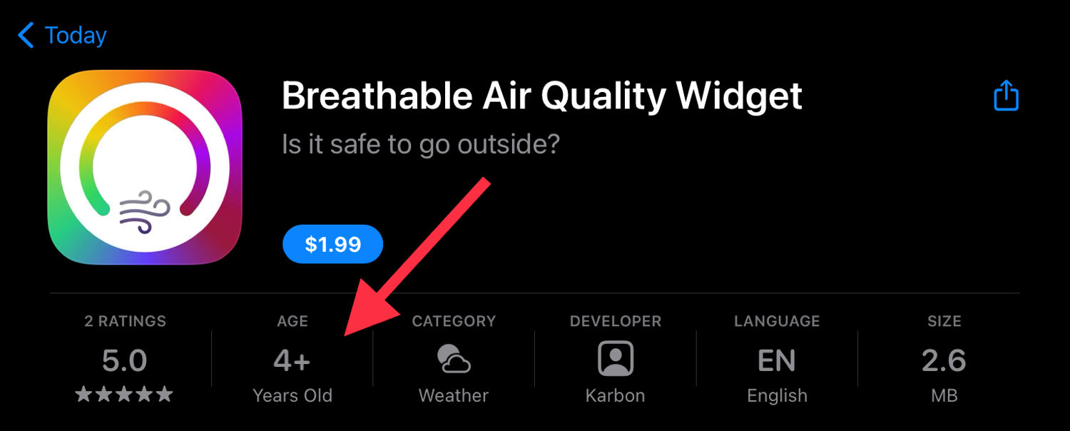
Take Breathable, for example. By all accounts, it’s a stupendous app for providing high-quality widgets that display your local air quality index. I read about its introduction on Daring Fireball. Low and behold, it’s listed as 4+ years old on its App Store page:
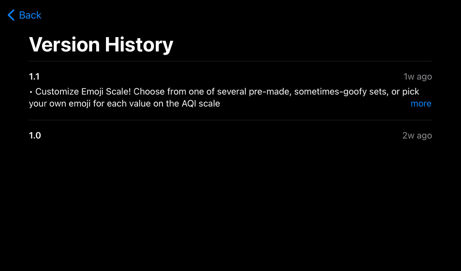
Nope. Just a couple weeks old. The only explanations that I can guess at is either the Xcode project is just that old and that’s where the metadata is sourced from, or the app’s developer account age somehow plays into the calculation. But I couldn’t tell you, and that bothers me.
If I can’t use the app age metadata to accurately judge an app’s longevity, why does it deserve such prominent placement?
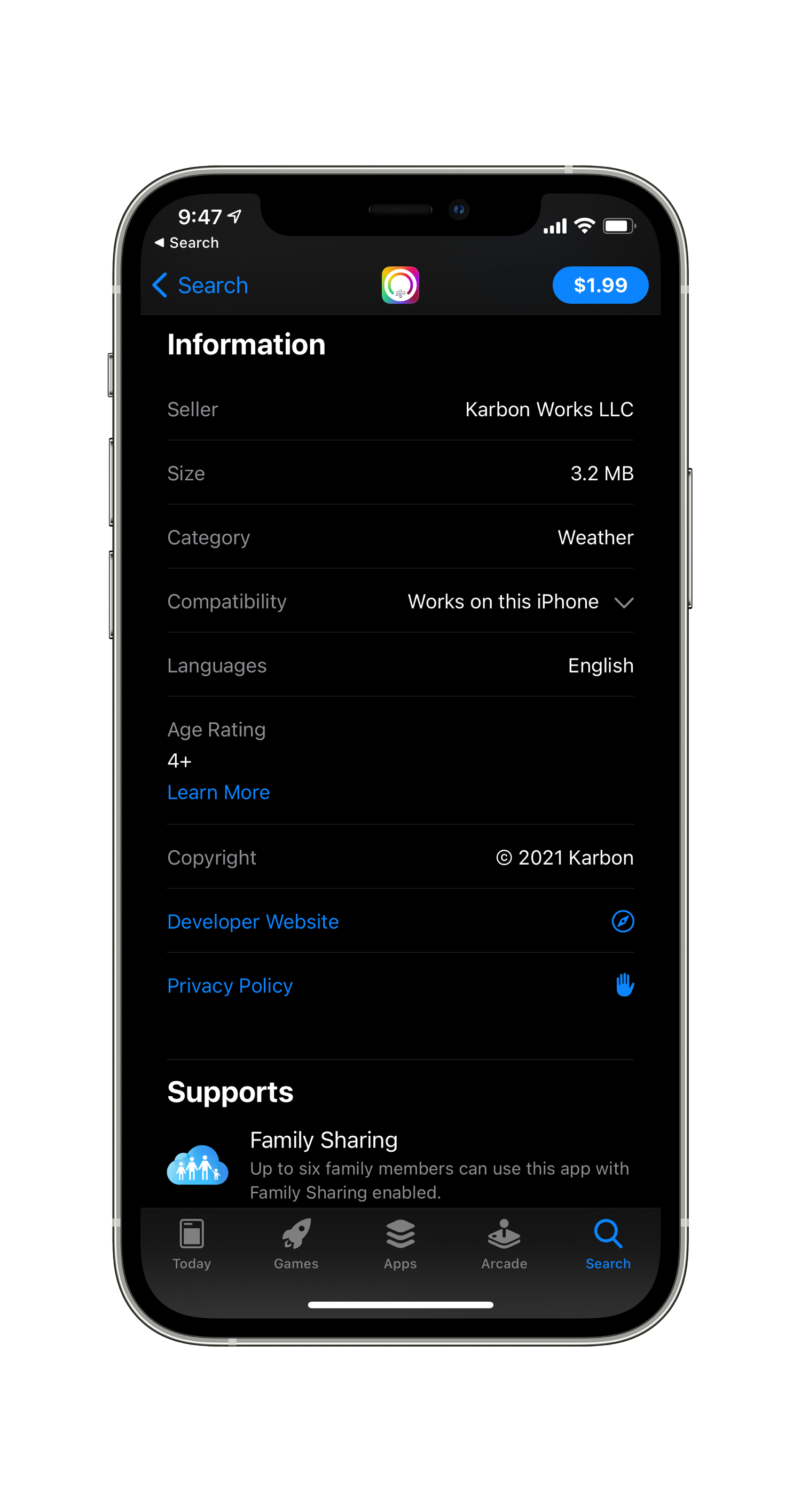
Yup. It totally is the age rating. A tap on the label (which I swear I’ve tried before) brings you down to more information which even includes a helpful “Learn More” link to read about the age rating groups. Mystery solved.
I’ll say this upfront: I’m not a photographer by nature. Sure, I use my iPhone’s camera almost every day and love many of the shots that come off it. But honest-to-goodness, compose-the-shot, consider-the-lighting, sweat-the-perspective — you know, real photography — isn’t a hobby that I’ve explored. Not for lack of interest, mind you, because I’m astounded and inspired at some of the shots that I see everyday hobbyists producing. No, I think my avoidance is for two primary reasons:
The times that I want great photos are when I least want to be taken out of the moment to capture them.
The complexity of camera settings. Learning about ISO, f-stop, RAW, and other photography jargon feels like a huge barrier.
I should also mention that I recently sold our hand-me-down Canon DSLR after not touching it for years. So why am I now dreaming of a standalone (and likely exorbitantly expensive) Apple-designed camera? Let’s dig in.
On trips into the backcountry, while enjoying a dinner date with my wife, and during social events with friends are the times I’m most interested in capturing terrific photos. But those moments are also when I’m most self-conscious about whipping out my phone to snap a pic. Even though the iPhone has long produced fantastic photos despite its constraints as a pocketable device with minuscule lenses, I’m loathed to get sucked into my phone/widescreen iPod/internet communicator. Although being glued to our devices is both commonplace and accepted, I don’t feel great about getting my phone out in those situations. My college friends and I used to have dinners with our phones stacked in the center of the table so that we’d stay focused on each other. If you reached for it before the end of the meal, you paid the tab.
Instead, what I’d prefer for those occasions when I know I’d like to take stellar photos but not risk getting distracted (or be perceived as distracted) is to use something akin to a Kindle. The Kindle is excellent for reading because it does one thing, and one thing only, really well: let you read books. I want that, but for taking pictures. I envision a device that includes all the photo smarts Apple has built into iPhones, like Smart HDR 3, Night Mode, panoramas, slow-mo, and time-lapse, but without the infinity pools of web browsing and the App Store.
It’s the pinnacle of first-world problems to long for a second device to save us from the issues that the first device created, I know. But the same reason I prefer to run with only an Apple Watch or read books on a Kindle applies here. I don’t want to be yanked out of the moment by an ill-timed notification or my inability to ignore emails. In an always-connected world, it’s the disconnected bits that center us and remind us of our roots.
Leveraging Apple’s Strengths
Okay, so a dedicated, prosumer camera. That order shouldn’t be too hard to fill, right? Sony and Canon have incredible handheld cameras these days. So why not just use one of them? In short, because of the ecosystem.
Software
While I’ve thought that Apple should introduce a DSLR-type camera for a while, it was a recent ATP episode that rekindled my curiosity about what this piece of hardware could be. Marco, too, advocated for a camera that married Apple’s software stack to hardware that would provide the best image data for that pipeline to process from the start.
Marco voiced what I felt was critical to the whole reason for taking high-quality photos: we want to do something with them. We want to revisit and reflect on them years later. We want to post them on social media to show off the beautiful bits of our lives. We want to share them with the people who were part of the moment. And we don’t want to have to muddy up the way we already know how to do those things. So pictures taken with this Apple Camera should just show up in the place we already go for all our photos, which is our iCloud Photo Library in the Photos app.
I said that I don’t want to be able to check my Instagram feed on this camera. But that doesn’t mean I don’t want to have to ability to seamlessly post the photos to Instagram when the time is right. However, hooking the camera up to an iPhone or Mac, or, hell, even moving pictures with an SD card, already feels antiquated in our increasingly wireless world. Instead, I think this camera should be internet-connected insofar that it could upload things directly to your iCloud Photo Library over a cellular connection. Both for safekeeping and ease of sharing, I think a dedicated hotline to iCloud is essential for this device. I envision snapping a picture with the camera and, only seconds later, pulling it up on my iPhone to send in Messages or post online.
Hardware
As discussed by the boys on ATP, Apple could be considered the biggest camera company in the world. The entire time that Apple has been advancing in the world of photography, however, they’ve made cameras in an “oxygen-scarce” environment. So far, primary goals for their cameras have been to fit within bare millimeters and have the least impact on battery life. I don’t see everyday users clamoring for an iPhone with inches worth of lens poking out from the back. And yet, Apple has been able to produce cameras that can take genuinely incredible photos. Just scroll through #ShotOniPhone for examples of what can be done despite minuscule glass and image sensors. Can you even imagine what would be possible with large traditional lenses and a full-sized image sensor, combined with Apple’s processing stack?
Of course, an Apple-designed camera would feel great in hand and cater to the less technical among us. I’m not looking for the camera with the most buttons and dials. I’m seeking one that helps me to take tack-sharp photos, with natural bokeh, without a ton of fiddling. Advanced controls could be present but perhaps accessible within the software interface. It would have a flip-around screen for taking selfies. It would have point-and-shoot capability with instant auto-focus. It would be made of high-quality materials shaped into a timeless design. I have immense faith in Apple’s design team here.
An area where I’d like to see some Apple innovation is with zoom lenses. Besides being an accessory category that I’m sure Apple would love to enter, I could see them improving how lenses attach to the camera. Perhaps the camera body would be compact enough to slip into a pocket or purse and function without an extra lens attached. Then you’d put an interchangeable lens over the standard one. I don’t know if that’s possible, but perhaps Apple can do something special like they did with Apple Watch band connections.
The point of this device is to take great photos, to do it quickly and without distraction, and to look good while doing it.
A Dream That Could Become Reality?
Will this product ever exist? Of course, I have no idea. Apple famously enters only product categories that it believes it can significantly impact and that will sell well. But there are enough photography nerds at Apple, including Apple Fellow Phil Schiller, that I’d be surprised if a prototype didn’t already exist somewhere within Apple Park.
The Leica camera designed by Jony Ive and Marc Newson. (Image: Wired) ⌘
To sum up this long, meandering wish-cast, these are the fundamental elements I propose for an Apple Camera:
Dedicated device with traditional, disconnected camera sensibilities
Deep integration with Apple’s ecosystem (i.e., the iCloud Photo Library)
Apple silicon for image signal processing
Iconic Apple industrial design
I would be very interested in such a device. I see myself slipping it into my bag or slinging it over my shoulder on outings. I could leave my phone behind and still capture, without breaking, the moment.
Written from Brunswick, OH 🗺 On a 2020 11-inch iPad Pro and Magic Keyboard ⌨️ While enjoying a Gin & Coke 🥃 by a campfire 🔥
Easily access your What’s New feed by clicking the new bell icon (🔔), located at the top of the Home tab on your phone. A blue dot indicator on the bell icon will let you know at a glance if new songs or episodes have been released since your last visit.
As it is, I rely on separate apps for tracking releases from artists in my library. But it would be so much better if they copied this straightforward thing and gave us a running list of all the releases. As it is, Apple Music’s notifications for new albums appear with no rhyme or reason that I can discern, and you can’t return to one after tapping on it.
I’m also a fan of the concept of “following” an artist:
Looking to add more content to your What’s New feed? Simply head over to your favorite artist and show pages and tap “Follow” in order to have their new releases appear in your What’s New feed over time.
Artists of music in your library would automatically be followed (though you should be able to unfollow specific ones at your discretion), and you should be able to follow artists whose music you haven’t saved, too.
I’m the kind of person who likes to tinker, to fiddle, to update, to improve. So I was thrilled to find RoutineHub, which is a straightforward place for sharing shortcuts and, critically, keeping them updated over time.
It’s not overtly obvious, but an iCloud link created by Shortcuts is like a snapshot. It captures the shortcut only at the moment that it’s shared, so any changes made in the future are not reflected in that link. If you wanted to share a newer version, a new iCloud link must be generated. So while old links, like those I put in blog posts, still work just fine, they don’t point to the newer, better version when I make a change.
That’s where RoutineHub comes in. My plan going forward is to make sure each post gets two links when I write about shortcuts I’ve created:
The original iCloud link. Since most of my blog posts about shortcuts contain screenshots, I want to make sure the original version can be referenced if a reader is following along.
The RoutineHub link. This lets readers get the latest version of the shortcut, and see a change-log of updates over time.
As an example, I’ve updated my post about the Stand Goal Cheater shortcut with a RoutineHub link. My hope is that this also provides a guard against link rot in case Apple or RoutineHub change their URLs in the future.
In a nice touch, RoutineHub makes it quick and painless to update shortcuts right from the Shortcuts app itself using RoutinePub. This shortcut allows you to send your latest shortcut link, a version number, and an update note to the correct entry on your profile — all from the Share Sheet using an API. Because of course they do.
My profile on RoutineHub is pretty bare-bones right now, but I’ll be filling it out with things I want to share in due course.
“On our first visit, I told him about the temple’s unique visual trick,” says Oshima. “The garden has fifteen stones but you cannot see all of them at once from a single vantage point.”
Oshima says Jobs immediately checked to see if this was true. He paced around, looking for the perfect spot to view the garden, but couldn’t find it.
“Then I explained the significance of the number: 15 means completion. In the past, men were recognized to have reached adulthood at the age of 15. A night with a full moon is called ‘Jyugoya’, or 15th night. The reason we can’t find all 15 rocks is that we’re still in a work in process.”
Captivating. There’s so much to see in the world. And apparently so much good sushi to eat!
When Apple asked me if I could pitch it in one sentence — they sort of asked it laughingly — I said: “It’s a 1,000-year chess game between Hari Seldon and the Empire, and all the characters in between are the pawns, but some of the pawns over the course of this saga end up becoming kings and queens.”
A one-sentence pitch. That’s hard to do. I couldn’t even do it to describe this link.
I thought about buying another car but instead decided to try an experiment where I’d just use my E-Bike to get around town and use a Lyft anytime I needed to go to a meeting. After doing that for about a year, my monthly Lyft budget was right around $199. So I guess you could say I’ve already paid the $199 per month self-driving subscription.
Another option worth considering, especially if you already have one vehicle at home and rarely commute to work.
The Email Protection feature also integrates with the DuckDuckGo mobile browser and desktop browser extension, giving people the option to fill in their “@duck.com” address or generate a disposable address that forwards email to their inbox. The mobile and desktop browser extensions are linked by opening a link on the Email Protection welcome email in your desktop browser.
From then on, when email is received, scanned, cleaned of trackers, and forwarded to your email, DuckDuckGo inserts a small bar at the top of the email notifying of any trackers removed. Clicking on that bar allows a user to get more information on the trackers blocked or deactivate a disposable address that has been compromised.
I’ve not gotten into the fake email game for newsletters, free trials, etc. It always seemed too much hassle to be worth it, especially if I end up enjoying the service and need to log in later. I might give Hide My Email a try this fall with iOS 15, but I’ll admit that I prefer DuckDuckGo’s method of striping out the offending trackers.
One of the headline features of this year’s 12.9-inch iPad Pro was the miniLED backlighting — or what Apple calls the Liquid Retina HDR display. A pair of new photos posted on Weibo provides a very close look at this tech.
You’ve got to check out the close-up photo in this article. I’ll never get over how the insides of Apple’s devices look so good, even though you’d never know.
For small businesses, Square has become a compelling one-stop shop. With their new banking service, you get access to sales faster, and can set up neat automations like saving a percentage of each sale toward a savings goal. That’s exactly how savings work in my mind. If I were to start a small business, I’d look first at Square.
Thanks for reading! If you found these things interesting too, or have something exciting to share, please drop me a line on Twitter!
In my Home Screen write-up for MacSparky, I mentioned how I use Drafts to get to-dos into Things, my task management system. Reader Venki sent me a message asking for some clarification about how I link them together. I’m glad that he did. It provided an excellent opportunity to review how I’ve been using Drafts lately and explore how I could be using it even better.
In a sentence, Drafts is my brain dump where I quickly get ideas and tasks out of my head for later, and my scratchpad for jotting things down at a moment’s notice. For more than a sentence…read on.
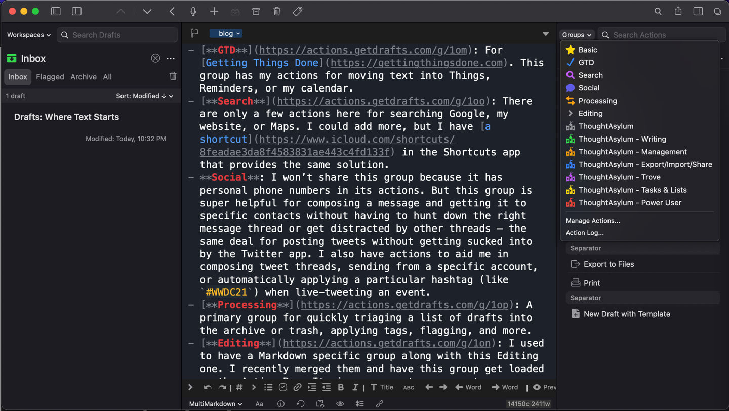
My Drafts Setup
After culling unused or duplicate actions, I’ve landed on a few action groups that work well for me. I’ll reference them in the sections below, but if you’d like to reference them while you read, here are the links.
Note that some actions rely on others to be installed for them to work. I can’t guarantee that my actions will work for you without installing the same sets that I have installed. But don’t let that stop you from checking them out.
Action Groups
Basic: Could also be called “Favorite.” These are the actions I use the most and are sometimes just “blank” actions that activate others from a different group.1
GTD: For Getting Things Done. This group has my actions for moving text into Things, Reminders, or my calendar.
Search: There are only a few actions here for searching Google, my website, or Maps. I could add more, but I have a shortcut in the Shortcuts app that provides the same solution.
Social: I won’t share this group because it has personal phone numbers in its actions. But this group is super helpful for composing a message and getting it to specific contacts without having to hunt down the right message thread or get distracted by other threads — the same deal for posting tweets without getting sucked into by the Twitter app. I also have actions to aid me in composing tweet threads, sending from a specific account, or automatically applying a particular hashtag (like #WWDC21) when live-tweeting an event.
Processing: A primary group for quickly triaging a list of drafts into the archive or trash, applying tags, flagging, and more.
Editing: I used to have a Markdown specific group along with this Editing one. I recently merged them and have this group get loaded as the Action Bar. It gives me one-tap access to many Markdown format characters that are otherwise buried within the software keyboard, plus more actions for manipulating text within the draft. There’s even one that I wrote: Insert Current Date (Prompt).
ThoughtAsylum: And then there are the ThoughtAsylum groups. These are chock-full of actions created by scripting wizard Stephen Millard. I couldn’t possibly explain all that the powerful ThoughtAsylum actions do. But, with them installed, I can usually search my action library for something that I want to accomplish, like “Remove Blank Lines,” and, yep, there’s already an action waiting for me to run.
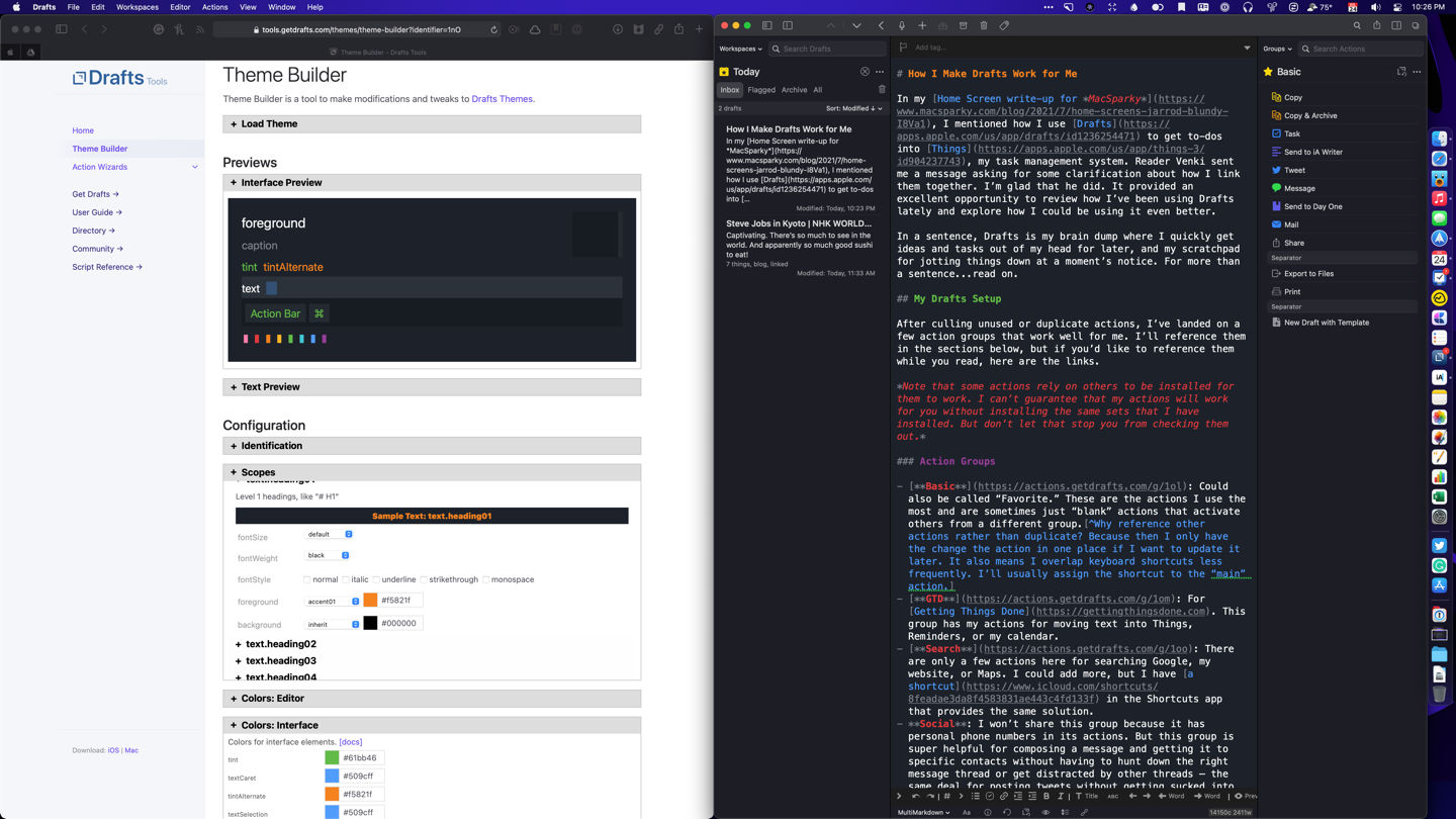
Not too long ago, I decided to try my hand at customizing how Drafts looked, in addition to how it worked. The main feature of Drafts version 26 was allowing users to write custom themes and syntaxes for adapting how the text appeared on screen and the app chrome around it. Tim Nahumck did an excellent write-up about the update on his blog.
Without going too far into the weeds, I’ll say that writing involves writing or changing a JSON file. Unfortunately, I didn’t know anything about JSON formatting, so I instead used the theme builder tool on the Drafts website to change the font size, style, color, etc., for the various kinds of text that I use when writing in Markdown.
I based my custom style on the colors used for this site, which in turn are inspired by Apple’s six colors logo. For example, my level one headings are orange, level two headings are green, link text is blue, quote text is yellow, and emphasized text is red. The effect is that I get an approximation of what the text will look like on my site when published, while I’m writing out in Drafts.
I created a light mode and dark mode, which you can install from the Drafts Directory.
I think my theme is both beautiful and functional. ⌘
Getting Ideas Into Drafts
As I mentioned above, whenever I’ve got something that I don’t want to forget, I’ll put it in Drafts. It’s the fastest way to get something out of my head and onto “paper” to remember or do something with later. When I open Drafts, it defaults to a blank page, blinking cursor, and active keyboard ready for input. That is the magic of this app. Anything that slows down the process of getting the app open and my ideas into it gets a big thumbs down from me.
Then I can go back later to clear out those ideas and put them in the proper resting place (Notes, Things, Calendar, Contacts, etc.). I’ve got Drafts set to show a badge for any untagged items in my inbox, so I always know if I have something that I need to clear out or tag for saving.
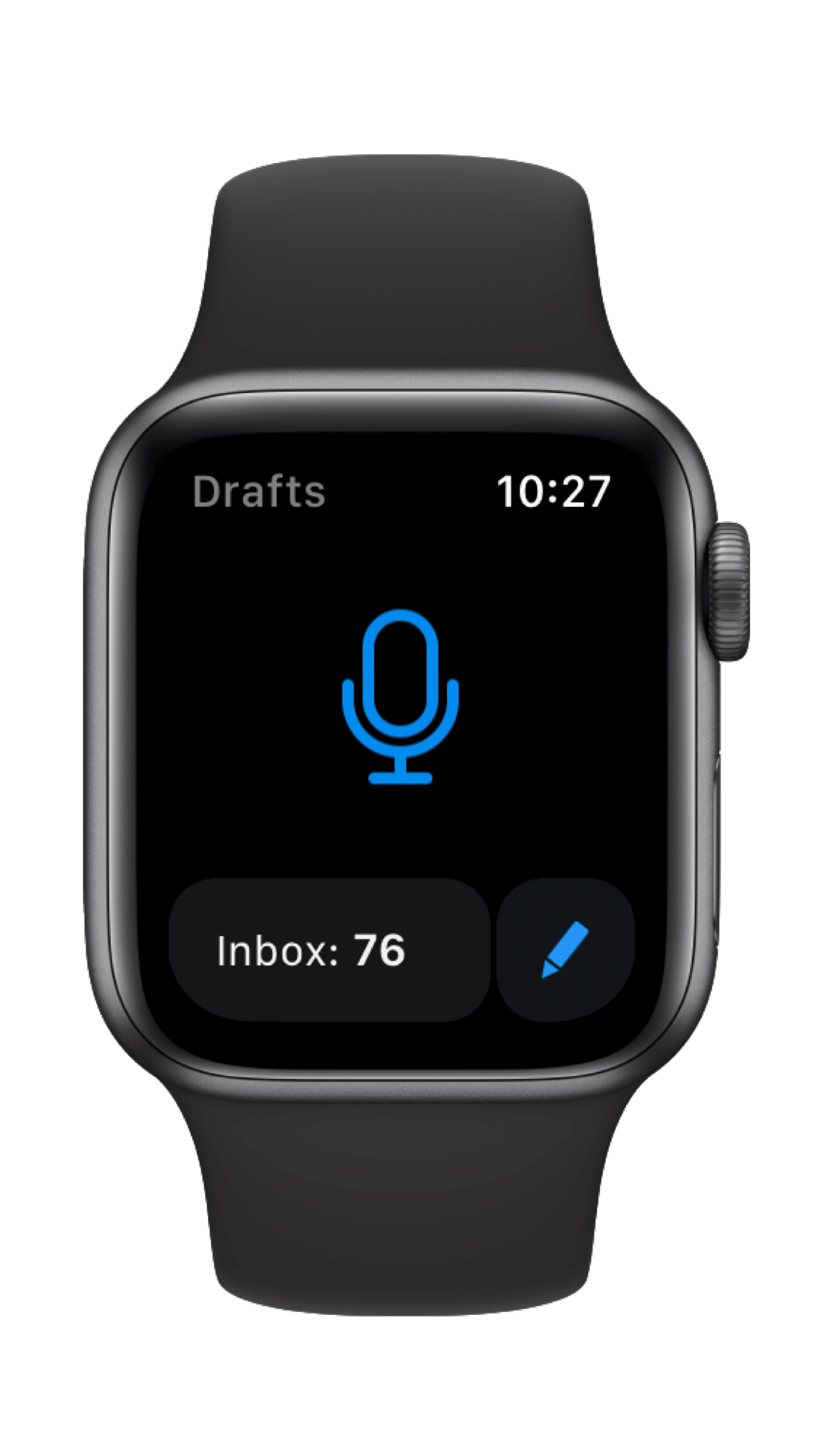
There are other ways of getting text into Drafts, and I employ several of them. My favorite is using the Apple Watch app. I’ve got a complication for Drafts on several faces to get to it without searching for it in the app grid view. Furthermore, I’ve got the watch app set to open to dictation, so I can immediately start speaking what’s on my mind, whether it’s a task for later, a quote, or a blog idea. Having that option set is especially helpful at night; otherwise, the thought will bounce around my head, and I won’t be able to sleep.
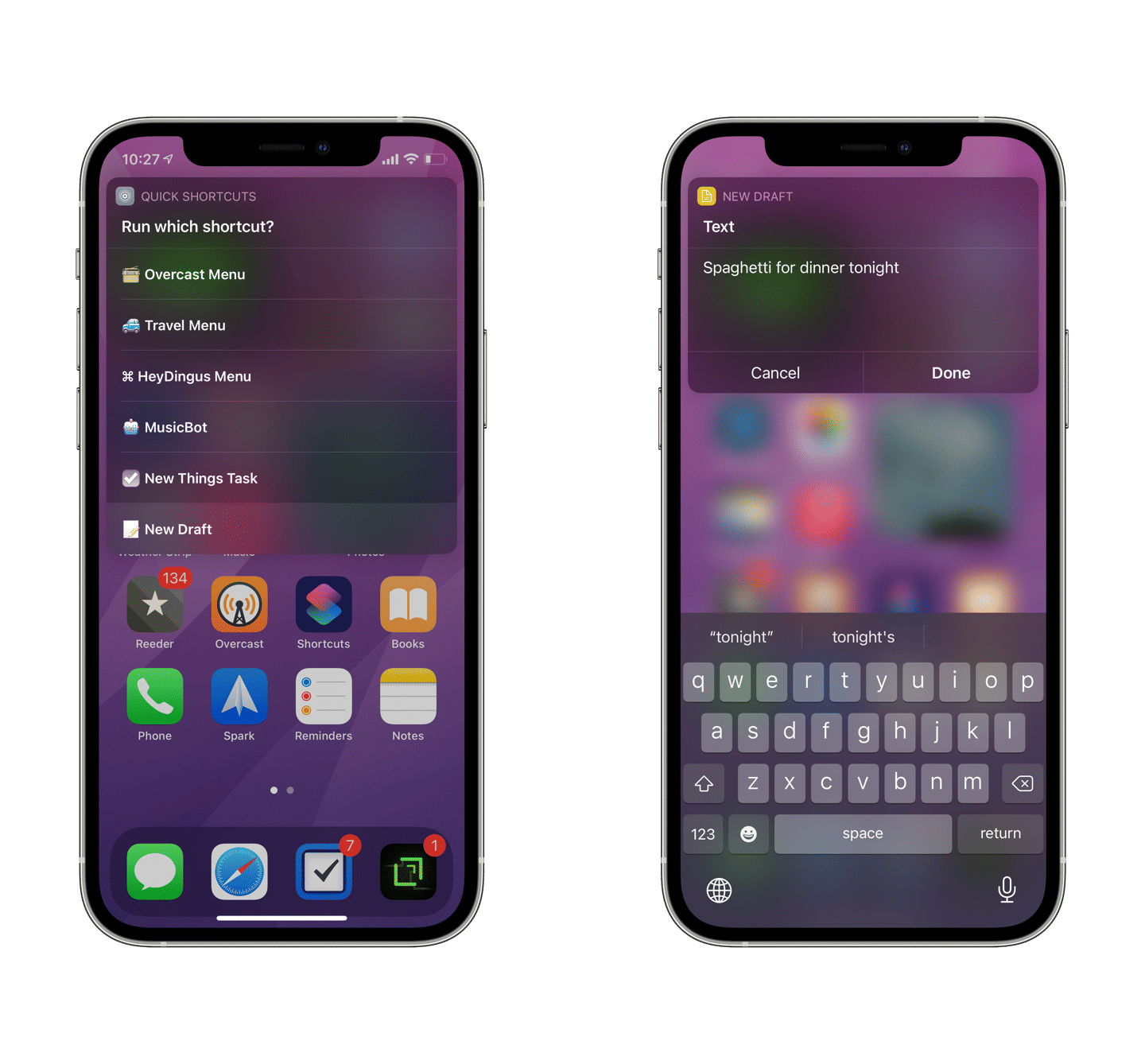
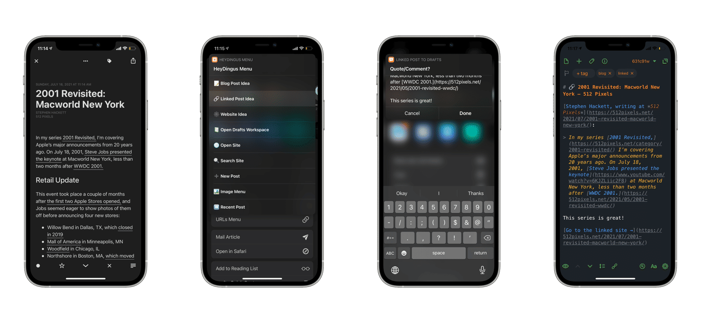
I also use Shortcuts to get things into drafts. As a model iOS citizen, Drafts donates tons of helpful actions into Shortcuts for creating new drafts, appending and prepending existing ones, running actions, and much more. I tap three times on the back of my phone to activate a Quick Shortcuts menu which includes a Create Draft shortcut for standard text entry from anywhere. Most often, though, I’ll send a bit of formatted text into Drafts which might end up being the start of a blog post, an email, or a tweet.
Capturing text into Drafts from anywhere on iPhone. ⌘
But once something is in Drafts, what happens then?
Drafts and Things
Often, I’ll want to get something out of my head and into Things for later, but without getting distracted by everything else I have saved in Things. Since Drafts opens to the blank text field, it’s ideal for getting things down quickly and then sending them elsewhere. Other times, I’m already in Drafts anyway, and it’s easier to make a new Draft than switching to Things to create a task.
Drafts has many available actions that take the current draft and send it into Things as a task. It uses a URL scheme, I believe. I’m not sure if any of those actions are built-in by default, but you don’t need a Drafts Pro subscription to install and use them. You just can’t edit the steps without going Pro.
To get the actions, you would install them from the Action Directory.
Here are the actions that I have installed:
Task in Things is the most basic action I use. It creates a new task in Things using the draft’s title as the task title and the draft’s body as the task notes.
Todos in Things will separate each new line of the draft into a new task in Things.
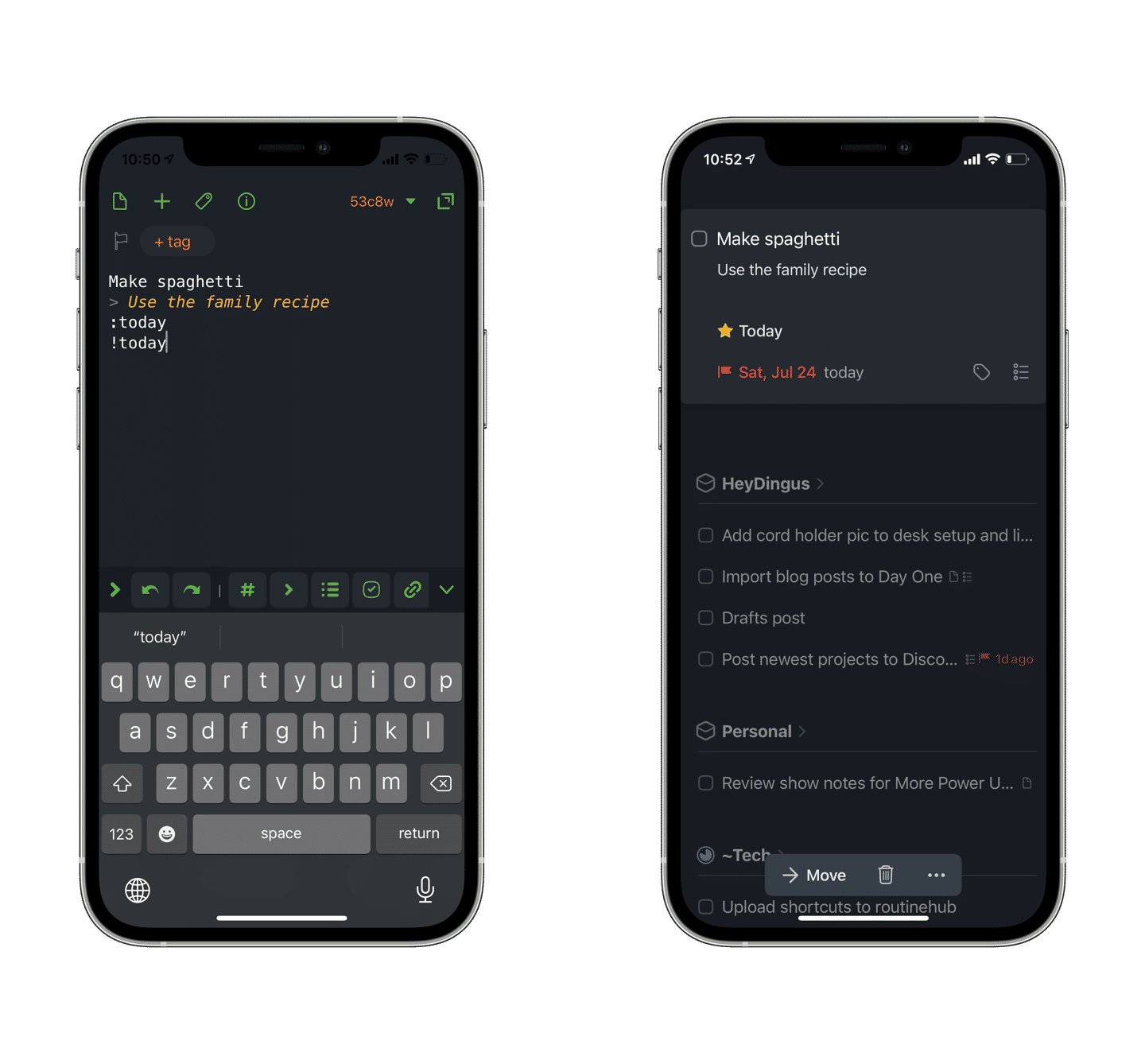
Send to Things accepts a bunch of syntax from the draft to create tasks in Things that have additional metadata like start dates and deadlines (with natural language!), tags, and more. It can do the same job as the two actions above, so I’m using this one more frequently as I get comfortable with the syntax. You can even create whole new Projects using this action, but I rarely do that.
Send to Things Syntax is helpful because it pops up an alert with the syntax to use in the Send to Things action. I just found this tonight, but it’ll help me remember how to format a more complex task before firing it off to Things.
Remind Me of… Things asks for a title and reminder date before making a new task in Things with a URL back to the draft. So if you’re working on a longer draft, for example, Things can remind you about it and get you back to it with just a tap.
With some simple syntax, the task is already formatted when sent to Things. ⌘
Multi-Device Friendly — One of the great things about Drafts is that it’s a universal application that can be run on the Mac, iPhone, iPad, and Apple Watch. Sync is speedy, so don’t worry. I’ve explained how I use it on my iPhone and Watch to capture text and do quick manipulations typically, but on the iPad and Mac, I write more long-form with their physical keyboards. The keyboard shortcuts make processing an inbox full of drafts blazing fast, and I use Command-T for applying a tag, Control-Option-Command-T to activate Send to Things, and Control-Option-Command-I to send the text to iA Writer all the time.
Those devices are also great for referencing drafts I have saved up for later. By applying tags, I can get drafts out of my inbox and into saved searches called “Workspaces” in Drafts parlance. I have the following Workspaces saved:
Inbox (anything not tagged)
Today (anything modified today)
HeyDingus (anything tagged website or blog)
Code (anything tagged code)
Templates (tagged template and can be used to auto-populate a draft with text)
and Tweets (things tagged tweet)
Tweeting — Speaking of tweets, I should mention that I use Drafts as a starting point and an evaluation filter for things that I want to put on Twitter. I’ll tag something as tweet if I’d like to post it, but it’s not ready yet. Sometimes it’ll get crafted into the perfect tweet. Often, though, upon a second pass, I’ll decide I didn’t need to say it in public after all. Drafts can be used as a spiritual successor to Birdhouse in that way.
Blog Post Planning — I throw all my blog post ideas into Drafts. First, they get triaged and usually a few sentences or an outline before getting sent to iA Writer for a more focused, hard-core writing environment.
Getting a linked post ready for Drafts with Shortcuts. ⌘
Journaling — Finally, I’ve got a few actions set up for journaling. They could be quick personal thoughts I want to document or templated entries. Sometimes it helps to have a few simple questions to get the ball rolling. All these get sent to Day One.
Flagging Drafts — I do my best to keep Drafts as an intermediary rather than a storage location. If I know that I’ll need to reference something long-term, then I’ll usually send it to Apple Notes which supports for rich text formatting, sharing, and adding rich links, files, and images. But if it’s not ready to go elsewhere and I do need to come back to a draft over time, giving it a flag is my method of knowing it’s a notable work-in-progress.
A bonus tip: write any content longer than a line that’s meant for a web form in Drafts first. Has this ever happened to you? You’re filling out a form online, and something goes wrong — the page reloads, your internet connection drops, whatever — and you lose all the text you’ve written. That’s burned me too many times, so now I’ll type it in Drafts first, then copy it into the web form. It’s (1) a better place to edit that text and (2) a life-saver to have that text saved on the device just in case.
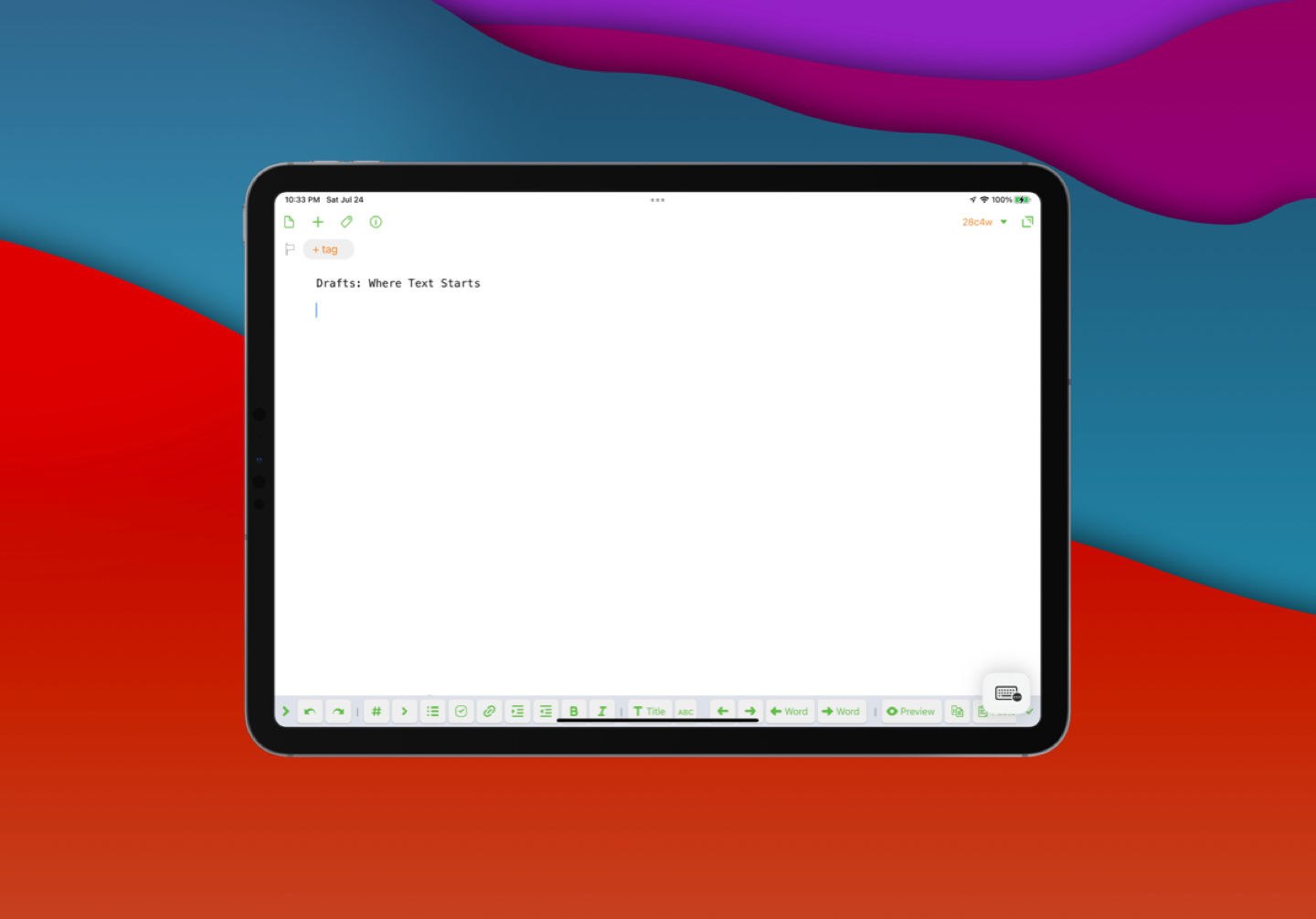
Where Text Starts
Drafts has been in my dock for years now. It is an indispensable tool that I use many times each day. Although you can use and sync Drafts for free, I’m happy to pay the annual subscription ($20) to fund its continuous development and access the Pro features like editing actions, themes, widgets, and more.
Since every draft item is just text, it takes up essentially zero storage on the device. Therefore, I just archive everything when I’m done with it or send it off to another application. That means later, when I forget where I sent it, I can almost always search in Drafts (which is insanely fast) and check its history to see where it went. Even three years later, with nearly 3,000 items, it’s only 47MB worth of data.
Although I feel that I have a good handle of what Drafts is best for in my life right now, I know I am but scratching the surface of what’s possible. Actions can include JavaScript, and there are some incredible workflows that people have created to work with their text. But Drafts, at its core, will always be about quickly capturing text to do something with it.
For additional writing on Drafts, I recommend checking out Tim Nahumck’s work on his site. He writes in-depth reviews and is a frequent guest contributor on podcasts and websites to talk about Drafts.
Why reference other actions rather than duplicate? Because then I only have the change the action in one place if I want to update it later. It also means I overlap keyboard shortcuts less frequently. I’ll usually assign the shortcut to the “main” action. ↩︎
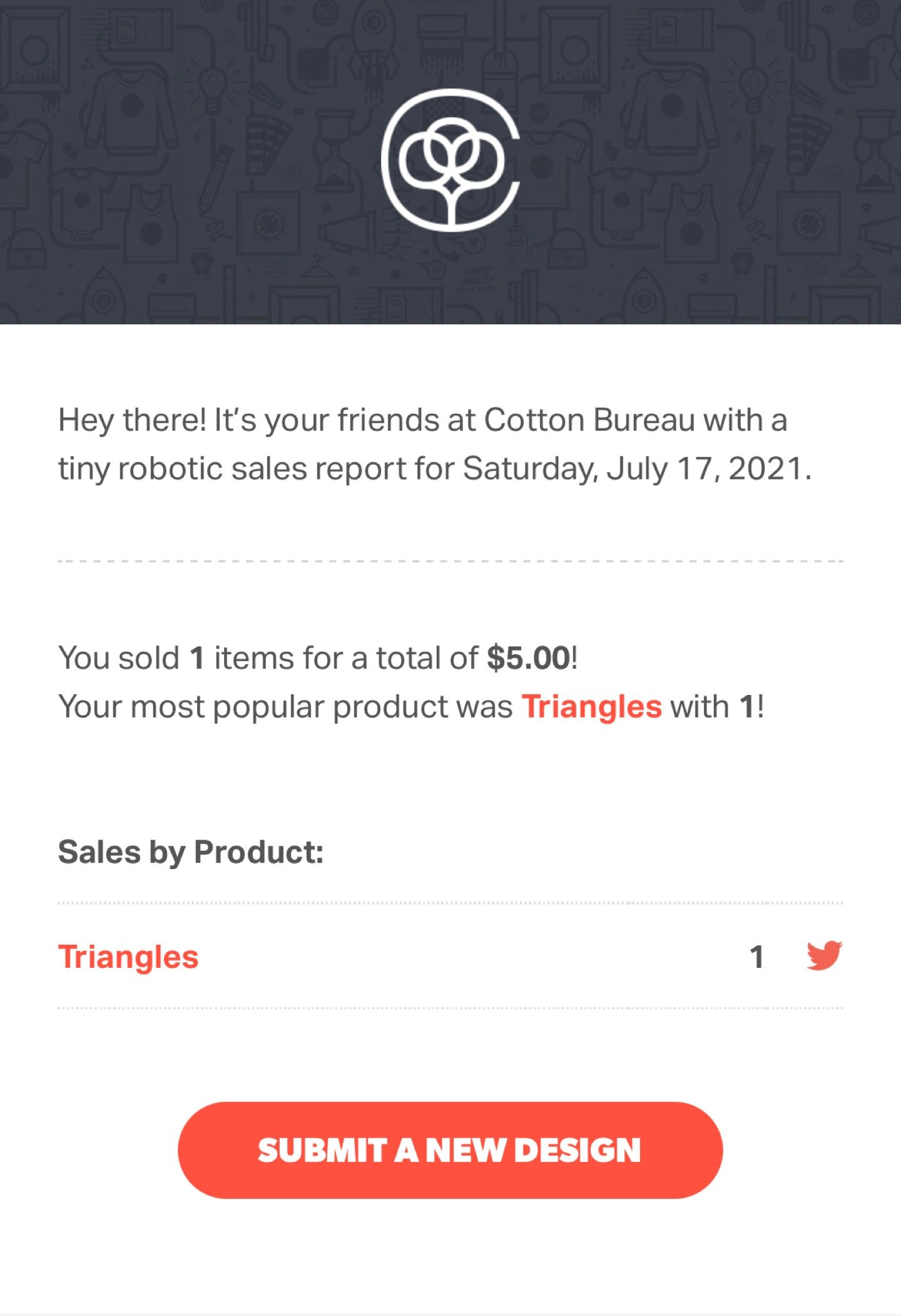
Last week, I received a report from Cotton Bureau telling me I made my first sale! Well, the first sale which wasn’t made right back to me, anyway. I made five bucks, but the rush of having something that I designed get chosen by a customer, and then made into a physical item to be whisked off to them is worth way more than that.
That ‘Submit a Design’ button sure is enticing. Even after I put out some designs for the Olympics and Ted Lasso, I’ve got a few more ideas cooking that I want to introduce into the world.
That’s right, I’m just as excited as the rest of the world for the second season of Ted Lasso, the first episode of which dropped today. I’ve spent the last couple of days diving deep into the fandom by listening to The Incomparable’s season one recap podcast: Football is Life (which is excellent, by the way). My wife and I finished rewatching the first 10 episodes earlier this week, and plan to indulge in S2E1 tonight.
And, because I’m a nerd, I’ll be making Ted Lasso’s biscuits to enjoy during the episode.
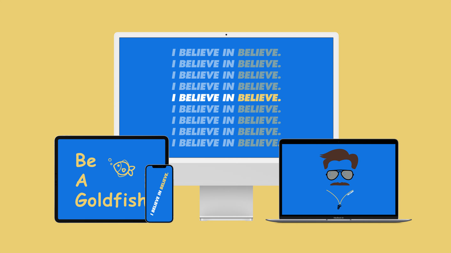
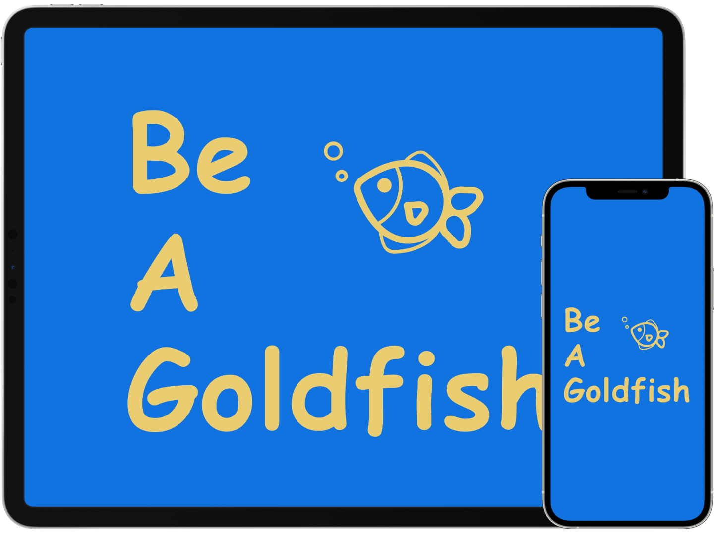
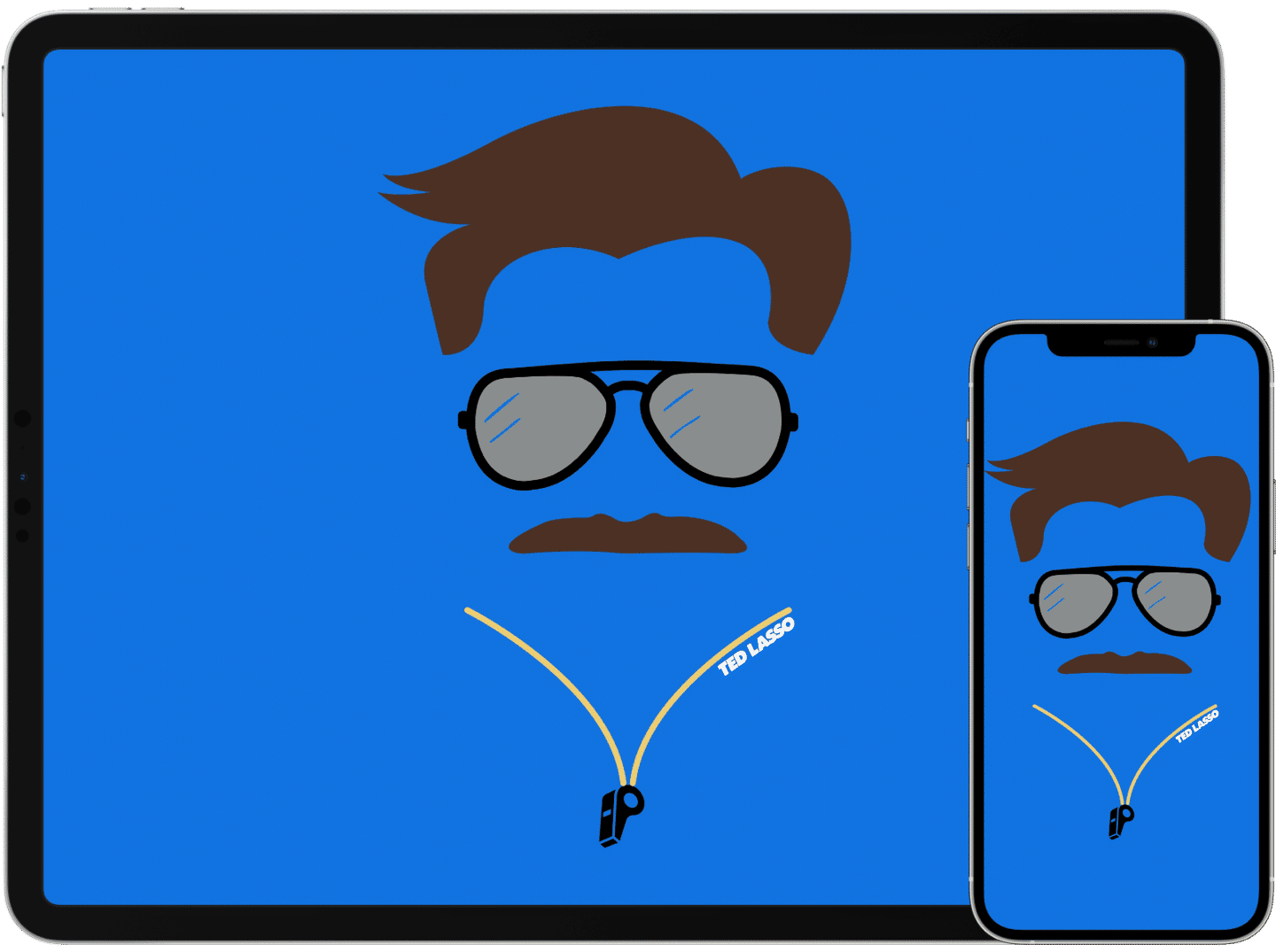
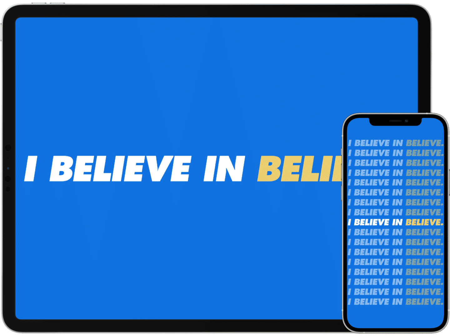
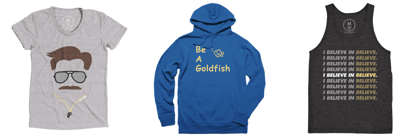
I’ve written about how much I loved Ted Lasso before, and my rewatches have only strengthened that adoration for the characters, the storyline, and the positive messages it promotes. In celebration of Season 2, I’m thrilled to release some fan art designs that I’ve been working on. Each of them come as both wallpapers for your device and shirts for your back!
Be A Goldfish
The first design comes from what is perhaps my favorite mantra from all of Ted Lasso. It originated in this sweet interaction between Coach Ted and player Sam after Sam makes a bad play:
“You know what the happiest animal on Earth is? It’s a goldfish. You know why? Got a 10-second memory. Be a goldfish, Sam.”
I love this. It came up again in the final episode of Season 1 when Ted tells the team that after you’re done being upset about something, it’s best to just forget about it. To move onward and forward.
I’ve always been impressed by minimalist graphic art that abstracts a character, but that you can, nevertheless, still recognize. So I tried my hand at putting together one of Ted. With help from the amazing creators who make their creations available on the Noun Project, I’m quite happy with the result.
There were already a mountain of the classic “Believe” poster designs out there, so I went with a different take on the show’s most iconic bit. The “I Believe in Believe” graphic, I think, is like showing off a promise to be positive, to have confidence in the best of one another, and to never lose hope.
This wallpaper comes in a couple of styles. Credit: Apple for the phrase and its style. ⌘
This past six weeks or so, I’ve had my head down working on a few new projects. Writing here at HeyDingus, of course, plus working my way through the Learn to Code course in Swift Playgrounds. I’ve also been inspired to create some things that other people can use! Cotton Bureau makes it easy to try my hand at t-shirt design, and a couple of them I’ve turned into device wallpapers, too. Drafts continues to become more indispensable to my day-to-day workflows, and I’ve contributed a couple things to the community there. I can’t wait to do more! If Drafts is where things get out of my brain and onto “paper,”
Shortcuts is the glue that ties everything together to get things done. I’ve been sharing a few of my shortcuts and how I made them.
I was very kindly featured in a couple of Matthew Cassinelli’s What’s New in Shortcuts newsletters and on David Sparks’ MacSparky blog. They got passed around a few times, and resulted in the first big spike of traffic that I’ve seen here. Shout out to all the Germans who found me when I was linked to on iPhoneBlog.de!
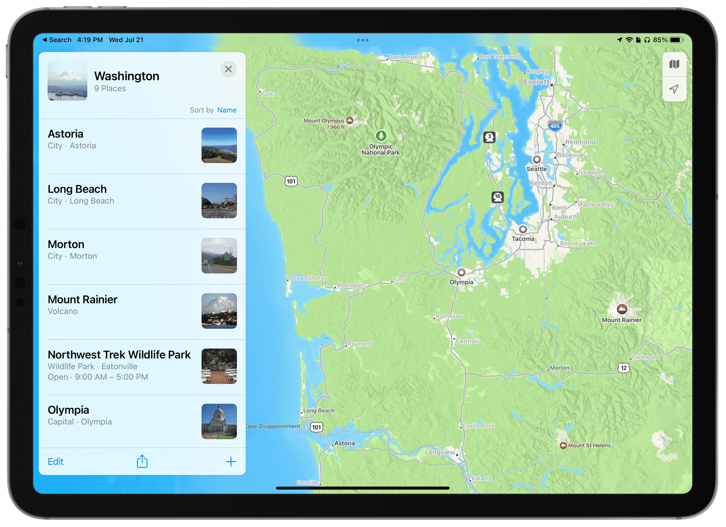
We saw much of the Pacific Northwest in just a few days. ⌘
IRL, as they say, my wife and I took a long-awaited trip out to Washington State earlier in July. We traveled almost the entirety of the northwest corner of the state. Some hot takes: Seattle was cool but too big. Tacoma felt smaller than it has any right to. Olympic National Park took forever to drive around, but well worth it; I can’t wait to go back. Long Beach in the southeast corner was lovely. The Cascade Mountains have great hiking and are more substantial than I expected, and we didn’t even get deep into them. Mount Rainier is massive; Because the rest of the state is basically at sea level, it towers above everything else as Washington’s only 14er (and the United States’ second most prominent mountain, only behind Denali). It’s awe inspiring.
Mount Rainier is so tall that you’re not that much above it even when flying. ⌘
Lastly, I’ve started a new job! I’m headed into the field of technical customer support, and I couldn’t be more excited! While a big change from my past jobs, it retains a lot of the things that I’ve liked from all my previous positions: helping people, tinkering with tech, and working toward a mission I believe in. My coworkers all seem fantastic so far, and have a goofy side that I was afraid I’d miss out on after working at camp for so long. Fears = quelled. Enthusiasm = raised.
Apps I’m Trying
Jump Desktop: I heard about this remote desktop app on Mac Power Users, and since I already have the Mac client through Setapp, I thought I’d compare it to Duet Air, which has a yearly subscription. I use them to control my Mac mini through my iPad Pro.
Textcraft: A no-frills text manipulation app that has a plethora of transformations and, critically, provides Shortcuts actions for them.
Boop: Another text transformation app, but specifically for the Mac, and made for more code-friendly manipulations.
Transloader: Based on the MacStories recommendation, I’m trying this app out for starting downloads on my always-on Mac mini even from an iPhone or iPad. It plays nicely with Downie, which would probably make saving videos from the web easier than on iOS or iPadOS directly.
Tripsy: Our trip to Washington provided an opportunity to test out Tripsy, which collects destinations, travel schedules, and reservations and puts them into a trip itinerary. It wasn’t perfect (I had some trouble with time zones and duplicate reminders since I saved both my wife’s and my plane ticket info there), but it was convenient to have all our documents and destination options in one place.
Stuff I’m Reading
To be honest, I haven’t opened a book for a couple of months. My RSS and Read Later lists in Reeder have taken all my reading time since WWDC. We did listen to Harry Potter, books six and seven, as audiobooks on the road in Washington, though.
Basic coding lessons. It’s helpful that even with a basic understanding of how code is written in one language (like Swift), even other languages (like JavaScript) start to make some sense too.
Working out. My running and workout regime took a brief break while we were out west and shortly after. But I’m getting back on schedule with the goal to run a half-marathon by the end of the year.
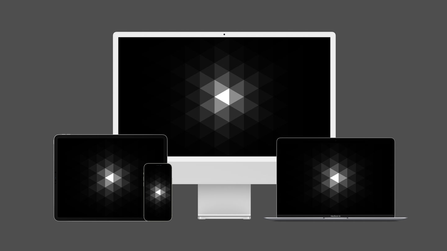
Hot on the tail of my International wallpapers, I’m excited to also release the Triangles wallpaper.
Apple device family using Triangles as the wallpaper. ⌘
When messing around with the pixelate effect in Pixelmator Pro, I happened to land on this design and thought it looked awesome! I stopped, and exported a few versions to work for a Mac desktop, or as wallpapers on an iPhone or iPad.
I can attest that Triangles looks sick on an OLED screen. ⌘
There’s really no more sentiment behind Triangles besides looking really cool, so I hope you enjoy it!
Triangles, too, is available as a shirt at my storefront on Cotton Bureau. I think you’ll like what I’ve done with it there.


.jpg)
.jpg)
.jpg)
.jpg)
.jpg)
.jpg)
.jpg)
.jpg)
.jpg)
+Wallpaper+(6K).jpg)