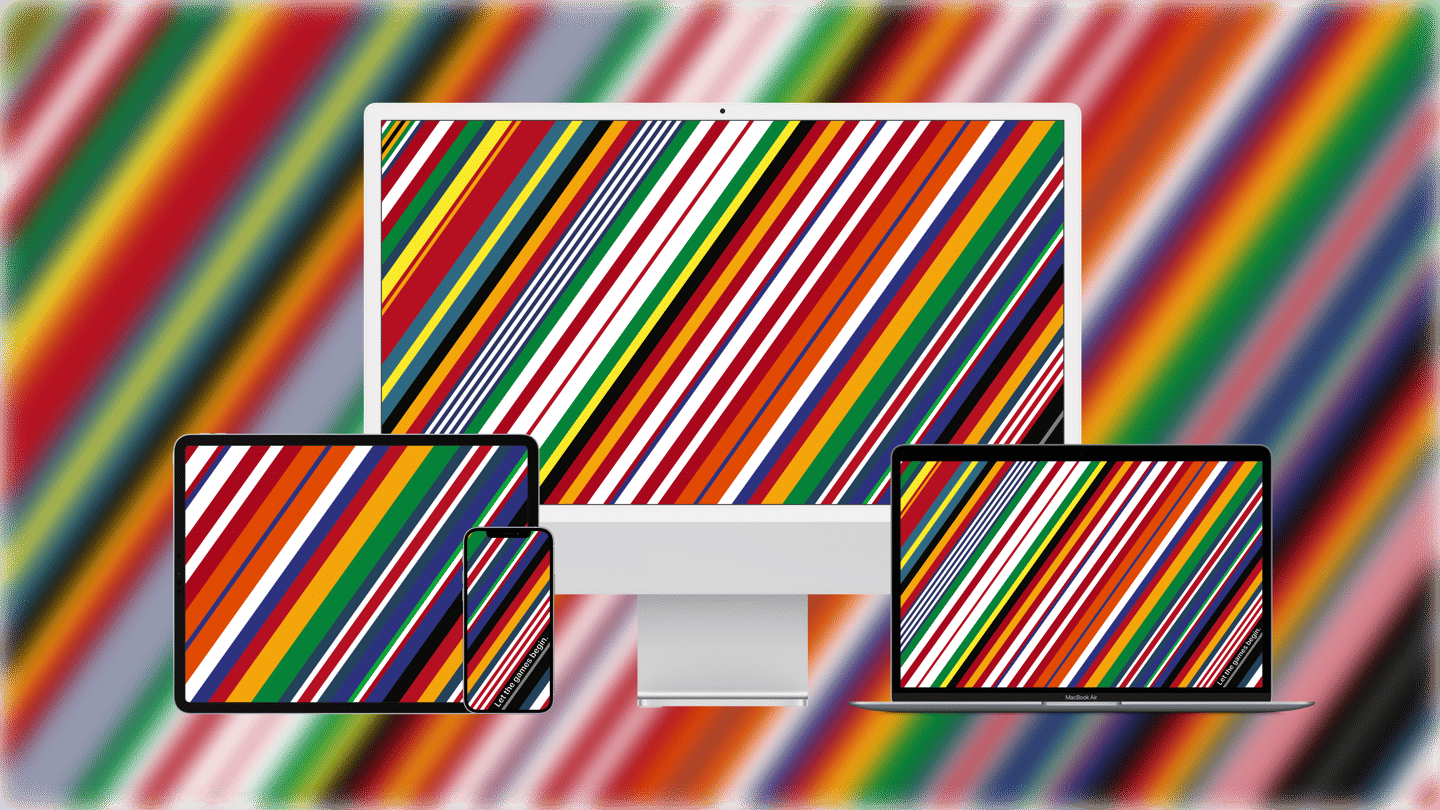
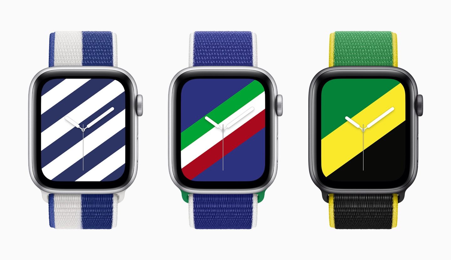
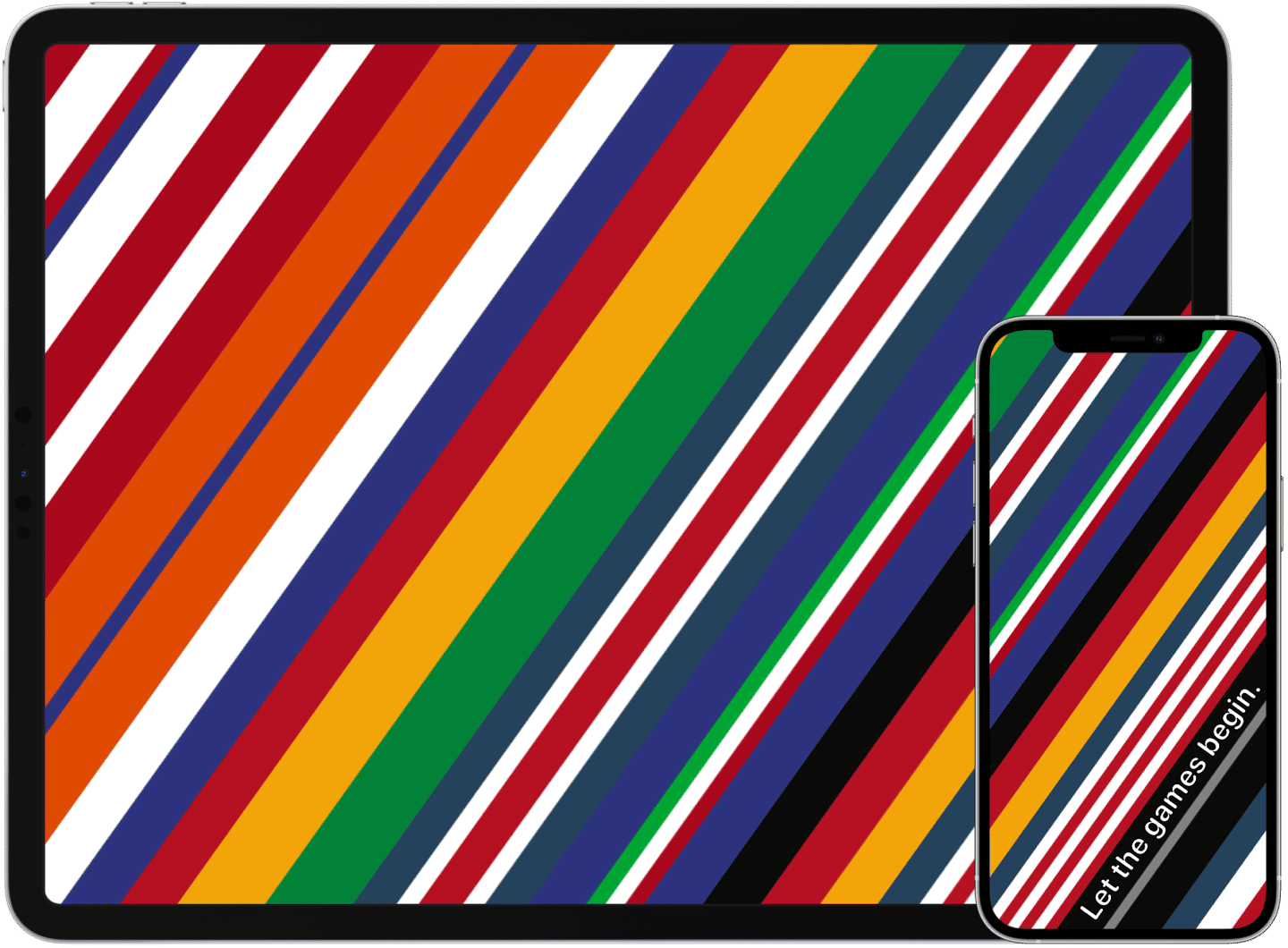
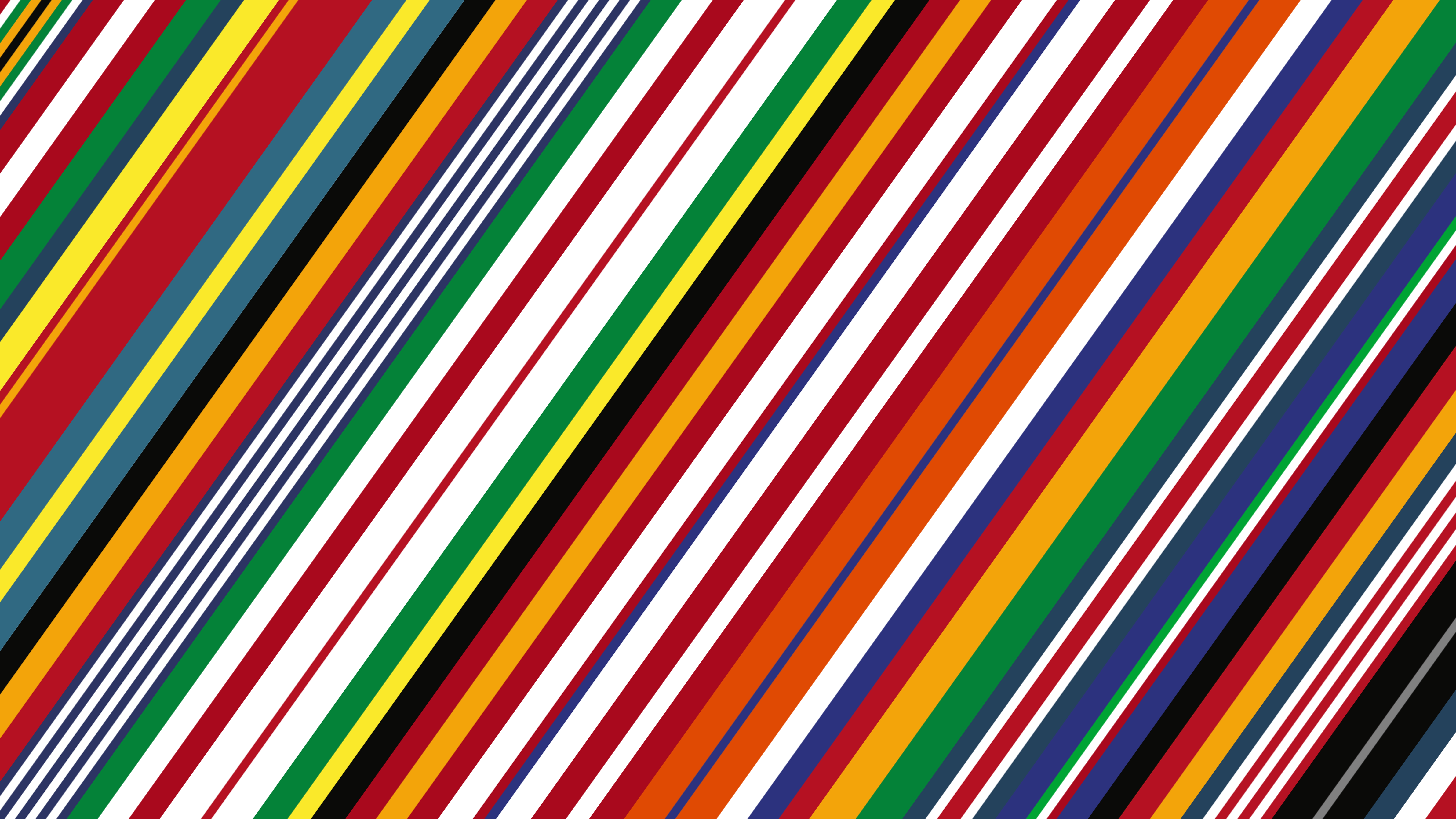
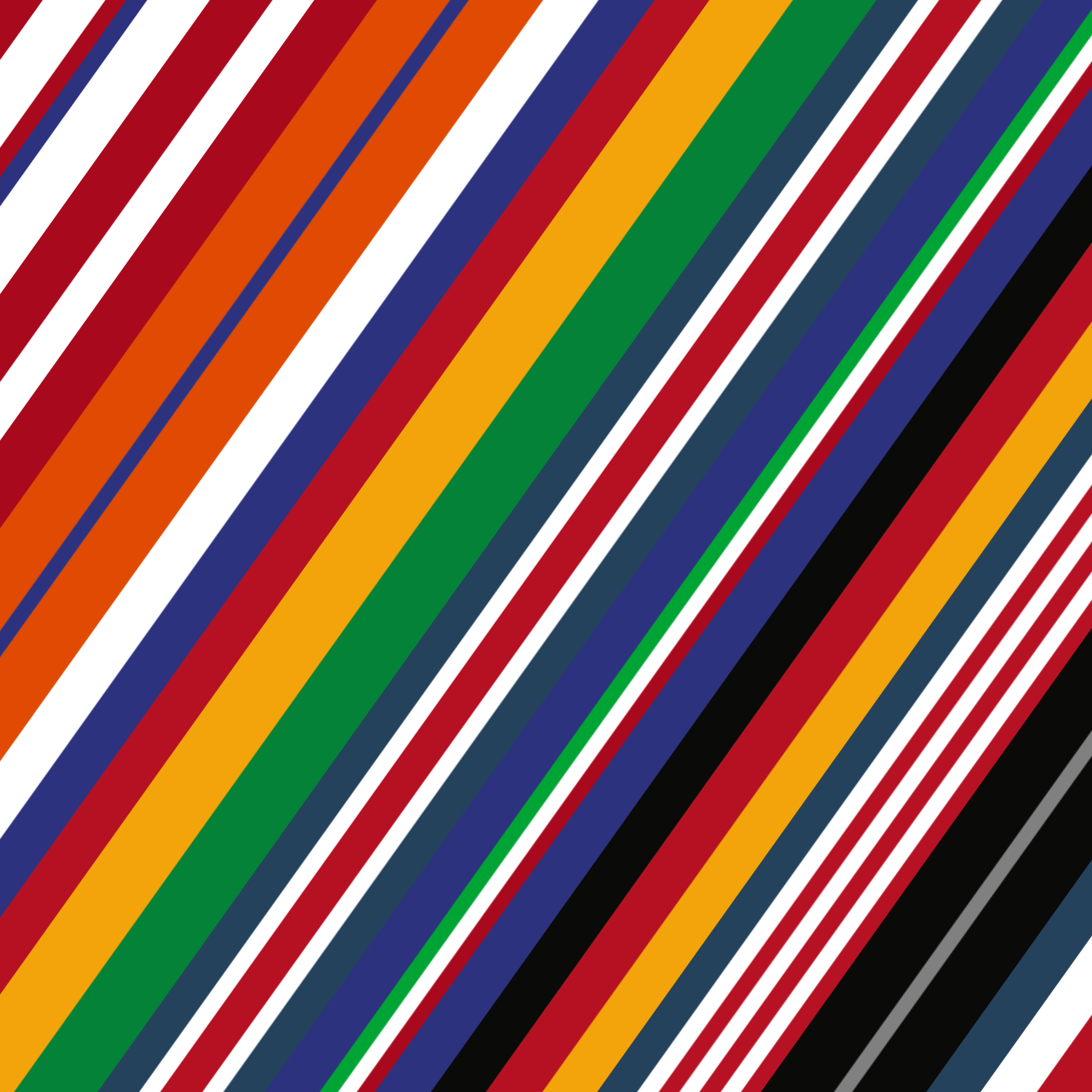
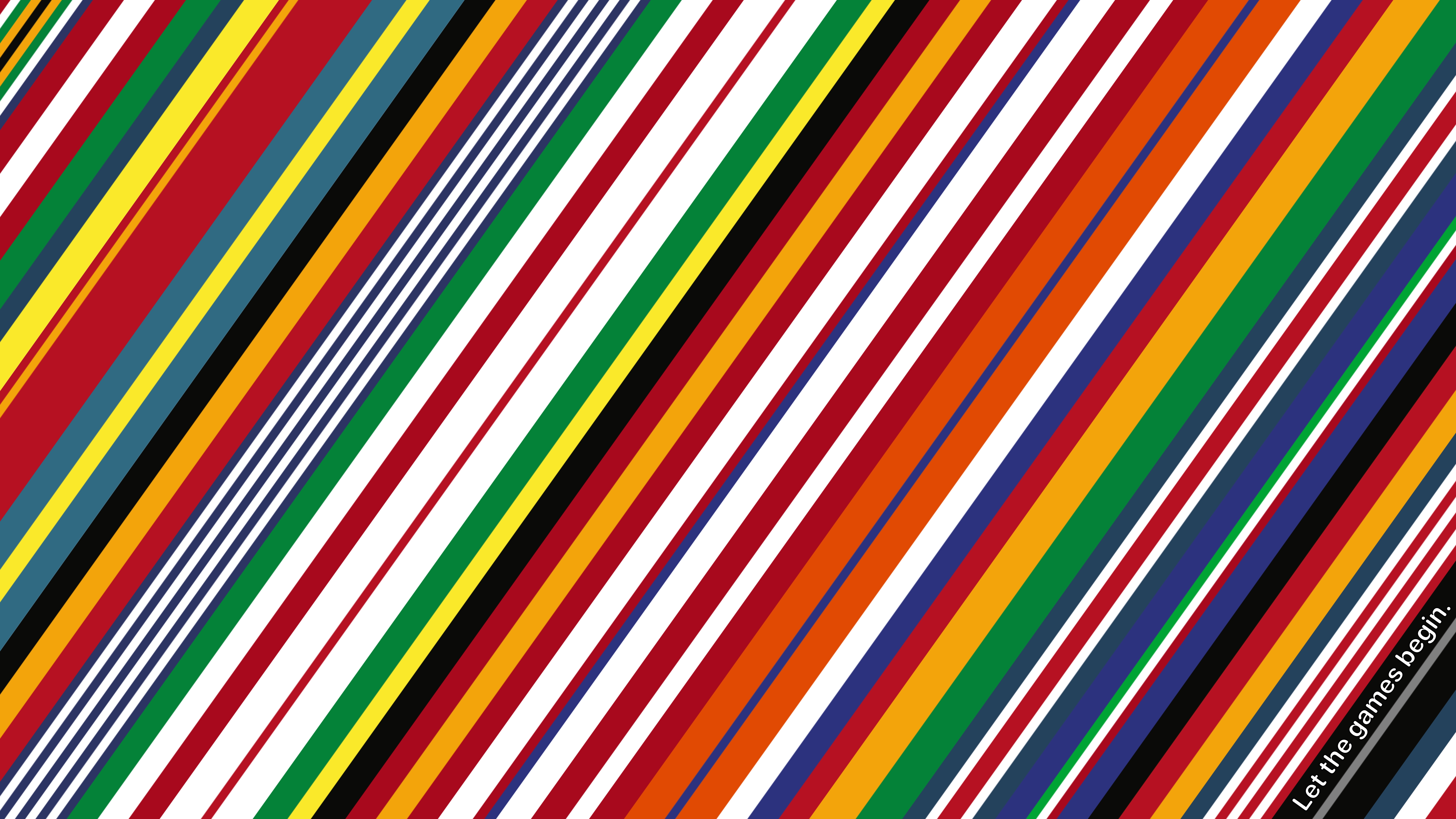
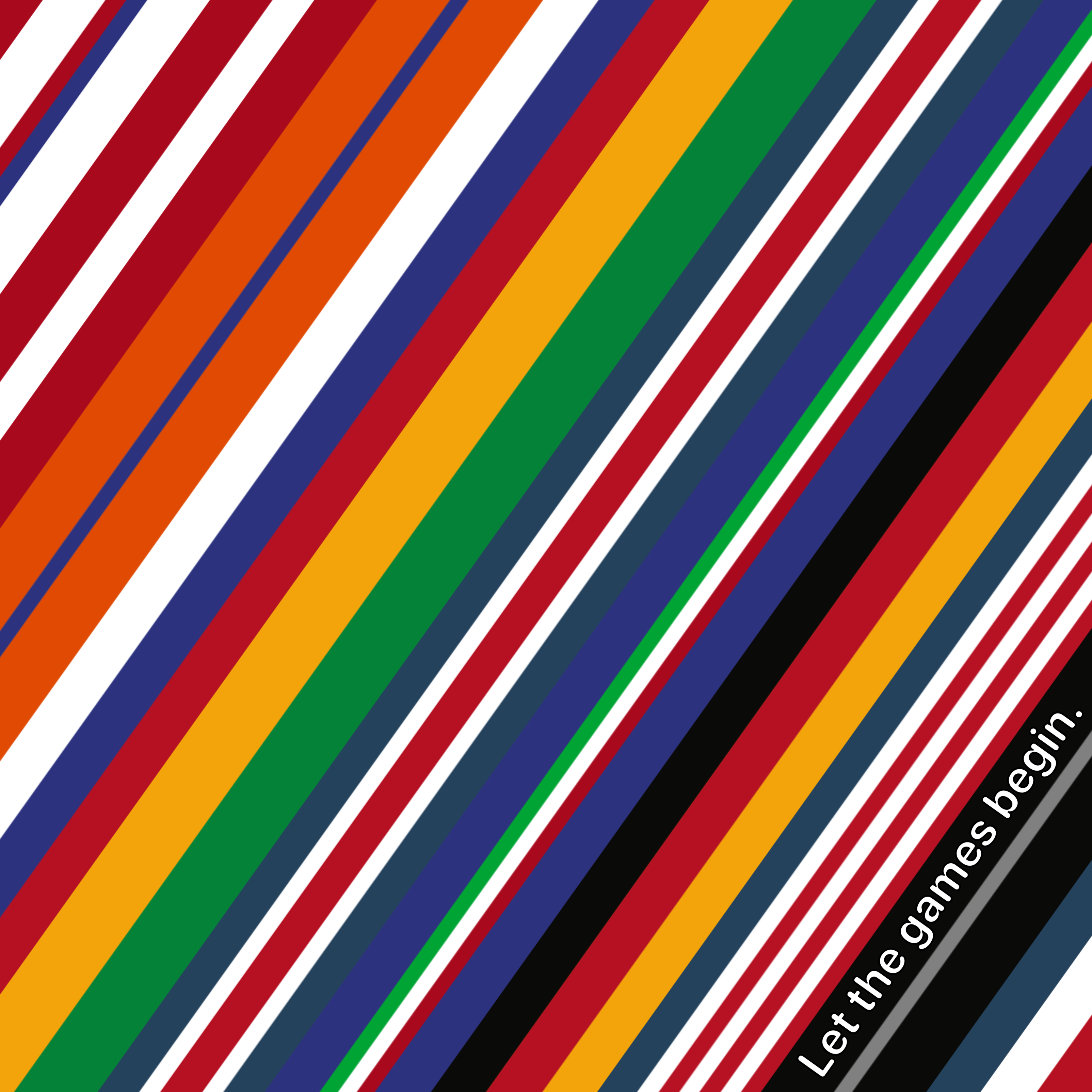
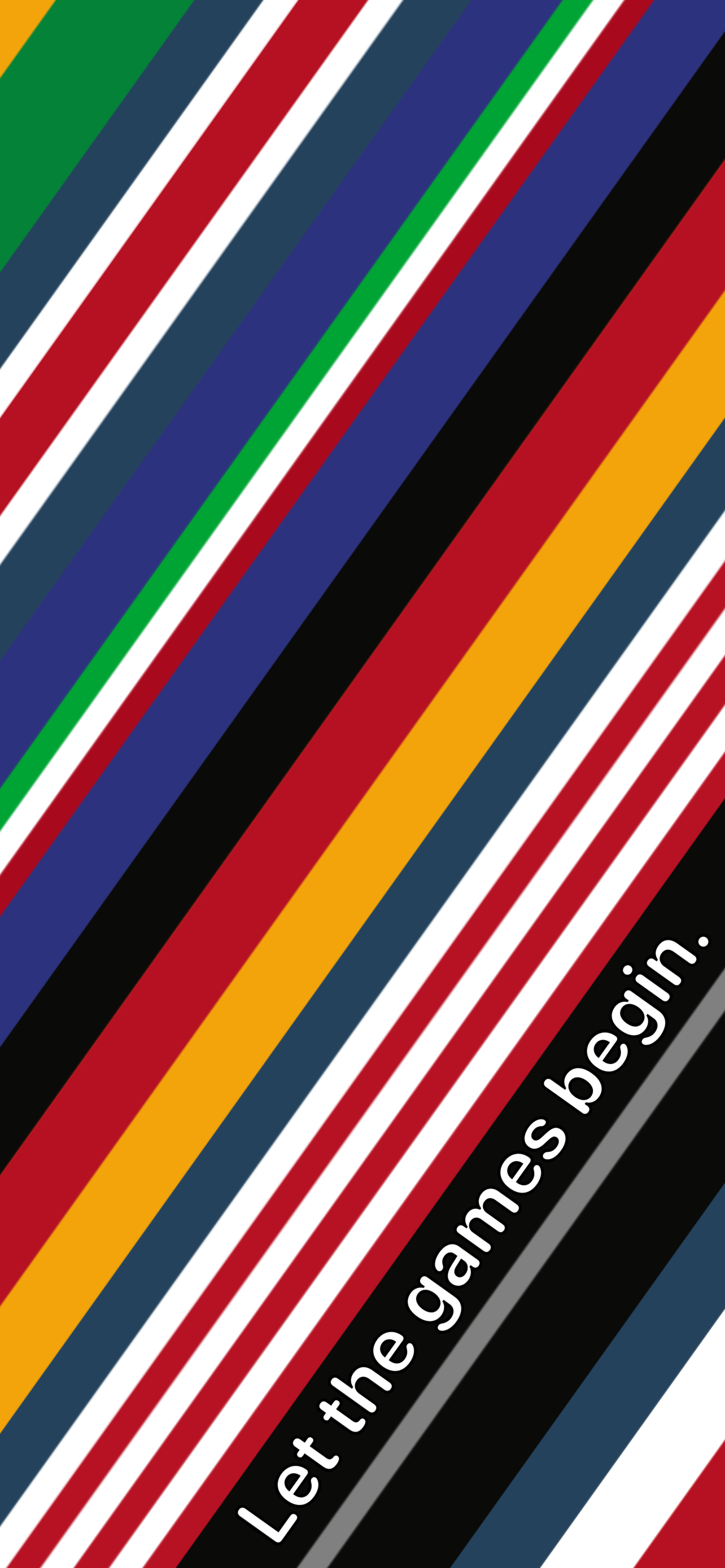
What I love about these faces is that they capture each country’s signature flag with a simple, understated stripes. It struck that many flags use the same color schemes, meaning several faces look similar, though none identical, and they look great as a cohesive collection.
I’m happy to get this out in time for the Tokyo Olympic Games, which start this week. Ever since I was a child, I’ve loved watching the Olympics. I remember laying on my stomach in front of the TV for hours with my family, building card houses and rooting for the athletes. It’s one of the few times that, worldwide, we come together in friendly competition. To me, these stripes bring a sense of harmony to all the countries involved.
Creating the Wallpaper
In a past life, I wanted to be a graphic designer, so it was fun to bust out Pixelmator Pro and see what I could make with it. It was fun, but it wasn’t fast. I haven’t done much with graphic manipulation since taking a Photoshop class in high school.
Still, after downloading the press images from Apple’s Newsroom site I set to work. I painstakingly matched colors, and made sure that the angle and width of each flag stripe matched the watch face.
It took me (more than) a few hours — and many layers1, errors, and do-overs — to get everything just right. I even tried to match the order in which the stripes are stacked based on the window installations at the Apple Stores.
Here’s a time-lapse showing a bit of the process:
Downloads
This wallpaper comes in two variants: International (plain) and International Games (“Let the games begin.” tagline), and in three sizes: 6K, Tablet, and Phone. You can download the full versions below. I hope you enjoy them, and the Olympic Games. Good luck to all the athletes!
If you’d like to see these designs in the physical world, in addition to the digital one, I’ve released them as shirts in several different versions, too!.
This was the first time in years that I’ve experienced true data loss on my computer. Even the M1 Mac mini wasn’t prepared for the pixel count and layers I threw at it. Luckily, things didn’t hang up until I tried to save the final version after exporting these wallpapers. It’s a bummer that I lost the last couple hours of work so I can’t easily go back to made adjustments. I’ll take it as a painful reminder to manually save often even in our AutoSave world. ↩︎
I rediscovered the Linky app this week. It’s magic for sharing links to twitter because you can create an image with highlighted text from the article. It’s also great for sharing photos.
I like Microsoft’s new emoji set! Their design language is changing, and these now fit right in. The Verge’s Tom Warren has a great side-by-side comparison tweet. Their animation is also intriguing. I think it’s the right direction, but we’ll have to see in practice. If it’s a good idea, it’s doubtless that the other platforms will follow suit. Google’s got new dark mode magic for their emoji, and it remains to be seen what Apple will do.
To each their own, but a hard-and-fast rule like “I DONOTANSWERUNSOLICITEDEMAILS,” makes me a little sad. If no one answered unsolicited emails, we’d rarely answer any email at all. I know that’s the point, but email is one of the few open platforms left for reaching out to (nearly, I suppose) anyone. I’ll note that later in his article, Professor Knuth admits to sending emails to strangers, “When I believe that the recipient won’t be bothered by my request.” I’d argue that is precisely the case for most messages that people send — it’s not meant to be bothersome. I, myself, got an email from a stranger last night with a comment and question about an article. It was delightful.
After discovering her latest single, I fell down the rabbit hole of Chelsea Cutler’s music last night. She’s got a gorgeous voice — so emotional and pure. Her latest full album was a collaboration with Jeremy Zucker in which they performed live for the internet.
Thanks for reading! If you found these things interesting too, or have something exciting to share, please drop me a line on Twitter!
Amazon is trying something weird and new (but also old) in the reading space. It’s called Kindle Vella, and here’s the introduction video. Basically, it’s books (or “stories”) that are released over time in separate parts. Yes, like TV shows or old-time magazine stories. I’m here for it! Many other media formats are successful using the serialized model, and I can see it working well for books too. At the very least, it’ll keep the conversation going while the story gets released.
What I’m not sold on is their business model. It’s too complicated by half. Personally, I think Vella would be ideal as a subscription service, just like video streaming services. Or have the author set a price for the whole story. I believe the token system will be a barrier for users.
One more suggestion: Amazon should use “chapters” not “episodes” as the term for a single chunk of the story. Maybe I’m old school, but “episodes” doesn’t feel right for a written story.
My happy place for writing, coding and learning. Device wallpapers are the built-in default one for iPadOS 15, and the built-in “The Lake” on macOS Big Sur. ⌘
Heads up, I sometimes use affiliate links for the stuff I like. If you shop using them, I’ll get a small commission at no cost to you.
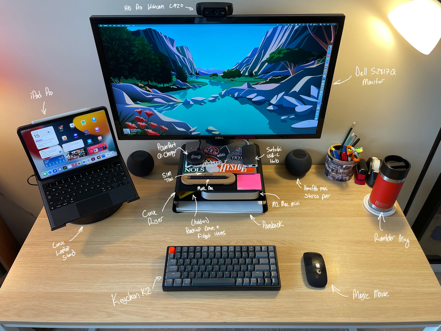
For the past 18 months, I’ve worked primarily from home. I’ve spent that time honing in on my ideal desk setup. Here’s what it looks like these days for writing, coding, creative design, and other internet indulgences.
The Office
I’m fortunate that my wife and I live in a townhouse with an extra room that previously went mostly unused. So when the pandemic hit and my job went fully remote, it became my hub for planning, live-streaming, and other content creation.
The room is located at the front of our house, with windows that look out into our neighborhood. It’s pleasant to see families walking dogs or kids playing in the street.
These days, I’m doing less streaming and fewer video calls, but it’s still beneficial for my wife and me to have separate spaces. I retreat here to listen to music, to read, and to write. Unfortunately, the office gets chilly in the winter, so I invested in a Vornado OSCTH1 Oscillating Space Heater under the desk. It’s small, looks nifty, and works well, but sadly, I can’t automate it with HomeKit.
What I’d Like to Improve in the Office
A comfy chair for putting my legs up and reading. There’s no room for it now, so that will stay on the wish list until we move somewhere bigger.
Desk: The desk itself is sizable with a white metal frame and light wood-veneer desktop. I got it from a friend after he moved, which was welcome since my old college dorm desk felt cramped. Although I didn’t pick it out, I’ve been pleased with its expansive flat surface and understated design.
Computer: The main feature of my desk is, of course, my desktop computer: an M1 Mac mini. 2020 confirmed that my 1-port, fan-less MacBook was no longer up to the task of everything I wanted to throw at it. Live-streaming, video production, Zoom calls, and too many open apps brought it to its knees. Luckily, Apple released the M1 Macs near the end of 2020, and I’d already been eyeing a desktop instead of a laptop considering my new far-less-mobile computing needs.
I maxed out the Mac mini with 16GB of Unified Memory (RAM) and 1TBSSD, with the intention that it should last me a good long while. Seeing as my severely limited MacBook lasted me five years, I’m confident in the mini’s longevity. Also, something is satisfying about purchasing what some people consider Apple’s most powerful prosumer machine for less than $1,400. My first-hand experience is that in the past six months the Mac mini has rarely broken a sweat no matter how hard I push it.
Display: One reason I could seamlessly move to a desktop computer is that I already had a decent monitor. I scored a killer deal on a Dell 4KS2817Q monitor a few years back, and while it’s nothing to write home about, it works well enough for now. The size is excellent, and it’s got a sharp screen. Occasional flickering and color weirdness, plus being slow to wake, are all that keep it from being great. Regardless, its large, flat base is perfect for plastering stickers.
Accessories: The extra ports on the back of the monitor are helpful since my options are somewhat limited on the Mac mini. Passed through the monitor and into the Mac are my webcam and external hard drive. Moving away from a laptop meant I lost my webcam. Options were scarce, and prices still inflated from the pandemic shortage, but I scored a Logitech C920x, which as served me well thus far. It features 1080p resolution and a decent microphone. No complaints here.
My external hard drive is exclusively for Time Machine backups, and I’ve been using this Seagate Expansion 2TB portable drive for five years now with zero issues. The last couple of macOS updates have significantly sped up Time Machine backups when formatted with APFS, so my desire for an external SSD has waned. Between iCloud Drive and Time Machine, I feel good about my backup solution.
The way my Mac sits on its shelf in the Twelve South Curve Riser stand makes getting to the ports on the back a challenge. My solution is to attach the Satechi USB-C Multi-Port Adapter which used to live in my laptop bag. It lets me plug in the occasional temporary USB device or SD card without fumbling around behind the computer.
The Riser stand raises my monitor to a more comfortable height and gives me cubby space for stowing away the backup drive and a Studio Neat Panobook, which I use for sketching ideas out on paper. It also provides a place for an Anker Qi charger for my phone, a sticky-note stack, my favorite pen, and a SIM card tool. The pen, also from Studio Neat, is the Mark One, which features a satisfying click, is a pleasure to hold, and writes like a dream. The SIM card remover is the best tool I’ve found for digging earwax out of my AirPods. Gross, but effective.
You’ll find your typical collection of pens, pencils, and paperclips on the top right corner of my desk, plus a stapler and tape dispenser; both get used with surprising frequency, so I like having them accessible. My favorite non-tech item on the desk, however, is my mug. The Yeti Rambler 12oz Bottle with HotShot Cap is magic at keeping drinks hot or cold all day. I love the lid — you can drink from anywhere around it then seal it closed with a quick twist. For more color options, you can purchase the Jr. version (it’s identical in every way, but comes with a different lid), but I do not see the striking orange color that I have anymore.
Mouse & Keyboard: The mechanical keyboard hype finally got to me, and I was gifted a Keychron K2 with brown switches. I adore the RGB backlighting effects and the overall aesthetic of this keyboard. I’m not picky when it comes to typing feel, but I have to say the clickiness is pleasing. It’s a pretty tall keyboard, so I’m eying a slimmer version to keep my wrists happy, but, honestly, I’m delighted with the K2. I keep a quieter Magic Keyboard around for video calls so that my clickity-clacks don’t disrupt others.
My mouse is the Magic Mouse 2. It seems like an ergonomic nightmare, but my hands prefer its low profile even more than using a trackpad. Multi-Touch scrolling and gestures with the Magic Mouse are perfect, and it’s hard to imagine giving them up for any other mouse.
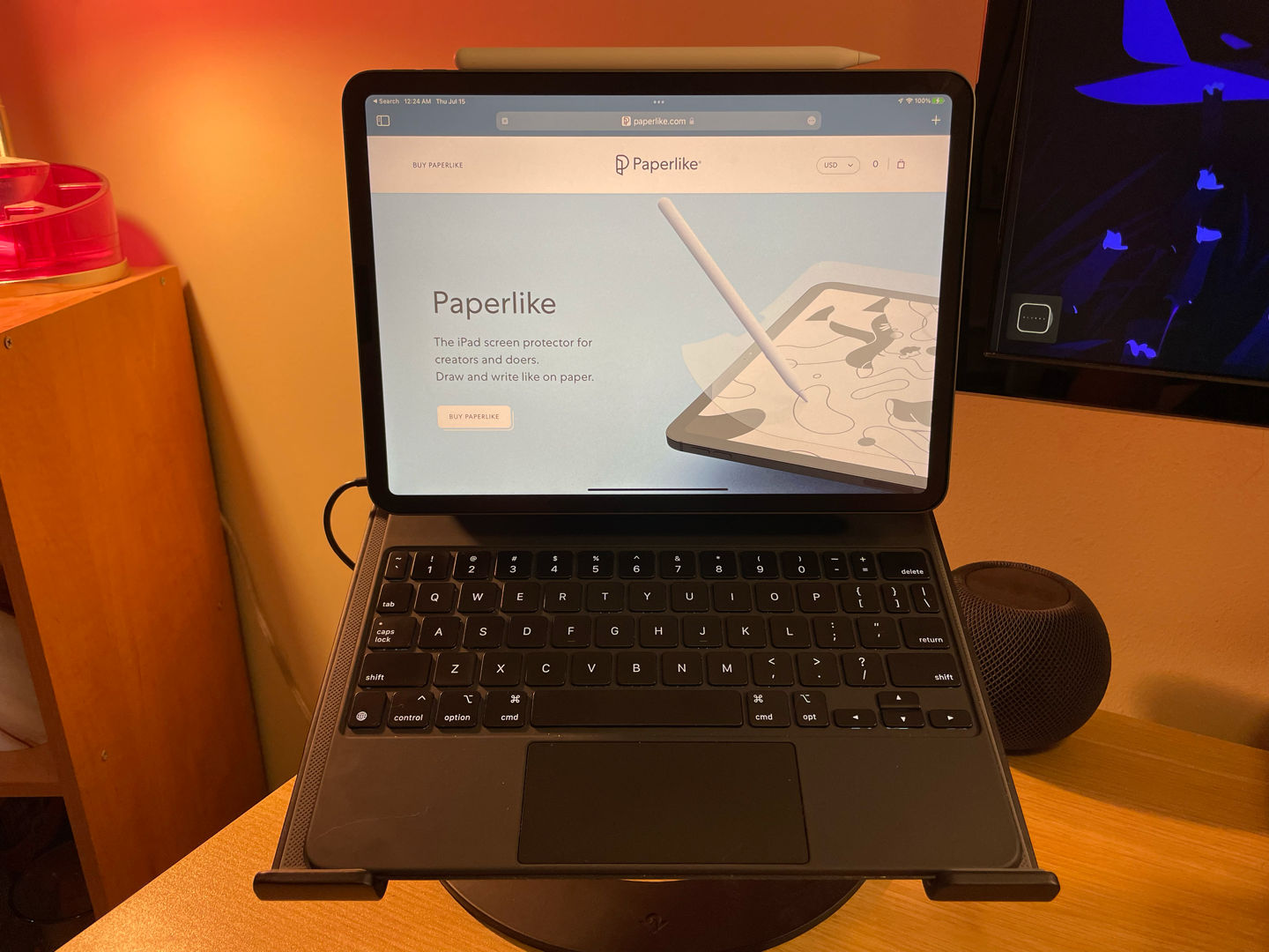
iPad Pro: I chronicled my recent iPad Pro purchase not long ago, so I’ll give only a brief summary here. The iPad Pro (2020, Wi-fi, 128GB, Space Gray), when paired with the Magic Keyboard, is a complete laptop replacement for me, and it did indeed replace both my old iPad Pro and MacBook. It’s what I’m using to write and edit this very piece. I got the Apple Pencil to go with it because of course I did. A Paperlike screen protector is currently installed on the screen, but I’m not sure that will last. I’m so excited to use Universal Control later this year because I
very often flow between devices depending on the task at hand. The iPad rests on the companion to my monitor stand: the Twelve South Curve laptop stand.
What I’d Like to Improve on the Desk
I’m intrigued by a sit-stand desk. I’m convinced that I would frequently use it in standing mode, but it’s not in the cards anytime soon.
A more ergonomic and comfortable desk chair. The Target Essentials one I’ve got now came with the desk, and it isn’t very good. Quality office chairs are just so costly!
An Apple monitor. It’s too bad that Apple got out of the consumer monitor game. I’ve got my hopes up for a grand reintroduction, which I wish-casted in this Home Screen feature for MacSparky.
While my USB-C adapter works fine, I’m curious about the Thunderbolt docks that have been out for a couple of years. But they’re expensive, and I haven’t seen one that appeals to me aesthetically, and, most importantly, I rarely need to plug accessories into my Mac anyways.
Audio
One place where macOS completely falls down is when you try to route audio to speakers that are built into a connected monitor. It doesn’t “just work” as it should. I’ve had to purchase software that taps into the kernel to merely adjust audio using keyboard media keys. It’s nuts!
Rather than mess with that weirdness, I purchased two HomePods mini and set them up as a stereo pair. I use AirPlay to send most of my audio (music, podcasts, and videos) to the HomePods and keep alert sounds set to play through the tiny speaker within the Mac mini’s enclosure. Though small, the stereo paired HomePods sound really good! Having a HomePod in the office is also nice for Siri requests, for sending audio from my phone, and for getting the whole house rocking by playing music on all the AirPlay 2-enabled speakers we own.
For personal audio, I’m spoiled by the AirPods Max. I used the Beats Solo 3 Wireless headphones for years, but they were always uncomfortable for even moderate-length usage. The AirPods Max look great in all colors (I’ve got Space Gray), sound incredible, and feature fantastic noise-canceling, which I use to focus in on a task. I can wear them for hours and hours with no discomfort. In fact, I’ve been wearing them for the past — checks watch — four hours straight. So comfy! While expensive, I intend to get many years of use from these headphones and have no regrets about their purchase.
To keep them accessible, I’ve stuck a Brainwavz UltraJ Headphone Mount under my desk for hanging the AirPods Max. It’s got a convenient place to hold a charger cable, too.
Cable Management
When I set up the Mac mini, I told myself it was time to get the cables trailing behind my desk under control. On more than one occasion, my office pals (see below) tangled themselves in those cords, and my desk devices only narrowly avoided disaster. So I spent a couple of hours with Command strips, cable clips, and twist ties to route everything neatly under the desk. I’m very satisfied with the result.
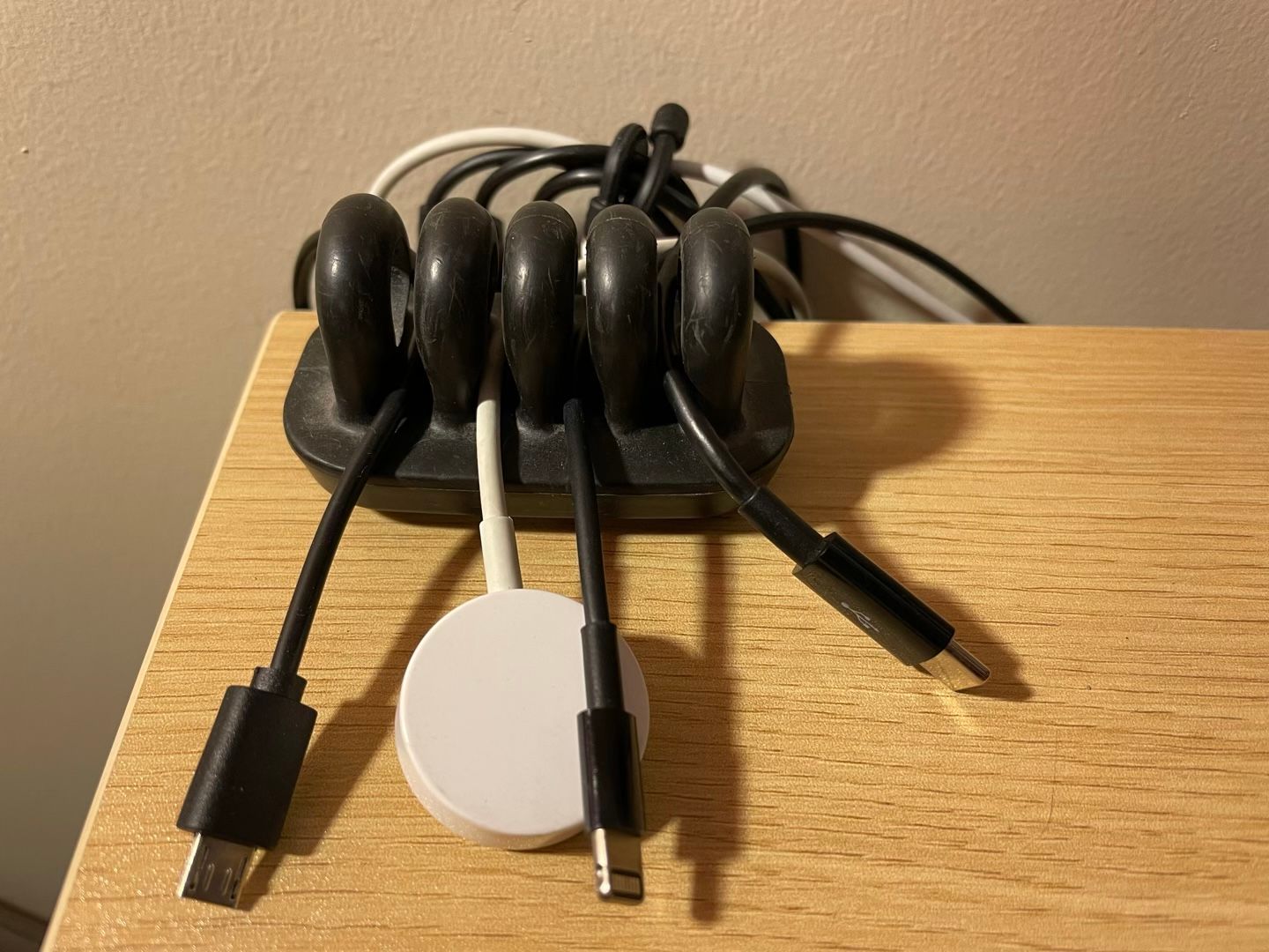
For the devices that are always plugged in, I stuck a surge protector power strip directly to the underside of my desk and filled it with charging bricks and cables. An Anker PowerPort 5-Port 60WUSB Wall Charger does the trick to charge other devices easily. It, too, is stuck to the desk, and I keep all the usual suspects plugged in and ready: Micro-USB, Lightning, USB-C, and an Apple Watch charging puck. They’re kept ready for action using a cable organizer similar to the OHill Cable Clips.
I’ll note that my PowerPort developed an issue after the warranty period. It now emits a high-pitched whine when charging anything of even mediocre wattage off the USB-C Power Delivery port. Otherwise, it’s great.
Lighting
I don’t have much to say here except that I’ve got two lamps connected to HomeKit that I can control via Siri and automation. One has Philips Hue bulbs (although today I would go with Nanoleaf bulbs instead to ditch the hub), and the other is connected to a simple Meross Smart Outlet. I enjoy adjusting them with my phone and voice, but the most useful automation I use is one I call by saying, “Hey Siri, video call.” That brings the bulb I have pointed toward my face to full brightness, which greatly helps to make my video look professional.
What I’d Like to Improve in Lighting
Multi-color lighting strips and light panels call to me. I think they’d look sick with my RGB keyboard lights and would help set the mood for focusing, relaxing, etc.
Printing & Scanning
It may sound old-school, but I still have a need to print and scan physical documents. My last printer finally died after nearly a decade of hard use at home and each summer in the camp office. I replaced it with an HP Color LaserJet Pro M255dw Wireless Printer. The laser toner should keep me from needing to purchase ink so frequently, and it makes the device a speedily little devil. Furthermore, after years of never quite remembering the correct way to insert paper to print double-sided on my last printer, I sprung for a duplex model.
While I accomplish a good portion of my scanning needs with Scan Thing on my iPhone, some larger projects led me to purchase an EPSON FastFoto FF-680W Wireless Scanner. With it, I’ve been able to digitize thousands of old family photos and get them into our iCloud Photo Library. As the name suggests, it’s fast and can power through stacks of images or documents with ease. The included software also adds OCR to PDFs, which makes searching their contents a breeze.
Office Buddies
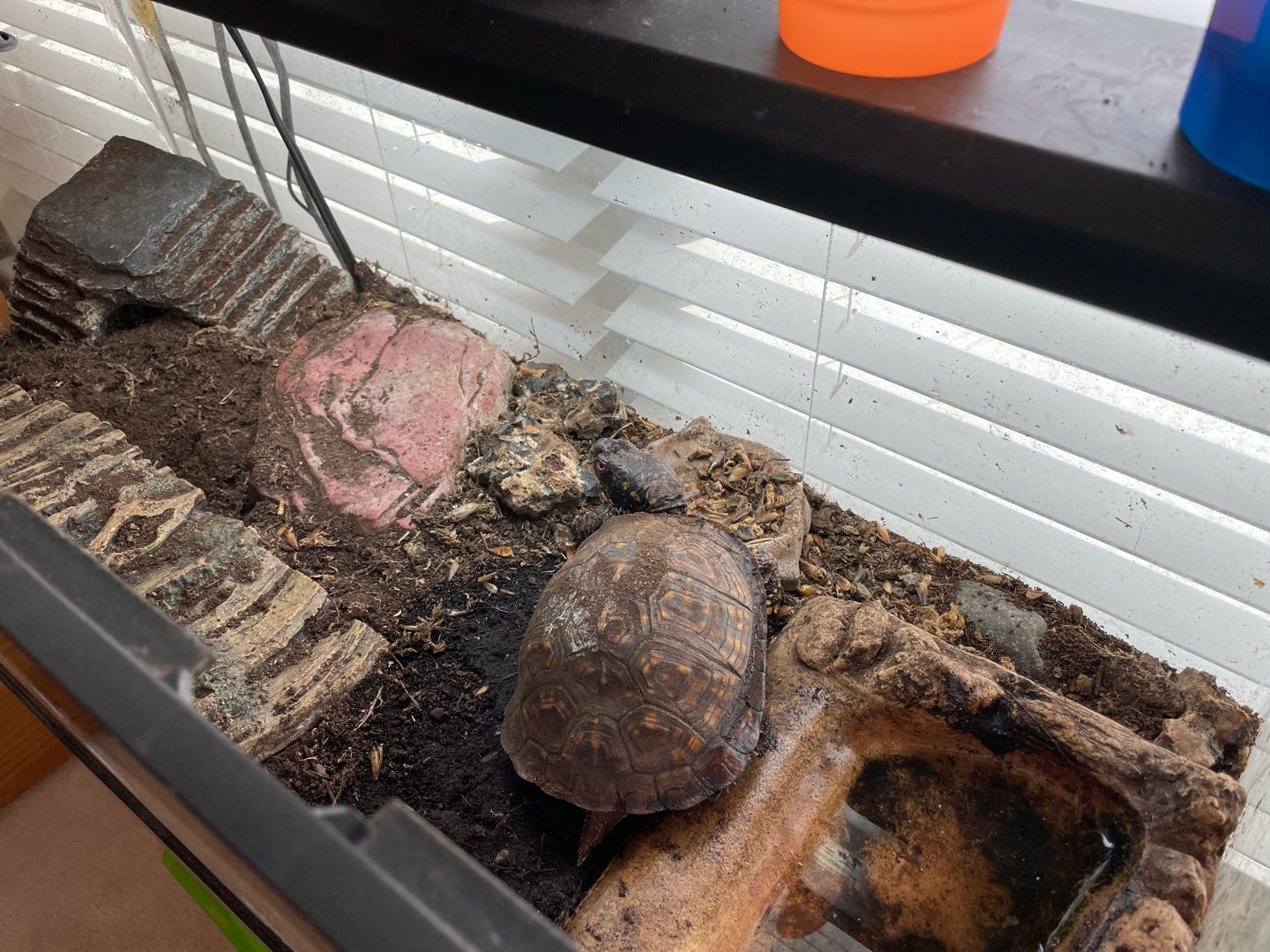
While I call it my office, in truth, I borrow the space from our Box Turtle, Remus. He gets the prime real estate directly in front of the window.
Most days, I’m also joined by our Golden Retriever, Phin, who alternates between laying on my feet and in the most uncomfortable-looking spots he can find. That is when he’s not gnawing on a bone or playing with one of his many toys.
Occasionally, our Maine Coon cat, Ollivander, deigns us with his presence. But it’s usually only to jump onto the desk as a reminder to feed him that can’t be ignored. I kid; he’s quite snuggly and enjoys napping in my lap while I work.
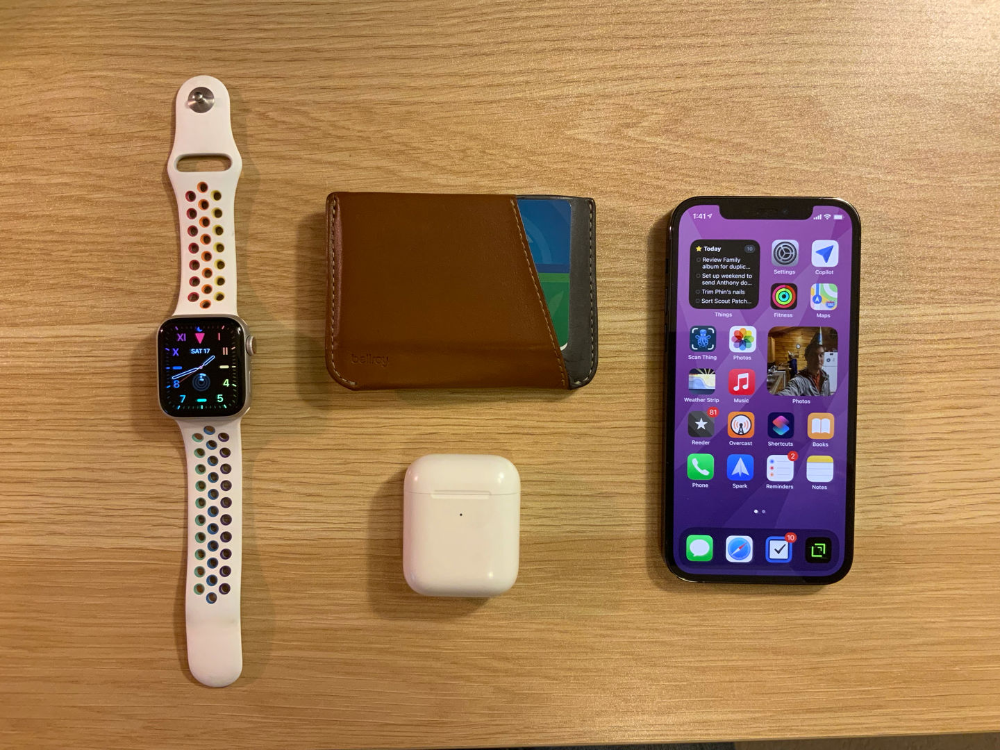
These devices don’t live in the office, but they get a lot of use even while at my desk. Here’s my everyday carry, as they say.
iPhone: A few years ago, I got on the iPhone Upgrade Program from Apple. I haven’t taken advantage of the annual upgrade every time, but I couldn’t resist the return to a flat-edged design this past year. So I’m rocking an iPhone 12 Pro in Pacific Blue with 128GB of storage. It’s an incredible device, but I regret not going for an iPhone 12 mini. I no longer have to do significant parts of my job from a phone while on the go, and when I tried one in hand, the mini’s size felt ideal. Losing the LiDAR scanner would be a bummer, but that’s about the only thing I think I’d miss. Not that you asked, but I’m a left-hand front pocket, screen in, and top down kind of guy.
Apple Watch: I’ve been wearing an Apple Watch ever since getting a Series 2 back in 2016. I’ve got a Series 5 Nike (40mm, Cellular, Silver) strapped on my left wrist these days. The always-on display was the selling point for me, but I’ll admit that battery life has taken a hit. I’m crossing my fingers for significant improvements in that area for the Series 7. Like many Apple Watch users, what I value most about having a computer on my wrist is fitness tracking, glanceable notifications, and swift actions on the small device. In addition, having a cellular model allows me to treat the Apple Watch like a connected iPod for listening to music and podcasts while on the go without my phone.
AirPods: Perhaps my all-time favorite Apple device, my AirPods (2nd generation) are always in my right-hand front pocket. Fours years on, I still appreciate never needing to untangle a wire when removing the buds from my pocket. Apple nailed the magic with the original AirPods, and they just keep getting better.
Wallet: I’m notorious for misplacing my wallet. It’s happened more times than I’m proud of, but I can’t remember a time that I’ve ever actually lost it for good. It’s usually gone long enough to finally purchase a new one right before finding the old one in a totally-obvious-yet-overlooked spot. That’s what happened for me to buy the caramel-colored Bellroy Micro Sleeve Wallet. On the bright side, I now have two wallets that I love. My older one was a gift from my wife, the Daily Carry Wallet crafted by an old camp friend who has an excellent shop on Etsy (it could be my wallet pictured on the item’s page seeing as my initials are embossed within it). Both are well-made, minimalist wallets. I’ve been using the Bellroy lately because its pouch design can keep smaller cards and coins from falling out. It lives in my right-hand
front pocket alongside the AirPods.
I’ve got a running list of all my gear going here.
I’ve been reading David’s blog and listening to his podcasts for years and years, and in fact, he was one of my inspirations for starting HeyDingus. So it was a huge honor to see my name published on his site. I may have gotten a bit overzealous and wrote a mammoth piece about the apps I’m using and why, but I enjoy reading in-depth articles about the tools folks use, and I always aim to write things that I would want to read.
I hope you enjoy the article, and definitely check out the other Home Screen features on MacSparky. They’re a great inspiration.
The chief problem with this is thinking is that, for starters, it’s madness, but secondly, it results in a lot of wasted cash. If I look at just my three current devices (1TB MacBook Air, 512GB iPad, & 256GB iPhone), I am overpaying for storage to the tune of nearly $800. That’s the value of an iPhone 12 or iPad Air sitting dormant in untapped (and likely never to be tapped) storage.
I’ve been consciously purchasing less storage for my devices based on real-life usage rather than “what ifs” for a few years, and yet I’m still afraid to total up my unused storage cost.
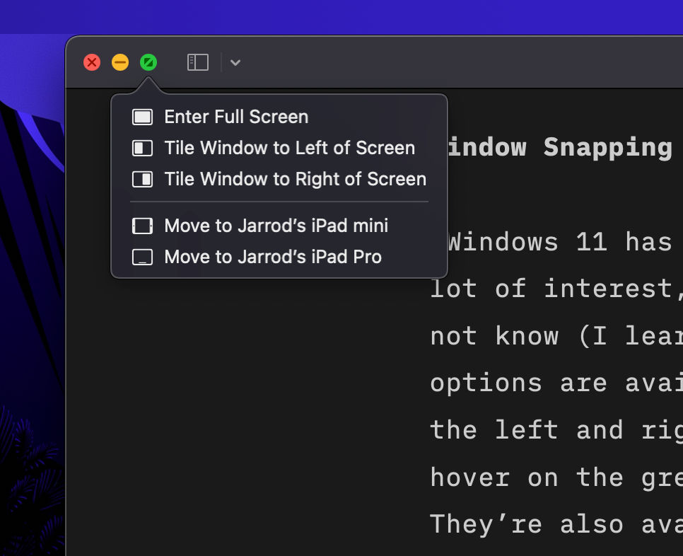
Windows 11 has new window snapping options that have drawn a lot of interest, yours truly included. But what you might not know (I learned only a few months ago) is that similar options are available natively in macOS. I don’t know how long the left and right snapping options have been hiding behind a hover on the green “traffic light” control, but they are handy.
How long have you been hiding there? Holding Option will change these to “Move Window” rather than “Tile Window”. ⌘
The default action tiles the window to a Split View within Mission Control and has you select a second one to fill the screen. However, I was pleasantly surprised that by holding the Option key it changes to “Move” rather than “Tile” and windows stay on the current desktop.
The result after moving the two windows to either side of the desktop. ⌘
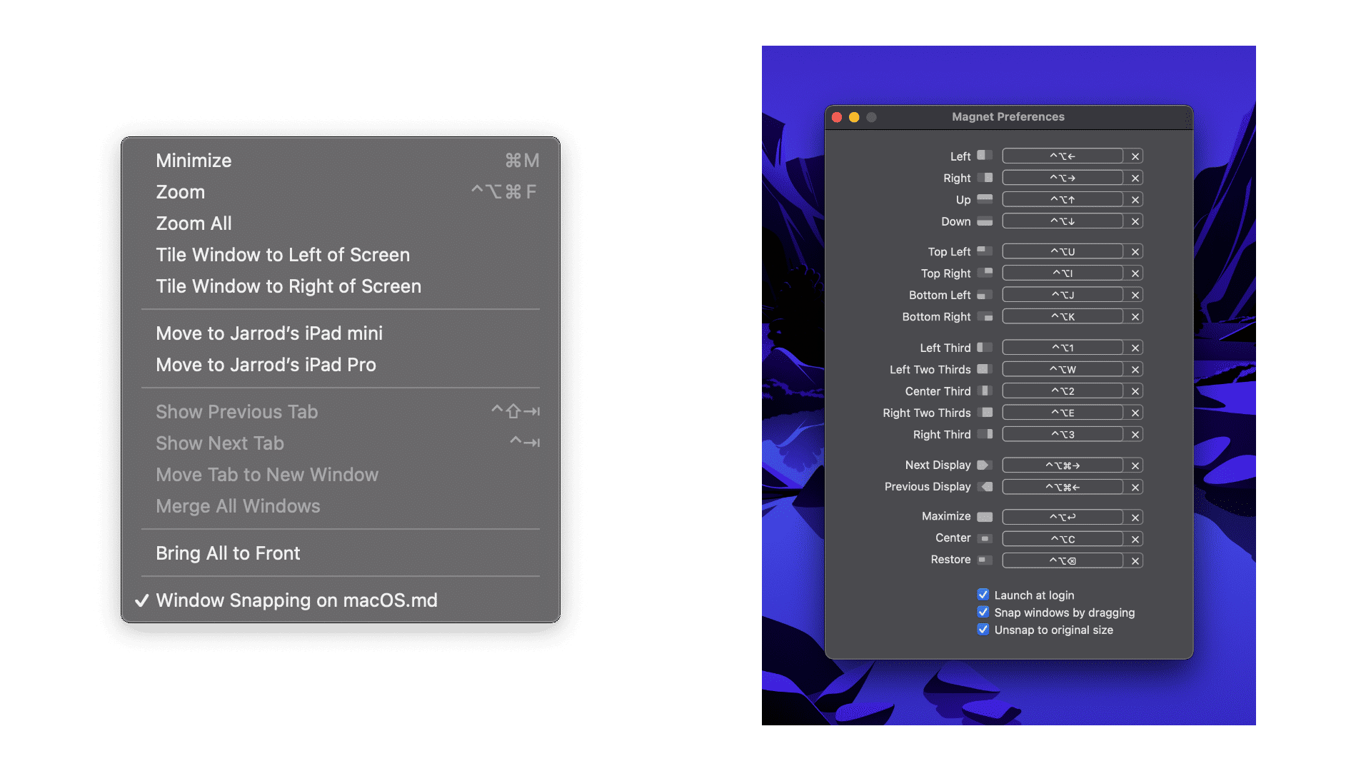
The same options are also available via the “Window” menu bar item, though without a default keyboard shortcut. For better window snapping and management in macOS right now, I highly recommend Magnet, available on the Mac App Store. It’s got more options and keyboard shortcuts.
Native window controls via the Menu Bar (left) and Magnet’s options (right). ⌘
That all being said, Windows will have the better implementation of window snapping come this October.
For years, I’ve heard about the Paperlike screen protector. Despite being interested, I never bought one for myself, having long been over using screen protectors in general. But this one seemed unique. As you might expect, it is designed to make the screen feel like you’re writing on paper when using the Apple Pencil.
To make a long story short, when I bought my new iPad Pro, it came with a bunch of accessories, including a Paperlike that the previous owner never used. So, I installed it and wanted to share my thoughts.
Installation
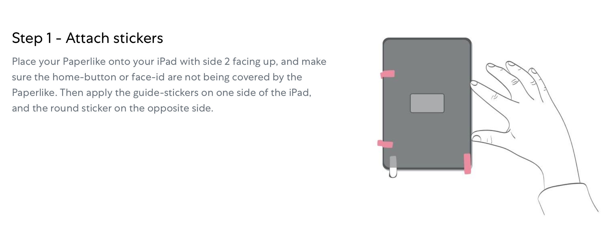
I’ll say this for the Paperlike company; they make installation as easy as possible. Not only do they have step-by-step instructions on their website anda video, they also include niceties that make the installation smooth. For example, they include sticker tabs (so that you have something to grab onto when positioning and peeling the protector), and a wet wipe and microfiber cloth (for cleaning your screen before installation), and an extra sticker for grabbing stray bits of dust after a wipe down.
These tabs help you align the Paperlike, and keep the iPad still during installation. (Image: Paperlike) ⌘
The only downside, which is no fault of Paperlike, was that the protector came with some minor creases. I imagine that it got a little bent during shipping from the previous owner. The result was that even after doing my best while placing the protector and then scraping as directed to catch and remove bubbles, that there are a few spots that the Paperlike retains bubbles and doesn’t stick to the screen.
The bright side is that I thought this would be an instant deal-breaker. One of the main reasons I stopped using screen protectors is because it was nearly impossible to install error-free. If I’d been given a pristine Paperlike, I think I actually could have done it. Even so, I’ve been able to overlook the bubbles for the sake of this review.
Paperlike In Use
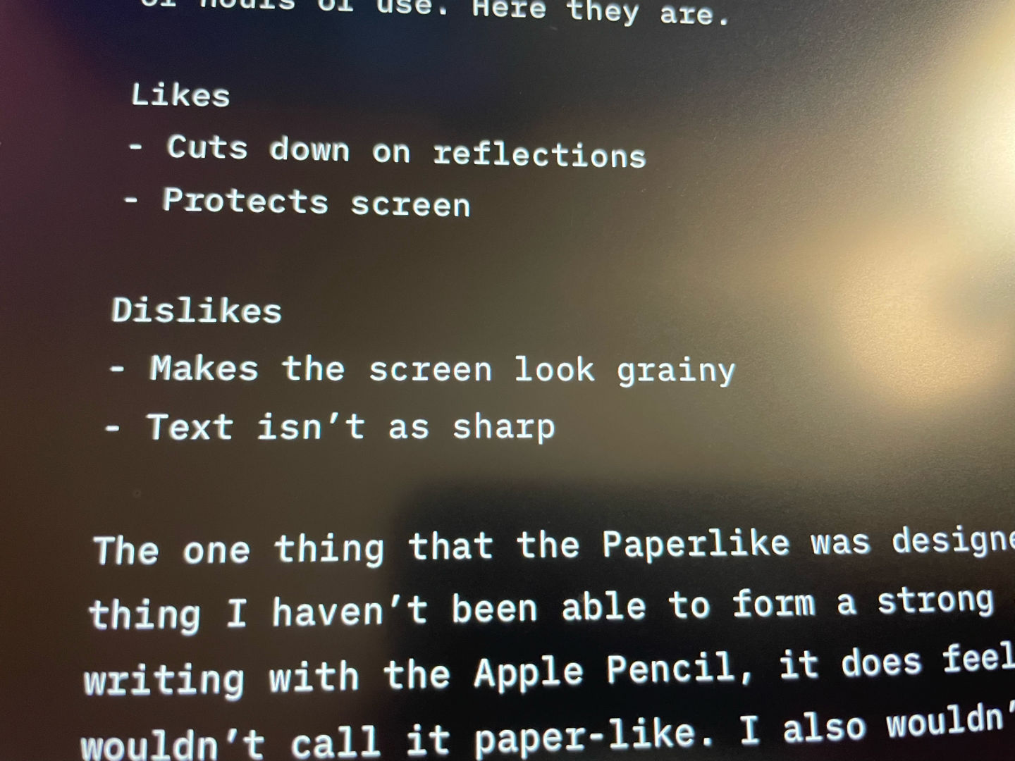
I’ve had a pinned note for weeks with “Likes” and “Dislikes” lists to fill with my opinions. Here’s the thing: I’ve had the same few items on the lists that I added within the first couple of hours of use. Here they are.
Likes
Cuts down on reflections
Protects screen
Dislikes
Makes the screen look grainy
Text isn’t as sharp
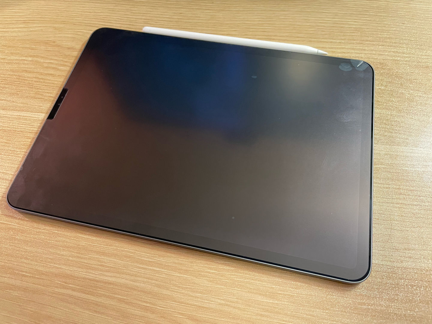
Blurry text on one of the nicest screens that I own is a bummer. ⌘
The one thing that the Paperlike was designed for is also the thing I haven’t been able to form a strong opinion on. When writing with the Apple Pencil, it does feel different; I just wouldn’t call it paper-like. I also wouldn’t call it good…or bad. The closest thing I can compare it to is writing on a chalkboard — a somewhat scraping feeling.
Overall, I haven’t disliked it enough to remove the Paperlike, but I also don’t think it will last me long-term.
What I have concluded, for sure, is that if and when Apple introduces an iPad with a matte screen — one that stays razor-sharp — I’ll be first in line to get it. Glare and reflections have always bothered me, and I can’t help but see them.
As for favoring writing on something that feels like paper, this doesn’t quite cut it. And I wasn’t unhappy writing on glass to begin with.
One more item for the “Likes” list that I noticed when getting my iPad ready for photos for this review: the Paperlike cuts down on noticeable fingerprints. This is the first time that I’ve wiped down the screen since I install the Paperlike, and while there’s certainly finger grease on the screen, the matte screen protector hides it well.
xkcd.com is best viewed with Netscape Navigator 4.0 or below on a Pentium 3±1 emulated in Javascript on an Apple IIGS at a screen resolution of 1024x1. Please enable your ad blockers, disable high-heat drying, and remove your device from Airplane Mode and set it to Boat Mode. For security reasons, please leave caps lock on while browsing.
Needless to say, I’ve been subjected to a subpar comic reading experience all this time.
The second season of Trying recently finished up. I think it’s a sleeper hit of Apple TV+. Not many shows’ second seasons live up to their first, but this one definitely did. But I actually wanted to link out to Maisie Peters who did one of the songs for the first season, and then was brought back to write the entire soundtrack for season two. Maisie’s music is soft, intimate, and lyrically beautiful. I can’t wait for her debut album due later this year.
My wife and I just got back from a trip out to Washington in the Pacific Northwest. It was a gorgeous trip and we can’t wait to get back. I tried out the Tripsy app (iPhone, iPad, Mac) to consolidate all our plane tickets, hotels, car rentals, and destination into an itinerary, and it worked pretty well! I particularly liked that you can just forward emails to the service to have them automatically added to the itinerary. It got a bit confused by having both our tickets saved and gave me double notifications for things like airport gate changes, but I’ll certainly be using it again for future trips.
While on that trip out West, we watched Luca on Disney+. It was cute and imaginative, but not Pixar’s best work in my opinion. Set in Italy, it shows the story of a young water monster who, with encouragement from his new friend, follows his dream of living among land people — and the freedom and knowledge he could gain from it. I still recommend watching it to determine for yourself, but it left me feeling like there could have been a lot more to the story.
Like Basic Apple Guy, I too am hoping for the iPhone mini to stick around for at least another year. Though it sounds like it hasn’t sold well, I think when more folks can get their hands on the device in stores they’ll have a better reception. I’ve played around with one, and the 5.4-inch iPhone 12 mini (which packs in screen content of 5.8-inch iPhones) is exactly what I’m looking for in a phone these days.
Thanks for reading! If you found these things interesting too, or have something exciting to share, please drop me a line on Twitter!
