A few days ago, I got a text from my sister seeking some iPad help. She wanted to know if there was an easy way to lock certain apps, or a whole folder of apps, behind Face/TouchID or a passcode. One of her young kids had recently deleted data from an app, and she wasn’t keen on having that happen again. So, not having had a reason to try locking an app before, but with a couple of hunches of where to look, I poked around for an answer.
App Lock, where art thou?
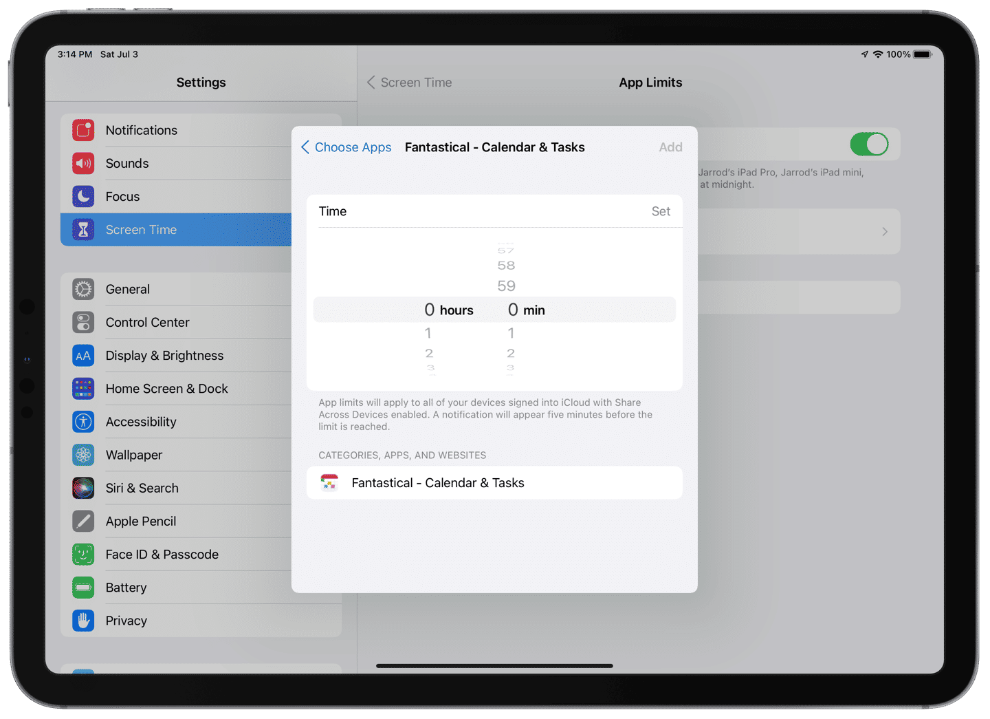
First, I checked App Limits in Screen Time. Alas, you can only restrict apps to a minimum of one minute of use per day. Furthermore, you can’t set any days in App Limits to zero minutes — they all have a minimum of one minute.
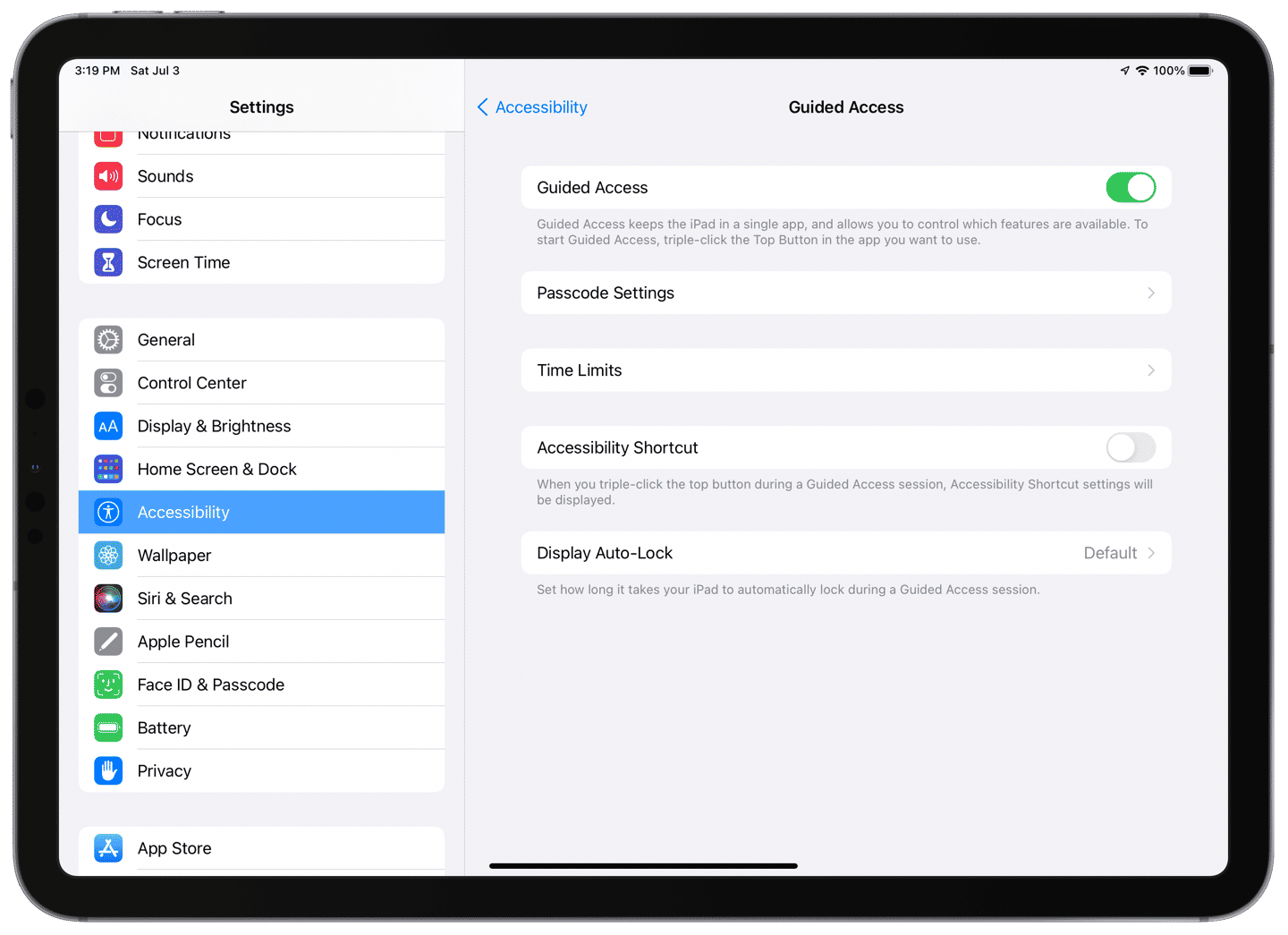
Next up, Guided Access. I knew you could use Guided Access to keep people in one app (convenient for single-purpose iPads or when you hand an iPad to a child to watch a movie, as a couple of examples), but perhaps you could set a few apps that the user could switch between, but nothing else. Nope. Guided Access is for one app at a time.
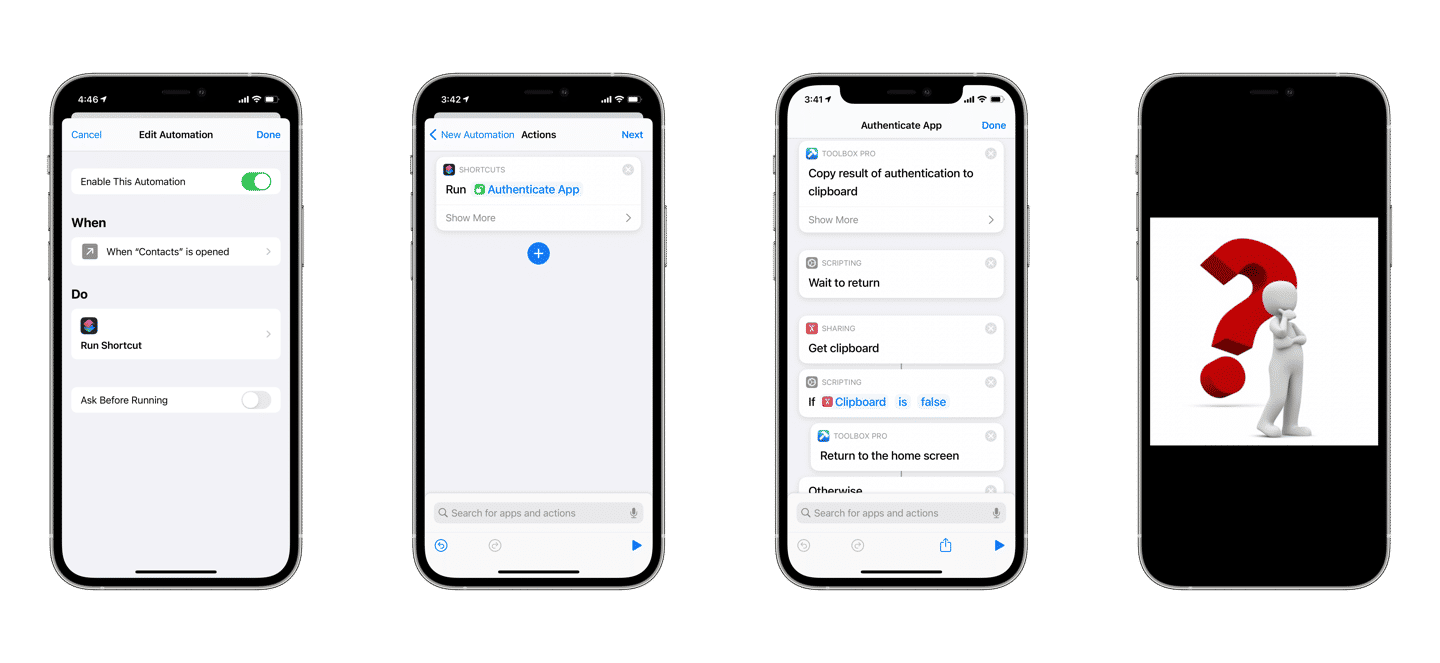
The third and most technical option I thought might work was to use the Shortcuts app. I was sure I’d seen examples of people using the automation tools to require authentication upon opening an app. Well, I was right; it was possible to require authentication as part of a shortcut, but not natively. Instead, the (excellent) third-party app Toolbox Pro provides the actions necessary and I wasn’t able to figure out how Shortcuts would reopen the app after a successful unlock without triggering a new authentication. That, plus one of the iPads in question was stuck on iOS 10 (Shortcuts also didn’t arrive until iOS 12), made that option a non-starter.
Some apps, like password managers, allow locking as a feature, but I think it should be built into the system. Sure, an App Limit of one minute in Screen Time provides only a short time window for trouble, but a child could do a lot of damage in one minute if in the right app. Needing to activate Guided Access each time you hand an iPad to a kid is unsustainable — sooner or later, you’ll forget — and it doesn’t allow much autonomy for the child to use the apps that they are permitted to access.
My suggestion is for Apple to bake locked apps into Screen Time. Let parents select all the apps that should be locked behind the Screen Time passcode. The app icons could even be grayed out on the Home Screen. Another option would be for the Shortcuts team to build actions that prevent an app from opening without authentication. I wouldn’t like the extra barrier to learning Shortcuts that this would put before parents, but it would be better than nothing.
A way to lock apps should live here.
This limitation showcases that Apple doesn’t see the iPad as a shared device. For them, the iPad is a one-device-for-one-user kind of product. If there were proper user accounts in iPadOS, it wouldn’t be a concern. But since there aren’t, making it simple to lock specific apps or folders would go a long way toward helping parents who share an iPad with kids. Frankly, with how much work Apple has put into parental controls over the years, I’m surprised that something this important doesn’t exist already.
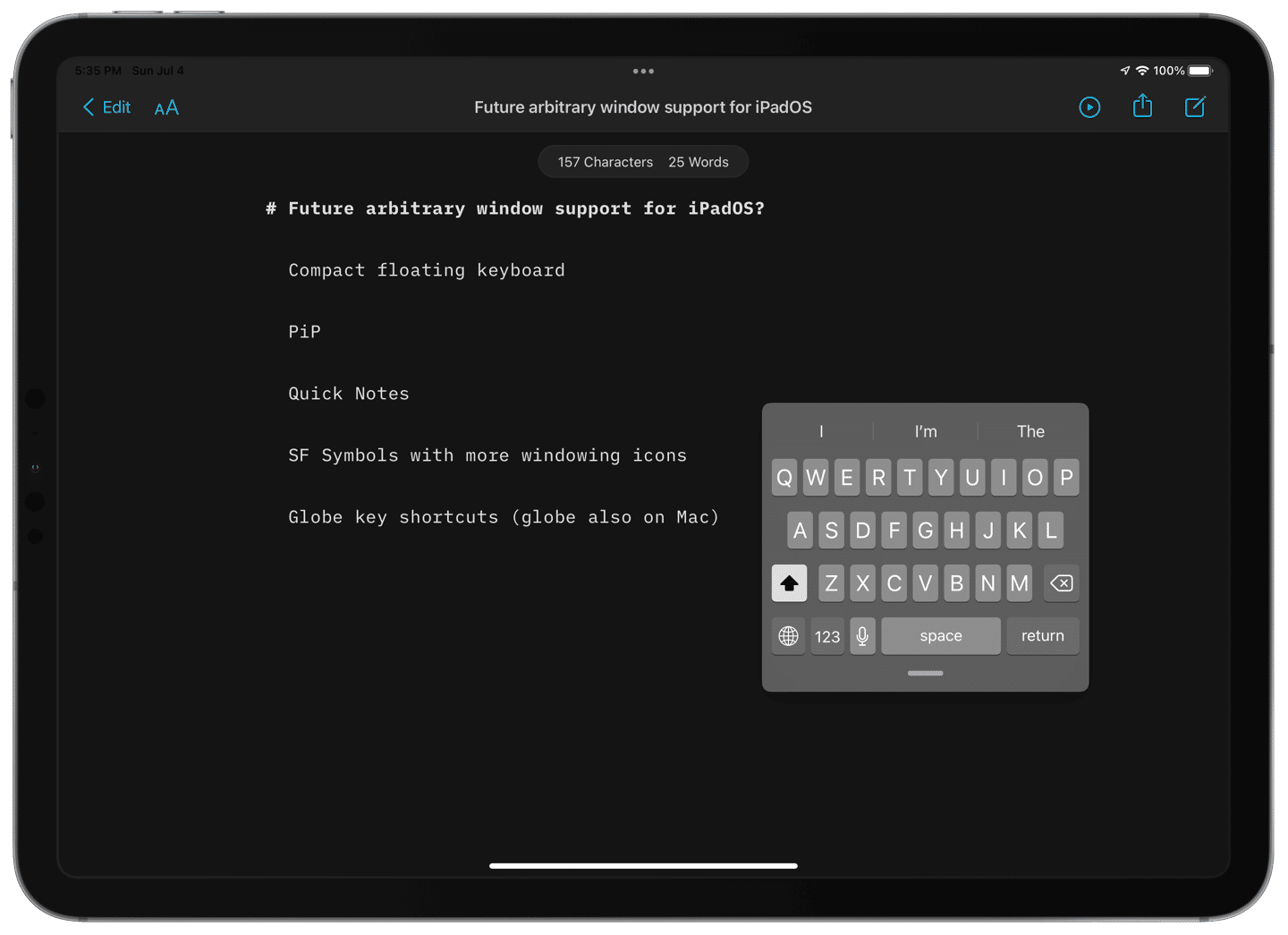
I’ve been noticing hints over the past few versions of iPadOS that point toward a Mac-like windowing system coming to iPad. Many people thought it would arrive this year in iPadOS 15. Instead, we got what seems like more groundwork — I’m looking at you, revamped multitasking controls and Quick Note — which could have been laid as a test for more significant changes to come. I’m not the only one who’s been seeing the signs. Jason Snell wrote a comprehensive piece for Macworld that detailed how the various floating window elements and multiple app instances in iPadOS have gotten us part of the way there already:
Apple has been flirting with the idea of putting floating windows on the iPad for a few years now. For example, Slide Over is a floating window attached to one side of the screen. Picture in Picture floats above apps but must be placed in a corner. Two years ago, Apple introduced the concept of multiple app windows—but they were really just multiple instances of an app, running in existing app frames. (A Microsoft Word file in full screen and a different Word file in a different Split View, for example.)
One thing Jason didn’t mention was the floating compact keyboard which also arrived on the iPad two years ago in iPadOS 13. It remains to today the only element that you place anywhere on the screen — it is not restricted to the sides or corners like PiP windows or Quick Notes.
The iPad’s software keyboard can be put anywhere on screen. ⌘
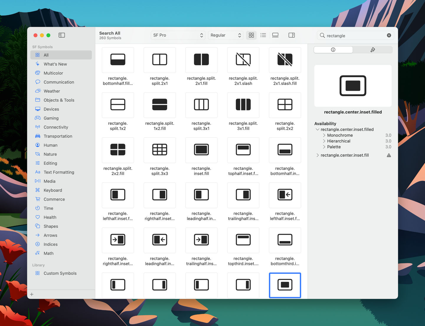
There are also a plethora of new icons in the SF Symbols 3 update, some of which are used for the new multitasking controls, but others that could be reserved for future windowing options.
Could some of these symbols be used for future window snapping? ⌘
Jason calls attention to some key commands that bring multitasking from the keyboard close to parity with the Mac:
But with iPadOS 15, things are getting more interesting on the windowing front. Yes, the iPad’s new Globe-key shortcuts seem to point to more sophisticated multitasking to come, but what really caught my eye is a more old-fashioned Command-key shortcut that Apple has imported from the Mac: next App Window, executed by holding down Command and the tick-mark (`) key.
Since the Globe-key also came to the newest built-in and external Mac keyboards, I’m expecting system-wide multitasking shortcuts to expand across both platforms.
I listen to a lot of podcasts. Over the past few years, they’ve become my favorite medium for keeping up with current events and for general entertainment. One of the reasons I’m able to listen to so many shows is that podcasts, by their nature, can be enjoyed while doing other things. So I listen to podcasts while driving, cleaning, preparing meals, walking and running, and getting ready for the day. Really, most times that my hands are busy and I don’t need to concentrate too closely on the task at hand, I’ve got a podcast playing in my ears.
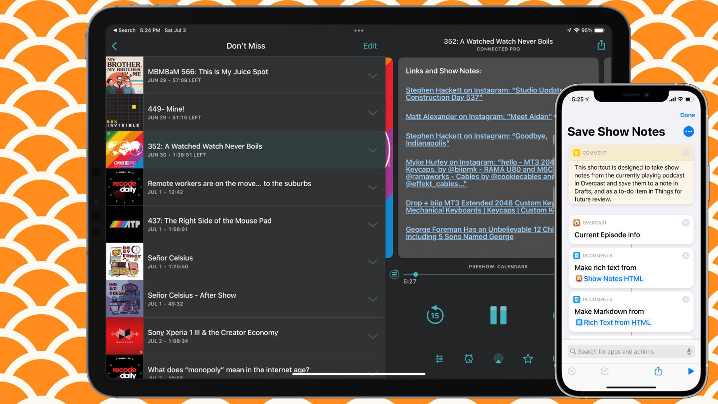
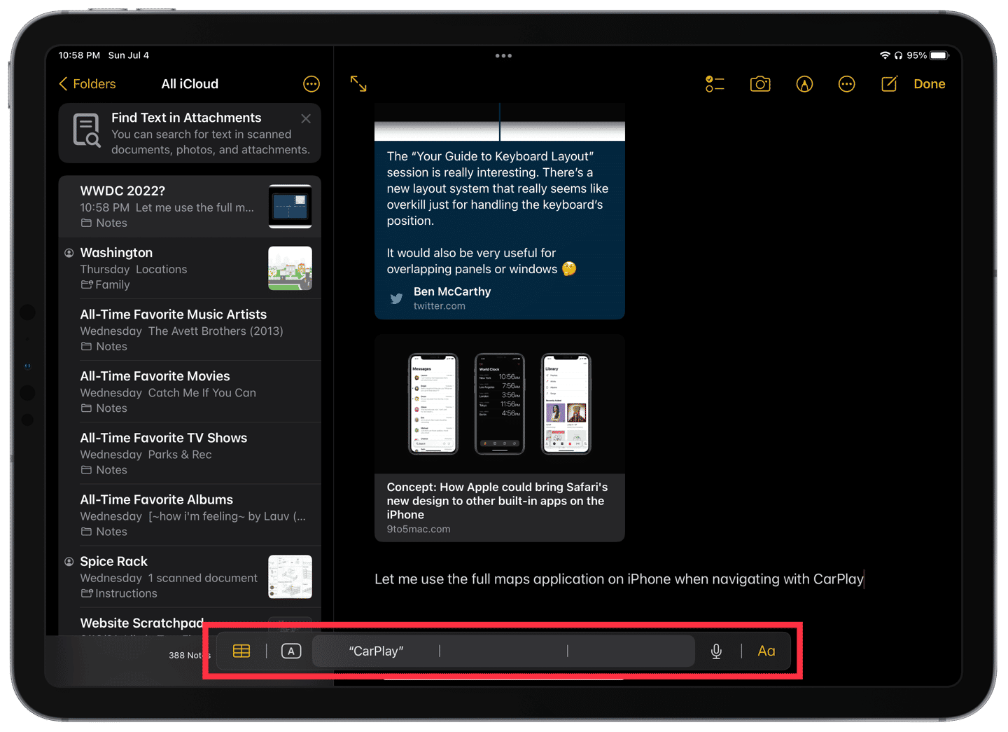
But it’s this aspect of podcasts that also makes it difficult to interact with shows that have rich show notes. My hands being involved with something else means that I can’t check out the links or photos referenced during a show. So I’ve built a shortcut that I can call via Siri to save them and remind me to review them later.
A brief aside about show notes — they’re great! I wish more hosts used them to share links to the articles, videos, products, or whatnot they talked about on their shows. It enhances the experience. I’ve discovered new favorite artists, followed hosts and guests on Twitter, and even purchased things from podcast sponsors because they were easy to get through links in the show notes. I always appreciate it when a host says that they’ll add something to the notes.
Why not in the app?
Before we get into building the shortcut, you may rightly ask, “Why not just look back at the notes in the podcast app later?” The answer is simple: my preferred podcast app, Overcast, removes completed podcasts from my listening queue and playlists. Since I typically listen to several shows in a row, it can be difficult to remember which shows had notes that I wanted to check out. I think it would be great to have a running history of shows that I’ve listened to, and I’ve suggested that feature to Marco Arment, the developer of Overcast.
Creating the shortcut
I wanted three core functions out of this shortcut:
Make a hands-free solution to save the notes.
Make sure I remembered that there was something I wanted to check.
Archive a copy of the notes for future reference.
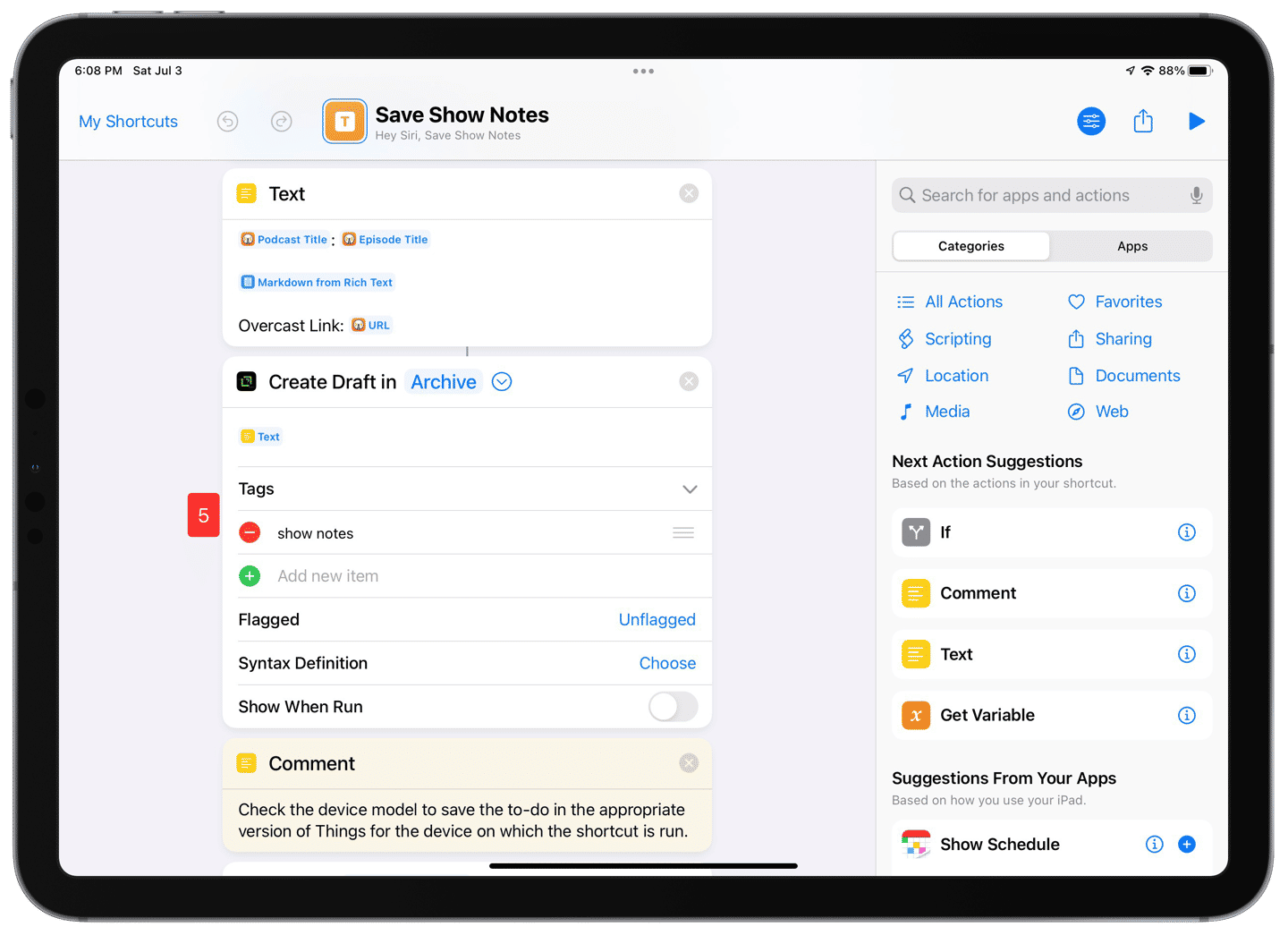
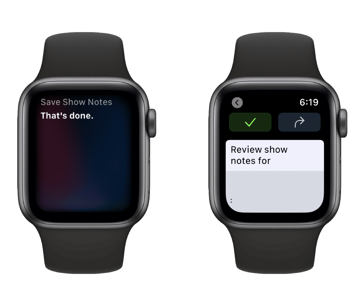
When Marco enhanced Overcast’s shortcuts support earlier this year, I knew I could easily achieve the first two functions just by creating a reminder with a link to the episode’s URL. But I wanted to get fancy. With just a little extra work, I was able to consistently format the show notes, save them to an archived draft with correct tags in Drafts, and create a to-do item in Things that also contains the full notes.1
Getting the show notes from Overcast, converting them to Markdown, and formatting the resulting note. ⌘
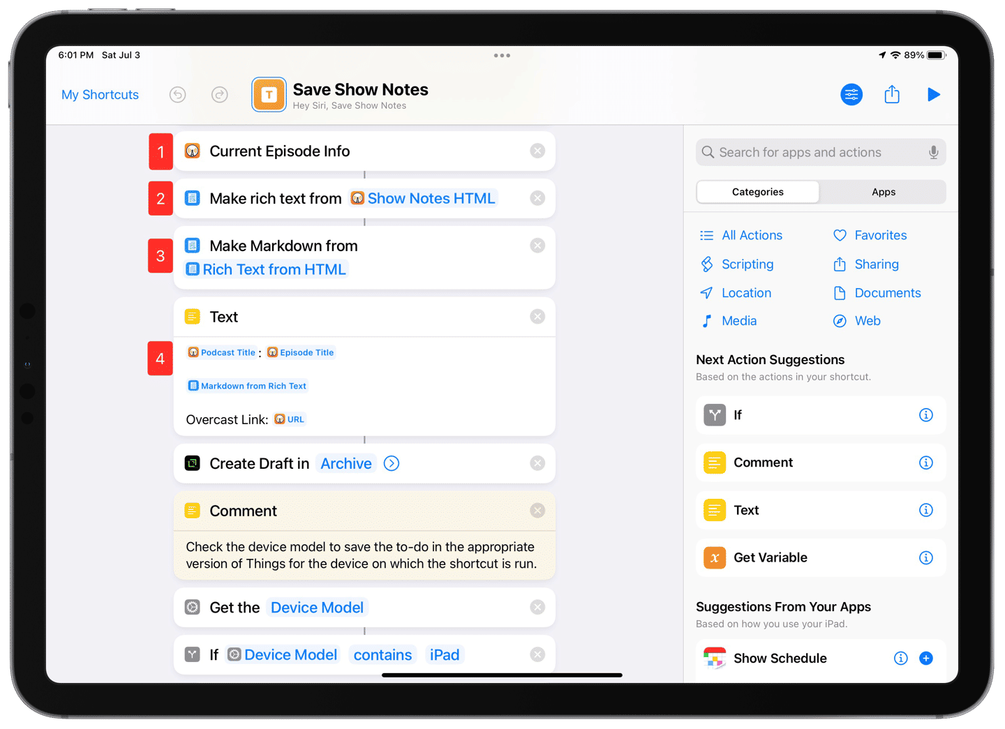
Step 1: Get details about the currently playing episode in Overcast. We reference this Magic Variable several times throughout the shortcut.
Step 2: Take the show notes in HTML (which is how Overcast provides them) and convert them to rich text.
Step 3: Take the rich text and convert it to Markdown. This action only accepts rich text, which is why we need to do the double conversion.
Step 4: Format the note’s text using the podcast’s title and episode title, the body of the notes, and a link back to the episode in Overcast.
Now that we’ve created the text for the note, now we have to put it somewhere. In this case, we’re sending it to both Drafts and Things.
Creating a new item in Drafts containing the show notes. ⌘
Step 5: Using the Create Draft action, we put the formatted text in the draft, apply the show notes tag, and archive it.
The final four steps are a little convoluted because Things has different app instances for iPhone and iPad. Since the Shortcuts actions are tied to the app, we need to duplicate that action for each device.
Checking the device and creating a to-do in Things that also contains the show notes. ⌘
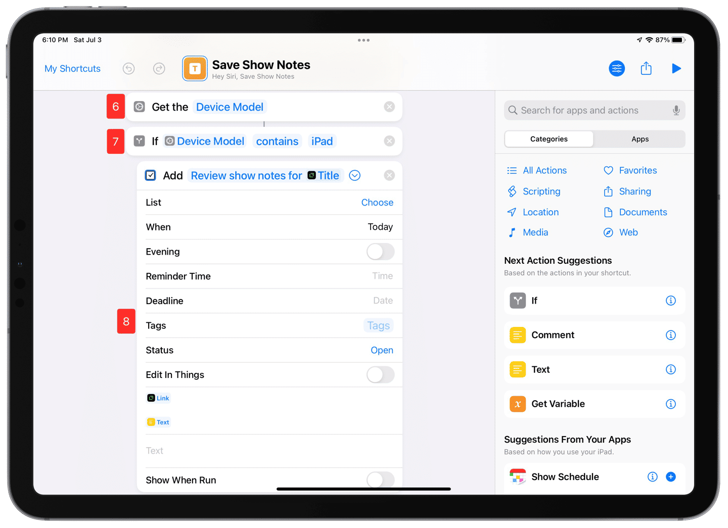
Steps 6 and 7: To determine which device is running the shortcuts, we get the device’s details and then create an If statement which checks the device model against “iPad.”
Step 8: If the device model contains ‘iPad,’ it creates a to-do item in Things for iPad set for the current day, and with a link to the archived draft, and shows notes in Markdown again in the to-do description. Since the title of the draft contains both the podcast and episode title, we can reuse that aspect of the draft in the to-do’s title. Why duplicate the show notes within the to-do when they’re already archived in Drafts? Pure convenience. The URLs can be tapped from within Things, so there’s a little less bouncing around needed. The version in Drafts is for an archive if we want to go searching for something specific later.
The Things action for iPhone isn’t usable on iPad. ⌘
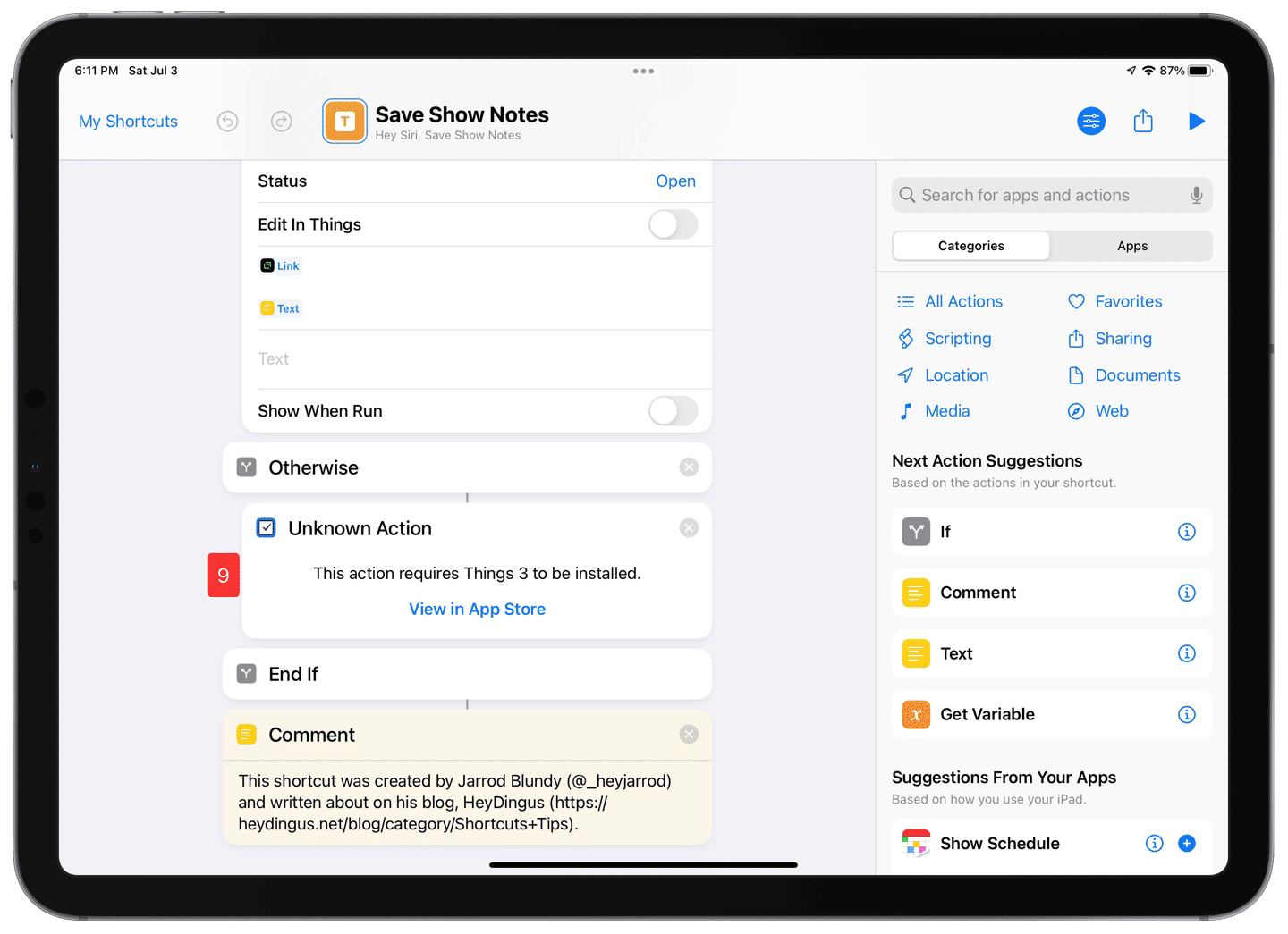
Step 9: The to-do creation action is duplicated but using the one for Things on iPhone instead.2
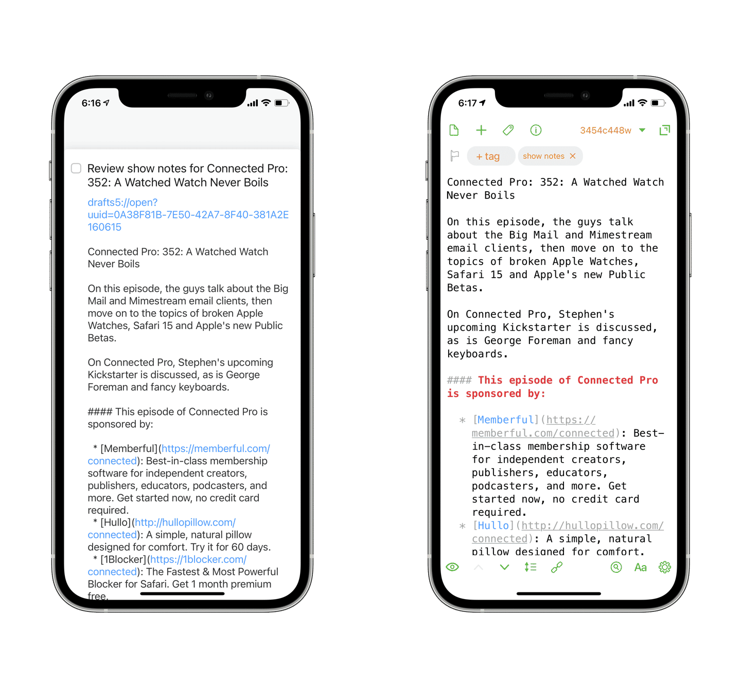
The finished products in Things (left) and Drafts (right) ⌘.
A few tidbits
I call this shortcut equally often with Siri (“Hey Siri, save show notes”) as I do as an item in my Overcast Menu shortcut. I keep that menu available in the Today View, so it’s always available with a couple of swipes and a couple of taps — which is nice when I don’t want to or can’t talk to my device. I’ll write more about controlling Overcast from a shortcut in the future.
An unfortunate consequence of using three well-developed apps that are good platform citizens on all Apple’s devices is that this shortcut can be a little wonky when running from the Apple Watch. Overcast, Drafts, and Things all have independent watch apps, which don’t always play nicely with Shortcuts. I wish that when a shortcut doesn’t perform as expected on the watch that it would fall back to using the phone’s actions, but, alas, I’m not aware of a workaround. So when run using Siri on the Apple Watch, this shortcut can result in blank to-dos and drafts.
Despite being able to be called via the Apple Watch, it doesn’t save the results correctly. ⌘
You may be able to recreate this shortcut for Apple Podcasts if that’s the client you prefer. I gave it a whirl, but the lack of a ‘Get Current Episode’ action makes getting details about the playing episode challenging. I’m also unsure that the description returned from the Get Details of Episode action will contain the full show notes.
I also tried to create a version of this shortcut that saves show notes as rich text in Apple Notes for a prettier archive. Sadly, Apple Notes doesn’t play nicely when accepting rich text from Shortcuts. For some reason, the rich links get stripped of their richness. On the bright side, raw URLs work great in Apple Notes, so saving the Markdown there would work just as well as in Drafts. However, I prefer Drafts because the show notes are a little more ephemeral, in my opinion, and because Drafts has far more powerful actions in Shortcuts.
I love this shortcut because it showcases how with just a few actions, we can pass data around between multiple apps and end up with something useful. I’d love to see more apps get on board with shortcut actions that get data out of their apps, as well as putting data into them. I use this shortcut multiple times each week, and it makes me smile each time because I created a solution for my own problem. This kind of user-driven problem-solving is why I like Shortcuts so much.
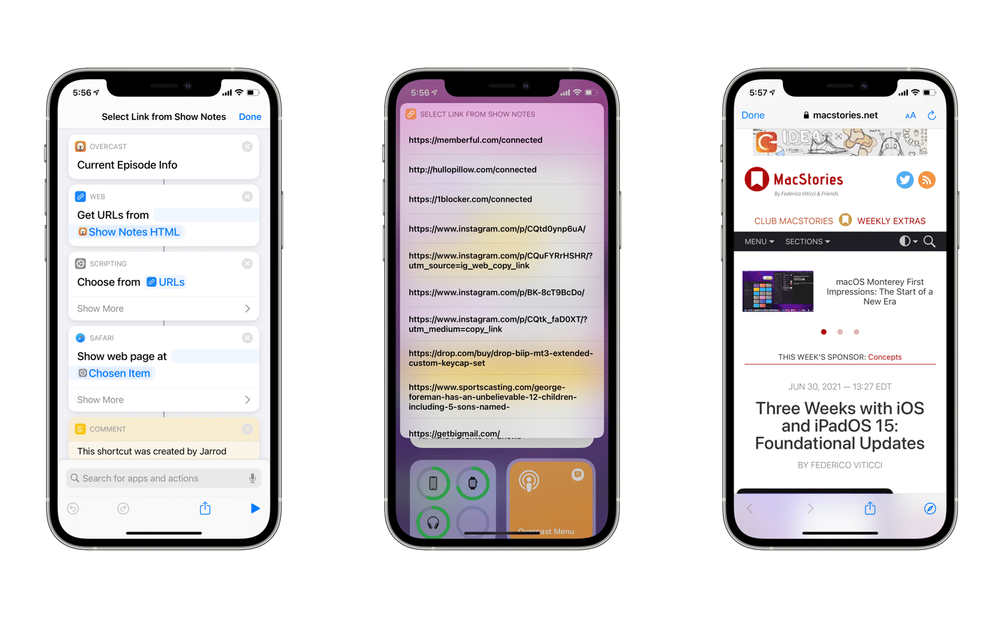
Sometimes I am using my device while listening to a podcast and want to check a link that the hosts discuss. For those occasions, I’ll select the Select Link from Show Notes shortcut from my Overcast Menu. With just four actions, it grabs all the links out of the show notes HTML, presents them as a list and displays the selected webpage in a Safari View Controller.3 It’s super-fast and is more straightforward than swiping around to get into Overcast’s show notes screen and scrolling to find the correct link.
Building and using the Select Link from Show Notes shortcut. ⌘
While designed for Drafts and Things, it could be adapted to your preferred notes app or task manager. ↩︎
I’d like to see Things clean this up and bring their apps under the same instance across all Apple’s platforms. It makes it tricky to create shortcuts that address Things because you have to remember to differentiate them, and the action must be added on that device. So you need to edit the shortcuts on both devices for it to work correctly. This will only get worse when Shortcuts arrives on Mac later this year. ↩︎
I like using the Show Web Page action because then it doesn’t clutter up my Safari tabs. ↩︎
Jason Fried, writing on his HEY World blog, wonders why car brands don’t take an active role in the car rental business:
I can’t imagine a better way to try out a car prior to buying it than renting it on a trip. If it’s a vacation or an important business trip — I’m already feeling good about it. Transfer those good feels, and special memories to the car — it’ll make me want one even more.
My wife and I have a trip coming up during which we’ll rent a car for the week. While we’re not in the market for a new vehicle right now, I’d love the opportunity to take a prospective purchase out for a real-world extended test drive. Or be able to stick with something we’re comfortable with, like a Honda or a Subaru. They could incentivize me to stay within their brand. As it is, we typically go with whatever is cheapest and that doesn’t suck.
With the release of the public beta, I put my iPad Pro (the one I’m typing on right now) on iPadOS 15. I’ve spent the last few days getting things set up and putting it through my usual day-to-day, which is to say some light research, reading, image manipulation, entertainment, and of course, writing for this blog. So, in no particular order, here are my brief thoughts after about three days of usage.
More widgets on the Home Screen are great, but it makes the layout go haywire when changing orientation. I wish they had found a better solution for maintaining the same structure when going to portrait orientation, even if it meant having a square grid of icons.
I wish that keeping the Today View permanently on screen was still an option, but I expect they’re trying to phase that view out altogether.
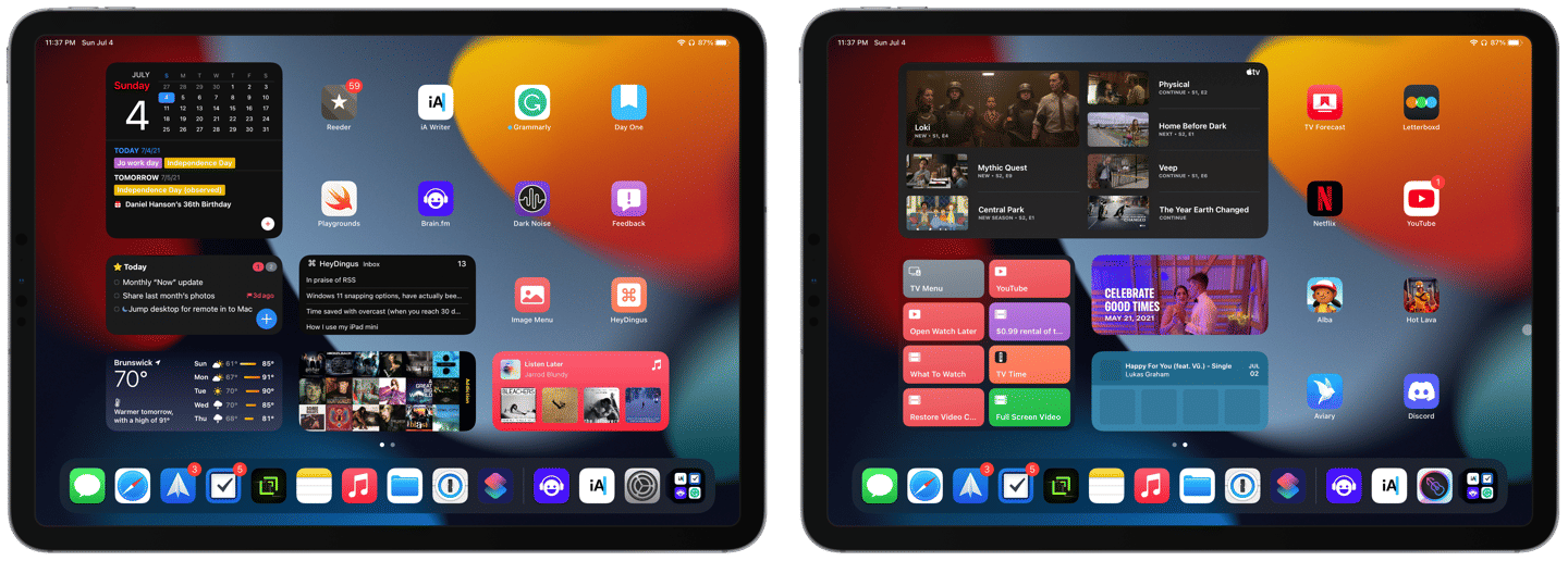
My two Home Screens: writing and music (left), and entertainment (right). Everything else lives in the App Library. ⌘
The new Safari design with consolidated tabs and Smart Search field isn’t as jarring as I expected, but I tend to close tabs as I’m done with them anyway so that they don’t pile up.
Global keyboard shortcuts are fantastic! But they will take some time to remember the new commands.
Updated Maps are gorgeous! 😍 I can’t wait for them to come to more areas (or for me to move to a place where they’re supported 😉).
Multitasking is a more significant upgrade than it might seem but again will take some time to relearn the faster ways to get around. When touching the screen, the swipe-down gesture to tile a new app feels very natural.
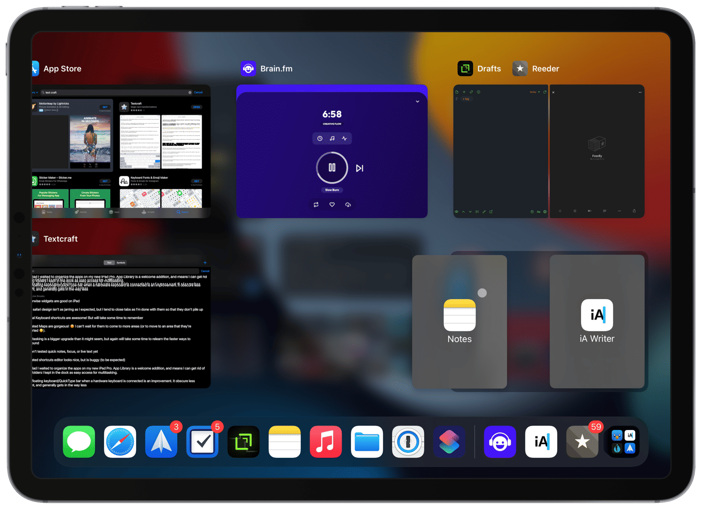
Being able to manipulate Split View instances from the App Switcher is a godsend!
Combining windows like this wasn’t possible before within the App Switcher! ⌘
The updated Shortcuts editor looks cleaner and is more functional with things like suggested next actions.
I’m glad I waited to organize the apps on my new iPad Pro. The App Library is a welcome addition here, and it means I can get rid of utility folders I used to keep in the dock for easy access when multitasking.
The floating keyboard/QuickType bar when a hardware keyboard is connected is an improvement. It obscures less content and generally gets in the way less.
The new QuickType bar is more compact and floats above content. ⌘
It was expected, but Shortcuts gets hung up pretty often. Also, the new permission prompts are a little out of control. I anticipate both will get ironed out before long.
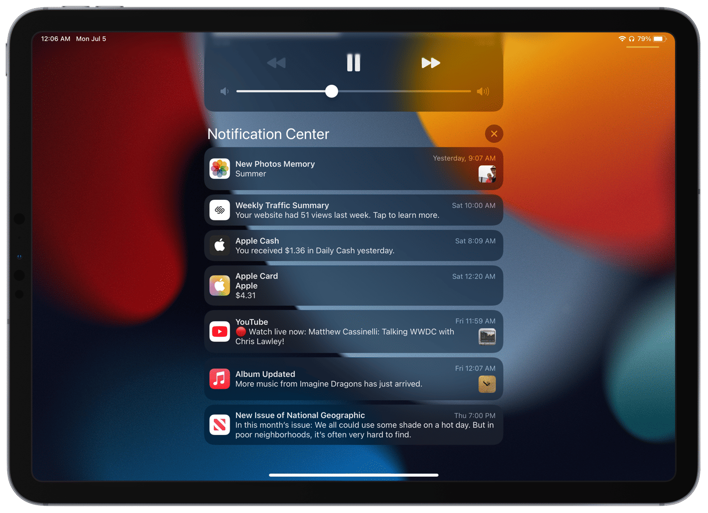
I wasn’t sure about the condensed look for notifications, but it’s quickly grown on me.
With their more compact design, more notifications can fit on the screen and are more identifiable by their larger app icon. ⌘
I’ve just seen my first Shared with You links in Safari, and I think that will be a sleeper hit. Furthermore, I hope it gets opened up to third-party apps in the future.
Still to test
I haven’t tried out Quick Notes, Focus, or Live Text yet. Nor have I had the opportunity to use any of the new features for FactTime.
Universal Control with the Mac is one of the things I’m most looking forward to since I jump between devices quite regularly. But I haven’t loaded the macOS 12 beta onto my Mac mini yet, and Universal Control isn’t even available in the macOS beta yet, anyway.
I frequently use Memoji stickers, and I’m looking forward to getting my little character into something other than the plain gray clothes he’s been wearing for years.
My takeaway so far
I’ll have much more to say about this OS upgrade cycle as I get more time with it and try the betas on other devices. But so far, I’m pretty happy with the changes I’ve experienced so far.
Both Safari and widgets on the Home Screen need some work, in my opinion. But they’re pretty good for early implementations.
Overall, the updates to iPadOS this year do not feel drastic, but that’s okay! The operating system is maturing, and while there are unquestionably things that I’d still like to be introduced or improved, I think the refinements this year are welcome. They touched up frequent interactions (e.g., QuickType bar, notifications, multitasking), which will bring bits of joy all year long. I like the direction iPadOS is headed.
On All Consuming this week, Noah and Adam reviewed Vacation sunscreen. While I can’t personally speak to its quality, I do love the website. It’s retro in an entertaining way — matching the parent company, Poolsuite, aesthetic. Check it out even if you have no interest in purchasing unknown sunscreen on the internet.
I thought that Myke and Jason had a really well-considered conversation on Upgrade regarding the ramifications that Apple could face by both playing chicken with regulators on App Store policies and not giving ground to developer wishes. The legislation and sideloading discussion begins about 50 minutes into the episode.
This app demo blows my socks off! Just by scanning a pile of Lego bricks with your phone, you can get tons of ideas of what can be built with them. The app spits out instructions and can guide you on finding the correct bricks within the pile. Camera and machine learning technology have come a long way to be possible at such speed on a mobile device. While I don’t have lego bricks to test it with, I wish that I did!
I came across another fun project this week: iPod.js, made by Tanner Villarete. If you’re nostalgic for using an iPod, this website (when accessed from your phone) can get you pretty close to that sweet music-specific experience. Log in with your Apple Music or Spotify account, and you’re off to the races navigating through the iPod menus to select a playlist, album, artist, or song from your library. And don’t miss the fully-functional Brick game, which I used to play for hours on end. (See also: this website by Zane Kleinberg for Dashboard nostalgia.)
Thanks for reading! If you found these things interesting too, or have something exciting to share, please drop me a line on Twitter!
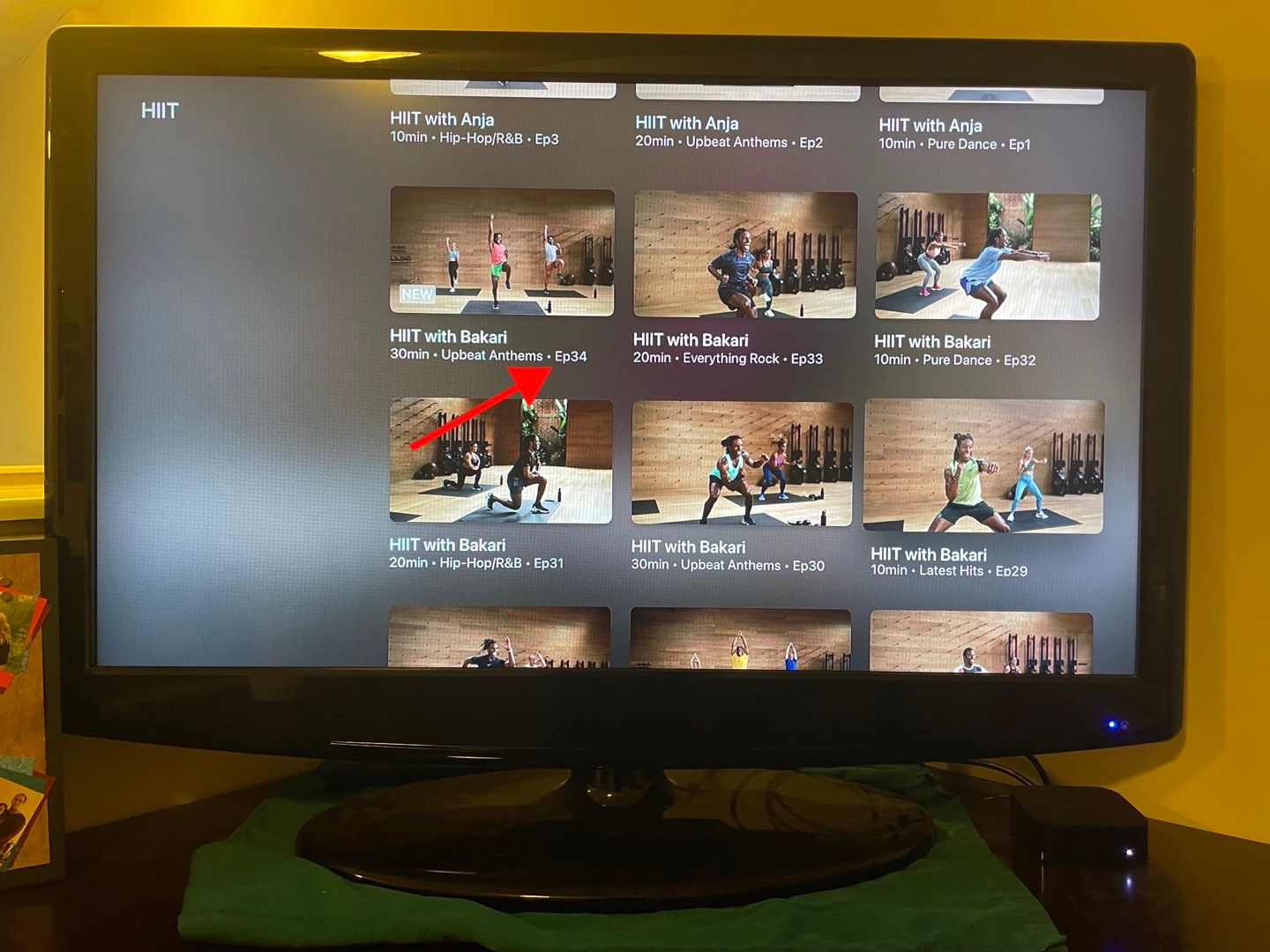
When I opened Fitness+ on an Apple TV running the tvOS 15 beta, I noticed that Apple has leaned into the episodic nature of its workouts by adding episode numbers for each workout video. This type of metadata wasn’t visible before, but I think it makes sense as they branch out into special series, such as with guest trainers. It also makes it easier to describe an episode that you particularly enjoy now that it has an identifier.
It appears the episode numbering format is by Trainer/Workout type. For example, looks like trainer Bakari has made 34 High-intensity interval training (HIIT) workouts so far.
If you ask me, this update suggests that every episode will be accessible in perpetuity. I had wondered if older workouts would eventually get phased out in favor of newer ones. But now, it would be strange to scroll back and have episodes stop before reaching #1.
At first, I thought that this would make the Fitness+ library get unwieldy. However, I’d guess that most users watch the most recent videos anyway, and only scroll back if they want more of a particular workout. And if Netflix can get away with its massive library of video content, I suppose Apple shouldn’t mind that its back catalog grows ever larger. Plus, if you prefer a specific trainer or workout type, you won’t have to worry that your favorite episodes will disappear.
The amount of ads embedded inside Apple News is unhinged, and it’s not uncommon for any 5-minute article to have 5-6 inline ads between every third paragraph, ranging from advertisements for horrifying skin conditions to embedded videos that autoplay while I’m reading. And with no reader view or effective way to block this content, the ads can go a long way towards ruining the experience.
I wanted to like News+, and still hop in there for the occasional article or mindless scroll, but the ads situation is grating. It’s a surprising dissonance coming from the company who is dead-set on disrupting the digital adverting industry. If it wasn’t included in the Apple One bundle, I wouldn’t renew News+.
On the other hand, if they were revamp the service and introduce a fully ad-free tier (which was also somehow fair to publishers), I could see myself gravitating to Apple News to read outside of the usual sources I get via RSS.
This would likely need to be at a higher price than the standard $9.99/month that News+ costs on its own right now. Keeping track of readership so that publishers get paid appropriately despite removing ads would be a big undertaking, but couldn’t be that different from what YouTube does for its YouTube Premium service.
To get a more favorable view of Apple News+, check out the full article on the BasicAppleGuy blog.
TL;DR: While I commend Big Mail for going big (heh) on rethinking email, a few missing basic features, bugs, and a realization that I’m more of an email traditionalist keeps me from sticking with it.
I’ve long said that email is my love language. I take pride in crafting valuable messages to people, in and out of the workplace. If you send me an email, you can rest assured that you’ll get a thoughtful response. So as an email aficionado, it should come as no surprise that I’ve tried all the high-profile email clients throughout the years:
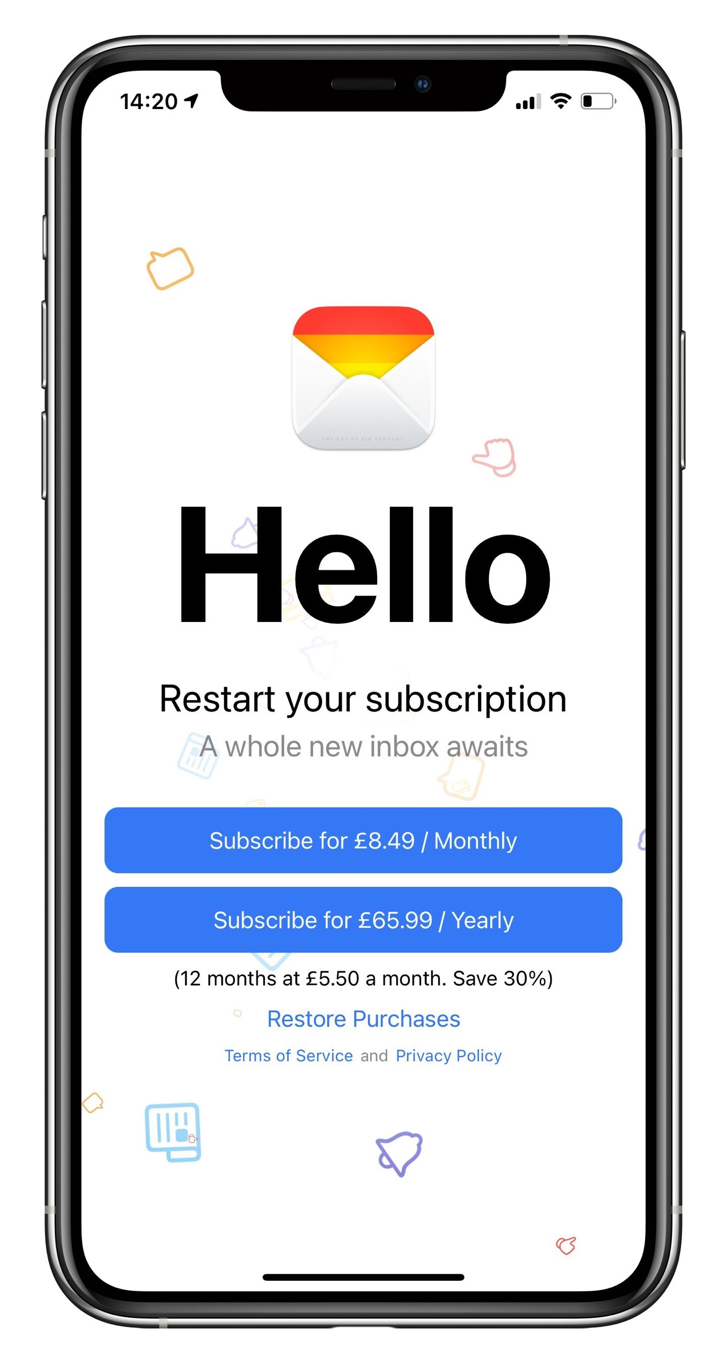
The hype for Big Mail, by The Not So Big Company, has been real. Flashy promo videos, a well-designed website, and pre-orders helped to raise its visibility well before launch. I, like many others, was hopeful for the promise of Big Mail: a rethink of email management — brought to the masses by HEY — but in a more familiar package.
Here are a few of the headline features.
Bouncer - Approve or deny senders the first time they email you. Approved senders get categorized automatically, ignored get hidden forever.
Automatic Categorization Using Scenes - Nearly every email can be categorized into Conversation, Notifications, Newsletters, or Purchases. Big Mail would sort them for you.
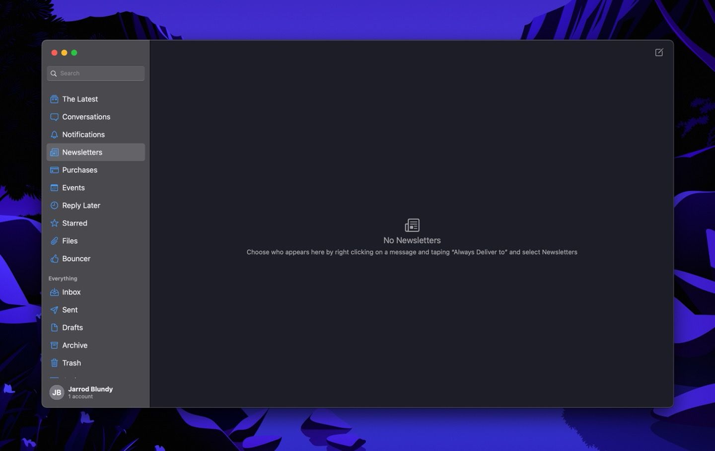
The Latest - Where new email surfaces, rather than an inbox. Once read, the email disappears from The Latest but sticks around in its Scene.
Privacy - Blocking those tracking pixels that have come under fire lately.
Setting up Big Mail
I’ve been using Big Mail as my primary email client for the past week, and I have some thoughts about what it’s like to make the switch. I removed Spark from all my Home Screens and docks and replaced them with Big Mail. I was only comfortable with this trial because Big Mail doesn’t do anything funny with your messages. Everything stays between your email provider’s server and your device. Big Mail just uses pseudo messages within a Big Mail folder to sync data and work its magic. If I didn’t want to keep using Big Mail after the two-week trial, I could easily switch back to another client. Having just recently made a transition away from HEY, I was glad for the non-destructive nature of Big Mail.
The sign-up process, I’ll admit, was a little confusing. I’d pre-ordered the free app, but I was greeted with a subscription screen upon opening it for the first time. I’d known this was a paid email service that came with a two-week free trial. Though I’m very familiar with subscription sign-ups, the welcome screen gave me pause. I wasn’t sure if I would be charged right away or if the free trial would kick in. Apple apparently also took issue with the subscription screen, which led to the app’s delayed launch, and I think I see why.
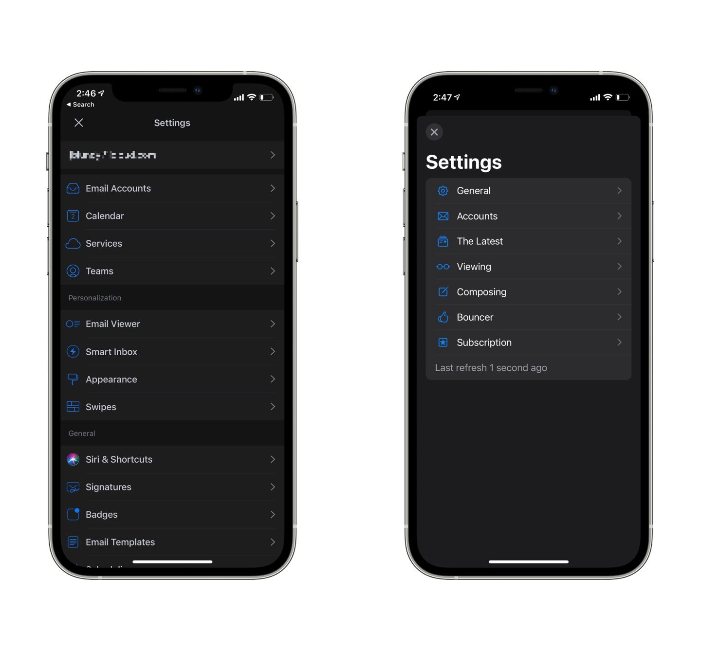
After a reasonably quick initial sync, I was up and running. I had a few emails that needed to be approved in the Bouncer. First, I took a look in the settings area — a little bare, which was especially surprising coming from Spark’s stuffed full settings screens.
Spark (left) has far more options in its settings than Big Mail (right). ⌘
Big Mail delivered on its guarantee to feel native to the operating system. With its large headings, SF Symbols, standard context menus, and following the layout guidelines for each platform, Big Mail looks at home on iOS, iPadOS, and macOS.
Sorting my existing emails into Big Mail’s scenes was simple. I could move an individual message or always sort a sender into a specific category, which I’d recommend. While not difficult to change afterward, I wish that I was given an option of where to sort that sender on approval in the Bouncer. I guess the developer wants the app to have the opportunity to do auto-sorting, but that was inaccurate enough that a choice upon approval would be helpful.
Since Big Mail works like most any other client, there was very little else to set up. So I made sure Glancing (marking messages as read upon a slow scroll by them) was turned on and adjusted the order in which items appeared in The Latest. After that, I waited for more messages to come in.
Using Big Mail day-to-day
Having gone through an email makeover last year when I tried out HEY, I thought I knew what I was in for with Big Mail. But while HEY was weird and quirky in ways that made sense, I’ve found Big Mail to be a mixed bag of delightful touches and frustrating omissions.
One thing I appreciated about HEY and now enjoy in Big Mail is partitioning off newsletter-type messages. Big Mail promised a little extra design polish for these messages to make them look more like articles in a read-later app, and I think it works. Newsletters (along with Notifications and Purchases) get a nice sidebar that takes on identity from the email content. I like it. Some messages don’t get the formatting exactly right, but I didn’t find the occasional pinch and zoom needed to be annoying.
A clean layout for newsletters, purchases, and notifications makes reading in Big Mail a breeze. ⌘
Another feature somewhat lifted from HEY’s playbook is eschewing the act of archiving messages. In Big Mail, once a message is read, it leaves The Latest and lives forever within its Scene. No need to archive because it’s (kind of) done for you. Except that Big Mail doesn’t archive the messages. Since it reads messages from specific folders, it leaves every message in the canonical inbox. When I opened Spark to see what was happening to the messages, there they were — marked as read but living in the inbox.1
I’ll acknowledge that the Conversation scene is quite nice. I had a few important messages that I was waiting for, and having all emails that involve a back-and-forth between recipients always be in the Conversations tab made it simple to keep up with them. But, weirdly, all the previous messages sorted into Conversations display my name rather than the person I was conversing with, which made them difficult to differentiate from each other. This brings me to the bugs I’ve experienced.
A buggy 1.0
I’ve experienced other strange bugs that taken alone would not be a big deal. I’m willing to overlook a few bugs knowing that writing an email app is a significant undertaking. But some of these bugs I have never experienced in any other app and make Big Mail feel as though it is built on a house of cards ready to tumble.
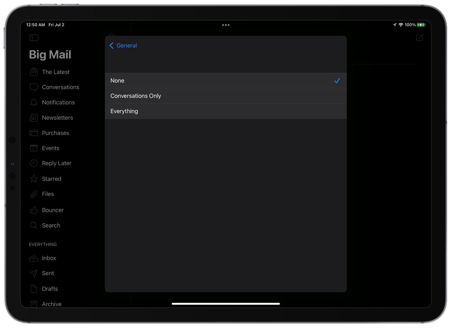
A notifications bug has become a sticking point for me. I typically leave email notifications off but like to have a badge display the number of new messages in my inbox. Unfortunately, that differentiation isn’t currently available, so I left notifications turned off, and yet a few days into the trial, I started getting message notifications on my lock screen. Though I don’t recall doing so, I had permitted Big Mail to send notifications in the Settings apps, but I still had notifications set to “None” within Big Mail itself.
If notifications are set to “none,” why am I still getting them? ⌘
I also regularly see empty alerts upon opening the app. Not being able to read them, I have no idea of what I’m supposed to be aware. I assume it’s trying to let me know of a syncing issue because I’ve seen plenty of those. Sadly, the Mac app or usually doesn’t get the memo about messages I’ve already passed through the Bouncer on my iPhone.
I swear I’ve approved a bunch of newsletters through the Bouncer, but my Mac doesn’t realize it. ⌘
When composing a reply, I have had the large heading-style subject follow my scroll down the page, obscuring the previous messages I’m trying to read.
And, perhaps most concerning, is the speed at which messages are delivered. It’s not uncommon for messages to take dozens of minutes to appear in The Latest or Bouncer even though they’ve been received without issue in Spark or Apple Mail. Since Big Mail is purportedly using only on-device processing and no third-party servers, I’m not sure what’s delaying those messages.
It’s good to keep in mind that the app has only been released to the public for about a week now, and I’m sure that the developer will iron out many of these bugs over time. But in the meantime, it gives me a nagging feeling that I can’t trust my email client — and email is supposed to be the most reliable form of online messaging around.
Some additional pros and cons
Pros
Native design.
Quick navigation.
Scenes, while there are many, make sense to how I mentally categorize messages.
I like “The Latest” both as a separate tab and a section within each Scene. But, to take advantage of the “Glancing” feature (mark as read while scrolling), you need to go down to the more traditional list of messages which isn’t apparent.
Attachments tab for each message thread to aggregate any attachments sent within that conversation. There’s also a global Attachments tab.
Cons
Some sidebar selections automatically close the sidebar, while others keep it open. That inconsistency is jarring.
I’d prefer that everything that gets marked as read also gets moved to the archive. This is important because, otherwise, everything gets left in the inbox. If I need to check from a web interface or just want to use a feature of another email app, that will be overwhelming.
Likewise, Big Mail would be much more useful if it organized my archived email using Scenes in addition to what’s in the inbox.
No Quick Actions from the Home Screen.
No Shortcuts support.
No Widgets.
Not available to set as a default mail app on iPhone and iPad. Apple introduced this integration in last year’s operating systems, and I’m flabbergasted that this wasn’t included in the 1.0 release of Big Mail. The result is that if I tap on an email address outside of Big Mail, I’m brought to Spark’s composing interface instead.
It seems like the app is always trying to catch up on syncing. Perhaps with time, more frequent background updates will kick in, but right now, it needs to sync every time I open the app.
My takeaway
It will probably come as no surprise that I don’t plan to stick with Big Mail after the trial period. But that’s not to say that trying it out has been a waste. On the contrary, I’ve learned a lot about how I prefer to manage email while I’ve bumped against Big Mail’s features and limitations.
For years now, I’ve been an email completionist. That is to say that I try to get to “inbox zero” as quickly as possible. While not easy, it makes me feel good not to keep people waiting on a response or keep irrelevant messages taking up space in my inbox and mind. Spark has been my trusty tool for getting to inbox zero for several years. With its swipe gestures, customizable keyboard shortcuts, and integrations with other apps (like my task manager), I can triage messages with surprising speed in Readle’s app. However, Big Mail is quick in a different way. Once the message is read, it assumes that it is no longer relevant. Every message is still accessible, but I can’t use the client as a productively layer in the way that I can with Spark.2 And I don’t get the same satisfaction from “completing” an email in Big Mail.
I’ve also realized that I get too many messages in general. While the newsletter formatting is pleasant in Big Mail, it can feel like organizing a junk drawer. And you should never organize anything that you should discard. I’d sooner unsubscribe or mark as spam with aplomb than need to glance through dozens of marketing messages, no matter how nicely they’re formatted, or easily they get marked as read.
So, I’m headed back to my trusty Spark and prolific use of archiving, snoozing, flagging, reminders, and sending as a task to Things. And I won’t need to pay a monthly subscription for my email client, which in the case of Big Mail is up to $10/month.3 But I wish Big Mail the best of luck, and I’ll be keeping an eye on how the developer responds to feedback. I have high hopes, even if it’s not for me.
It’s worth noting that in the 1.1 release, the developer did add archiving support, as well as reading messages from the archive folder, but by default, every message continues to live in the inbox. If you archive an email in Big Mail, it’s no longer sorted into its Scene. ↩︎
I recently came across an interesting article about using email as a to-do list and productively layer. While this example features the Superhuman app, I find that I can do everything I need with Spark’s integrations and keyboard shortcuts. ↩︎
If some of the features of Big Mail, and HEY before it, appeal to you my experience has you second-guessing, I recommend reading this article on Just Use Email. It tells how to set up similar benefits using the most vanilla of email clients: Apple Mail. ↩︎
After the idea floated by earlier this year on his Connected podcast, Stephen Hackett (who also writes 512 Pixels) has created a custom calendar for 2022 featuring Apple’s hardware and significant dates in Apple’s history.
The project launched today on Kickstarter, and has already hit its goal. I thought it was a great idea when I heard it on Connected, and I’m so glad that Stephen followed through. It’s fully on brand for him.
Here’s a bit of the description from the Kickstarter page:
I love sharing my knowledge in this field, and wanted to do so in a practical way, so I have designed a custom 2022 calendar. Each calendar measures 20 inches by 13 inches when it’s hanging on your wall with a simple thumbtack or pin. The top features my own product photography, while each month highlights some of Apple’s hardware announcements over the years.
Check out the video there as well, for a peek at the calendar’s design. I’ve backed it, and will eagerly await its arrival (estimated for November).