I’ve got a twofer tip today, and it’s all in the title.
Help Siri Out a Little Bit
Sometimes it’s nice to have multiple ways to run a shortcut. Apple clearly understands this as they provide many ways to launch one. We can run shortcuts from the app, the share sheet, widgets, Siri, and URL schemes. But let’s focus on just one of those for a moment: Siri. Just say the name of a shortcut to Siri and it’s off to the races, but very specifically the name that you set. Back in the iOS 12 days, we could record a different launch phrase to run shortcuts. For example, you might want to tell Siri to “Make a new task” that actually runs your ‘New To-do’ shortcut to add something to your Reminders list. iOS 13 improved that feature by allowing typing out a unique phrase in addition to recording one. But fast-forward to iOS 16 (and in the iOS 17 beta) and we’ve lost that functionality
along the way. But I’m here to tell you that you can gain some of it back by, you guessed it, creating another shortcut. Isn’t this fun?
The key is that ‘Run Shortcut’ action. Just plop one of those bad boys into a blank shortcut, select the shortcut that you want to create an alternative launch phrase for, and then name this new shortcut whatever you want the launch phrase to be! My preferred style is to put two forward slashes before the name/launch phrase I want to use. For example, “// Save Show Notes” is what I named the one that runs my ‘Save Podcast Show Notes’ shortcut. Including “podcast” in the title was clearer for sharing the shortcut, but I don’t want to say that word every time I run it using Siri.
Keep in mind that you can create many of these shortcuts to cover all the launch phrases you want.
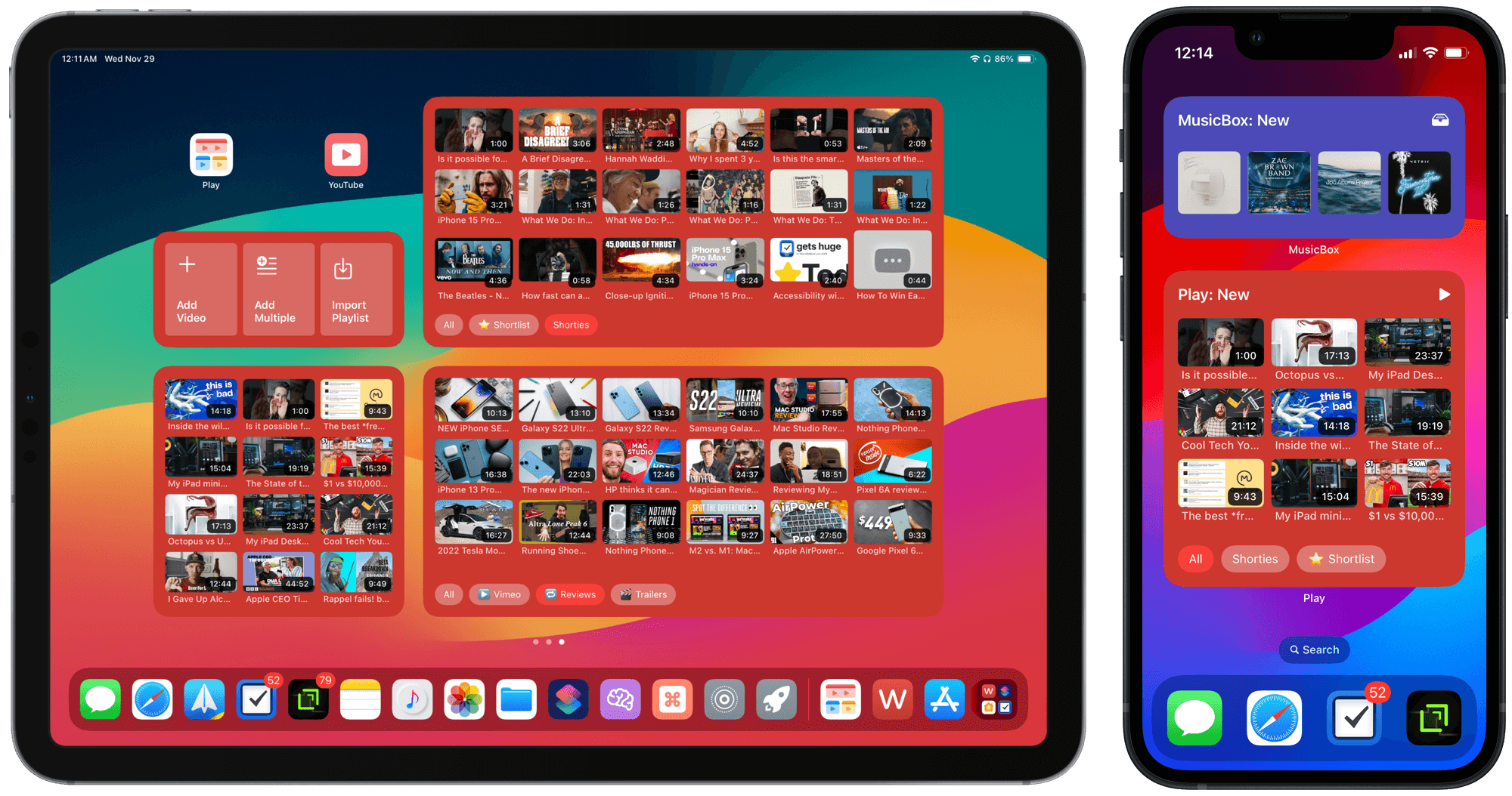
Tell me if this has ever happened to you: You create a Shortcuts widget that has all the shortcuts you want. You’re a little annoyed already because (1) they all have to be in the same folder, and (2) must be the first four shortcuts in that folder. Then, some time and many new shortcuts later, you realize that the buttons you wanted on your home screen aren’t there anymore. Now you’re really annoyed because your specifically configured quick launcher is no longer quick. All because you put some new shortcuts into that folder and had the audacity to forget to go in and rearrange them again so that the ones you want in your widget remain the first shortcuts in the folder.
I’ll never understand why new shortcuts get added to the top of a folder instead of the bottom. But by creating separate one-action ‘Run Shortcut’ shortcuts, you can add just those to a ‘Today View’ folder, or a ‘Social Media’ or ‘Blogging’ folder. Select that folder in the Shortcuts widget and Bob’s your uncle. No more annoyance. Everything stays where it should be.
Plus, now you can keep the “source of truth” shortcuts — the ones that do all the work — neatly organized into coherent folders while mixing and matching widget shortcuts to your heart’s content.
I suppose since this is the place where I showcase my opinions, I should register one for the Twitter → X rebrand.
Speaking objectively, of course. I’m subjectively sickened by what Twitter has turned into under Musk’s management, if you can call it that.
If Musk wants to make an everything app, I guess “X” is as generic as you can get. “If you don’t stand for anything, what will you fall for?” and all that. But, not being a fan of everything apps, I think a better course of action would have been to make X the overarching parent company and user account system that ties together the new banking and shopping services that he seems to want to reenter, alongside Twitter for social networking. Much like Meta has done with Facebook, Instagram, and now Threads.
But, as an erratic and impulsive person seemingly intent on emptying Twitter of all its brand value and cachet for the fun of it, Musk has turned what was an approachable and understandable product into one that is harsh and intentionally vague. I mean, come on, posts will be called “x’s”? What even is this? They’re just posts!
Twitter has long been dead to me, but this feels like Musk dancing on its grave. I now get the same feeling from news about The Social Network Formally Known as Twitter as I did about Truth Social and Parler: sad-and-incredulity-tinged indifference.
We just launched updates to improve Instapaper’s organizing and sorting tools for iOS, macOS, and web. Features include drag & drop to reorder, sorting improvements, modern swipe actions, better integrations with Shortcuts on iOS, and more!
My status with read-later services being one of perpetual dissatisfaction, I’m always on the lookout for the one that checks all my boxes. At the moment those boxes include a pretty reading interface, a text-to-speech engine worth a damn, a web app, speedy share sheet saving or shortcuts support, modern gestures and context menus, and the ability to read saved items from buckets organized by site. Bonus points are awarded for one-tap sharing articles out using the share sheet, an ‘Archive and next’ button, highlight syncing via Readwise, the ability to read articles on my Kobo, a good video-watching experience, lots of sorting options, and
integration with Reeder.
I was as surprised as any to learn today that Instapaper ($2.99/month), the O.G., checks off more boxes than any these days. Let’s take a look:
Pretty reading interface ✅
Text-to-speech engine worth a damn ✅ (okay)
Web app ✅ (better)
Speedy share sheet saving ✅ (better)
Shortcuts support ✅ (good)
Modern gestures ✅
Context menus ✅
Ability to read saved items from buckets organized by site ✅ (via Reeder)
One-tap sharing articles out using the share sheet ❌ (2 taps)
‘Archive and next’ button ❌
Highlight syncing via Readwise ✅
Ability to read articles on my Kobo ❌
Good video-watching experience ✅ (better)
Lots of sorting options ✅
Integration with Reeder ✅
Score: 12/15
The Competitive Landscape
Here’s how my previous favorite, Readwise Reader ($8.99/month), fares:
Pretty reading interface ✅
Text-to-speech engine worth a damn ✅ (better)
Web app ✅ (best)
Speedy share sheet saving ✅ (best)
Shortcuts support ❌
Modern gestures ❌ (there are gestures, but they’re janky and get in the way more than they help)
Modern context menus (including for in-article links) ❌
Ability to read saved items from buckets organized by site ❌
One-tap sharing articles out using the share sheet ❌ (3 taps)
‘Archive and next’ button ✅
Highlight syncing via Readwise ✅
Ability to read articles on my Kobo ❌
Good video-watching experience ✅ (good)
Lots of sorting options ✅
Integration with Reeder ❌
Score: 8/15
(I should also mention that Reader has a ton of features that I don’t and won’t use. Article notes, Ghostreader, the feed, configurable views, and the home screen — none have stuck and now feel like extra cruft crowding the library, which is what I live in.)
And the-one-I-should-probably-be-using-but-has-quirks-that-get-under-my-skin-and-is-actively-getting-worse-in-the-name-of-getting-better, Pocket (I can get away with the free features, but $4.99/month for unlimited highlights, search and more):
Pretty reading interface ✅
Text-to-speech engine worth a damn ✅ (good)
Web app ✅ (good)
Speedy share sheet saving ✅ (best)
Shortcuts support ⚠️ (okay)
Modern gestures ❌ (Also janky)
Modern context menus (including for in-article links) ⚠️ (Not for article list)
Ability to read saved items from buckets organized by site ❌
One-tap sharing articles out using the share sheet ❌ (2 taps)
‘Archive and next’ button ❌
Highlight syncing via Readwise ✅
Ability to read articles on my Kobo ✅
Good video-watching experience ✅ (good)
Lots of sorting options ❌
Integration with Reeder ✅
Score: 9/15
While I probably should just use Pocket as my syncing service and read the majority of the articles directly in Reeder or on my Kobo, I’ve become too reliant on easy access to listening to articles with text-to-speech. Reeder doesn’t offer that, so my primary reading has to be in my chosen service’s dedicated app.
Either an Apple-provided API for enhanced article text-to-speech, or Instapaper (or Reader) integration with Kobo can’t come soon enough! But for now, I think I’ll be satiated with Instapaper’s feature set, and very happy with the decrease in my monthly subscription payments.
A Couple of Last Notes
There are two more features from Instapaper that I really like so far from my brief tests today: (1) You can set up a playlist of articles to listen to, one after the other, and (2) the ‘Report a problem’ quick actions let you identify parsing issues with just two taps.
Also, it was only due to Instapaper’s email notification test that I even heard about, or considered using, their expanded feature set:
We are trying something new by sending product updates via email in addition to posting on our blog.
I’m okay with this for most services, as long as I’ve opted into emails from them already.
If you don’t see the Following tab, try double tapping the Home button. Then you can swipe over to the Following feed. You can then double tap the Home button to hide the tabs at the top. From my testing it stays on the Following tab when you close the app and reopen it.
This instantly revives Threads for me. I was growing tired of missing posts from people I specifically followed, and of being inundated by random posts.
I hope they bring (brought?) over the “You’re all caught up” feature from Instagram so I know when I’ve seen everything new from my following list. Then I might swipe over to the ‘For you’ tab for more fresh posts.
The other next obvious-but-not-guaranteed feature Threads needs is to allow the ‘Following’ tab to be set as the default view upon opening the app. Right now, it’s hidden whenever the app relaunches.1
Relaunching is different than the reopening that Chris describes above. If the app stays in memory on your device, the ‘Following’ tab stays put. But if it is Force Quit (which you should rarely do), or simply isn’t opened for a while, the tab appears to hide behind the double-tap gesture again.↩︎
In the spirit of Tronc, Elon Musk has decided to throw away more than a decade of brand equity by changing the name of Twitter to…the letter X. Imagine if more media executives followed his lead.
It just gets better and better. The second to last example made me snort aloud.
The USA is about to finally catch up to the rest of the world which has been enjoying instant peer-to-peer transactions directly from the bank. Here’s Ashley Belanger, writing for Ars Technica:
Yesterday, the US Federal Reserve officially launched FedNow, a new system rolled out to 35 early-adopting banks and credit unions for processing instant payments between financial institutions. The Fed’s goal is to eventually connect more than 9,000 banks and credit unions nationwide, tossing out the old payments system and supporting faster payment processing between all US institutions.
FedNow isn’t all about peer-to-peer transactions, it’ll be great for instant rent payments and access to paid invoice funds too. But I’m expecting that, when this reaches mainstream, it will mean the current crop of peer payment services — Venmo, Cash App, Apple Cash, and the like — will need to compete harder by adding new convenience features or rewards to remain useful and relevant going forward.
Since I already use those services as very simple, very temporary intermediaries to my bank account, I’m glad to see something first-party arrive. But I have some trouble imagining that my banking app is going to come up with as good a user experience as I get with $Cashtags or Apple Cash over iMessage. We’ll see.
2️⃣ When my friend Catherine wants my attention, her go-to move is to step on my keyboard and then rub her face on my face as if she’s sorry. She’s not sorry. [🔗 xkcd.com]
3️⃣ Very Necessary Emojis and Very Necessary Reactions prove that that iMessage apps are still a thing this world needs. Insta-buys. [🔗 Aviv Stein // linktr.ee] (Via @BasicAppleGuy)
4️⃣ Yep, they had me pegged for all three common geographical misconceptions in this (delightfully visual) article. [🔗 John Nelson // storymaps.arcgis.com]
5️⃣ I love Dogs With Jobs™ and this one has a great job: retrieving bats at baseball games. [🔗 @goodable // threads.net]
6️⃣ This About page for Kev Quirk’s site is one of the best I’ve seen. It’s so clever to expose some features of the site through an imagined chat with the reader. And I was tickled to see it’s built on Blot, like this very site. [🔗 kevquirk.com]
7️⃣ Did you know that there are a group of 100 lava lamps that help keep about 10% of all web traffic secure? Me neither. Check out this 1-minute video about the project at Cloudflare. [🔗 Atlas Obscura // youtube.com]
For the Letters project this month, I’m corresponding with Jason Becker, the instigator of this whole series of projects around the web.
Here’s a glimpse at our second exchange, as summarized by ChatGPT:
In Jason’s second letter, he shares heartfelt details about his pets, particularly focusing on Gracie, a 13-year-old Pomeranian-Beagle mix, whose health is declining, and Brandy, a terrier mix. He provides a brief history of his dogs, including Martina, his childhood dog. Jason then explains his role in an “education-finance technology” company, emphasizing the challenges of adapting financial software for schools’ unique needs. He reflects on the unique experience of being part of a startup from its early stages, expressing gratitude for the diverse phases he has witnessed and the skills acquired. Jason discusses the evolving nature of his work and explores the idea of bringing passions together for success. In his response, Jarrod shares stories about his own pets, a Golden Retriever named Phin, a Maine Coon cat named Ollie, and a turtle named Remus. Jarrod delves into the intersection of his interests in the outdoors and technology, expressing gratitude for Jason’s insights
and seeking advice on blending his passions on his blog. He also provides a glimpse into his work as a mountain guide and how he balances guiding clients with personal outdoor adventures, inviting Jason to share his fears and coping mechanisms in return.
If you’d like to be a penpal for this project, please reach out! I’d love to get you on the schedule.
As Vice President of Human Interface Design at Apple, Alan Dye has spent much of his career working for a company that has done perhaps more than any other to make design sexy, essential, and highly coveted. He joins to discuss his lustrous creative path working with Ogilvy’s Brand Integration Group, Kate Spade, Apple and the brand new, highly anticipated Apple Vision Pro.
I know Alan Dye catches a lot of flack for some…interesting design choices for the macOS interface. But I still thoroughly enjoyed this podcast episode with him. He made for a delightful guest with the conversation expertly guided along by host Debbie Millman, who had very clearly done her homework. It certainly helped that the two of them have a personal history, but Alan was so eloquent and thoughtful about his answers. It really was engaging conversation.
If you, like me, like it when Apple employees are able to emerge from the ring and show a little personality — anything to remind us that Apple really is just a collective of (very smart and talented) people — I feel confident that you will enjoy this interview. It covers Alan’s history before Apple, what he’s done there for the past 16 years, a bit about their design studio’s process, and a lot of excitement for Vision Pro. Go give it a listen. (Overcast)
The finalists in the Tiny Awards are all incredibly clever little internet projects that push on your preconceptions of a “website”.
One of them writes a poem for you to read while following directions from your current location, along with actions to do along your journey to a new place.
Another is a digital publication that contains a project that uses a language model to rewrite thoughts out of the author’s private journal with an evocative illustration of spiraling thoughts.